Monday, April 30, 2012

From the Desk: Creative Color Book Review

Book title: Creative Color
Author: Faber Birren

Yes, I'm already reviewing another book on color theory. My recent flight to Shanghai afforded me many hours of time to read and I literally read this book all in one sitting. This book was a somewhat random pick for me. I was searching around on Amazon looking for a book that had information about the emotions evoked by various colors and somehow came up with this book. Now admittedly, I had expectations of this book that didn't come to fruition, so I have a somewhat biased view of it.


What I learned:

True purple doesn't exist in sunlight! It had never occurred to me, but purple is a fabrication of red and blue, which are at the ends of the color spectrum when sunlight is split by a prism. Once I stopped to think about it I realized it was obvious. It also goes along with why the human eye sees yellows and greens as brighter than other colors, since they are in the middle of the sunlight spectrum.

"Psychological study has shown that the average person will readily distinguish about nine steps from black to white." If I use myself as an average person, this isn't true. But check for yourself using the below chart of 16 steps.
x00 x11 x22 x33 x44 x55 x66 x77 x88 x99 xAA xBB xCC xDD xEE xFF

There's definitely a couple that blend in, so it's interesting to note. For me the first 2 appear identical, but the rest are easy to identify. Perhaps their study was influenced by having borders between the different steps, which I learned from Interaction of Color will definitely influence the experienced value. In any case, another interesting point made is that a mid-tone grey is usually picked out at a ratio of roughly 3:1 black to white. Again, I didn't find this to be personally true. Example:
x000000
x000000
x000000
x888888
x888888
x888888
xFFFFFF
xFFFFFF
xFFFFFF

Perhaps they are speaking specifically when using paint.


What I liked:

There's a really good section about a painting technique of the Old Masters called Chiaroscuro. The relevant part to paint mixing is that when shading or lightening a color, add a little bit of the color (hue) in to keep the ratio strong. For example, when creating a darker shade of pink, add both black and a little bit of red. This will keep the ratio of red to white/black more consistent and keep the color vibrant and strong. I found this to be of huge help just to know. It was sort of a 'eureka!' moment for me because it gave me a solid explanation why shading colors with things like P3 Coal Black or Umbral Umber helps keep the color more vibrant and interesting.

A few key wording definitions were actually quite helpful to walk away with:
  • Lustrous - Reflects light (example: metal)
  • Iridescent - Diffracts light, splitting the spectrum like a prism (example: mother of pearl)
  • Luminous - Gives off light (example: the sun)


What I didn't care for:

The color printing quality of this book was, in my opinion, poor. Many places there are color plates that are meant to illustrate differences of colors and I found them to not actually have color differences between some swatches. It was frustrating to say the least.

The author talks a lot about the "non-objective" style of art, which personally I found to be a huge turn off. Particularly in the realm of miniature painting, non-objective art is a rather useless pursuit since miniature painting is, but it's very medium, about painting an object to look like that object.


What I would have liked to have:

I would have really liked more color plates (and of course of better quality). Perhaps I was spoiled by Interaction of Color but the more I train my eyes, the more sensitive I am to poor printing quality of colors.
As a final note, there wasn't really anything about emotions evoked by colors in this book. Perhaps that biases my view of it as a whole (along with the other great books I have read recently), but I have to say that other than the couple of key takeaways, I didn't really get a whole lot from this book.

Sunday, April 29, 2012

From the Desk: Recent Things Worth Reading

A couple quick links for hobbyists, in case you missed them...

The Crystal Brush awards just wrapped up. It's definitely worth reading the post on CMON and looking at the gallery of winners. Amazing stuff.

Massive Voodoo has posted some really inspirational work from some other artists about scenes and displaying. Short read with very inspirational pictures.

Saturday, April 28, 2012

Impressions of Shanghai

I spent the last week in Shanghai. It was my first trip to China and I thoroughly enjoyed it. I was there for work, but it still afforded me some amount of time for sightseeing and downtime fortunately. I didn't do any touristy things. Instead, I enjoyed the local cuisine and culture, just drinking in the experience. In a the style of Massive Voodoo, here are my Impressions of Shanghai...

Wednesday, April 18, 2012

From the Desk: My P3 Color Wheel Prototype

Building my own color wheel has turned out to be more challenging than I expected. When I started out doing this, I merely grabbed the Quiller example and started trying to match P3 paints. This worked out fine for the most part, but left a specific hole that I just couldn't quite get a match for one slot (showen to the right here). That missing color is a red-orange color. Beyond that, the color matches are relatively close. Some of them like Cygnus Yellow, Cygnar Blue Highlight, and Khador Red Highlight are pretty much dead on matches. Others, like Arcane Blue, are not quite as close. And still others, like Exile Blue, are not really close enough. Still though, it made for a rough guide to start with. However this exercise got me thinking: Can I actually make one color by matching its two adjacent colors? Enter the color testing!

At this point I started doing a bunch of mixing of paint to see how things worked out. Now honestly I didn't know for sure how well it would work, although I suspected it would be relatively close. What was surprising to me was just how many of them matched quite well. These studies also went a long way towards finding appropriate matching colors for the wheel by mixing two colors and working from there. To some degree I was quite pleased with how accurate my guesses were. One area that was difficult to work through were the oranges. In the P3 line there are multiple orange and yellow shades, and they have quite a bit of variance to them.

Now at this point I need to make a confession: Although I know the names of most of the P3 paints, I don't really use the names to refer to them mentally. I store all my paint pots/droppers horizontally with the tops facing outward. On the tops I paint a swatch of the contained color and this is how I find the paint I need. This means that I don't remember my "formulas" for certain models because I don't necessarily remember which paints by name, but rather I have to reconstruct by colors used. On the plus side, I reference and pick colors by, well, their color. This has definitely helped my so called visual color IQ.

In any case, my P3 color wheel is still a work in progress. I'm working on a new one more based on the Munsell system, and am trying to incorporate some additional information into it. Why go through all this effort rather than actually just making more progress on my model backlog? It all goes back to my desire to have a better sense of color theory really. It's not specifically about having a "P3" color wheel, but just being able to build a color wheel from model paints. So far the small amount of time invested has definitely been worth while.

Monday, April 16, 2012

From the Desk: Interaction of Color Book Review

Book title: Interaction of Color
Author: Josef Albers

Written almost 50 years ago, this book really caught me off-guard. It is written with a very practical mindset of experimentation and observation. Unlike other color theory books I've read, this book's studies utilize color paper to create plates for study purposes, rather than allow for the blending of two colors via mixable pigments. The result is a number of very scientific-like observations about the perception of color, and more specifically, the interaction of multiple colors when placed next to each other in various ways and combinations.


What I learned:

The perception of color is unique to each person, and there is no way to actually know how another person perceives color. Albers puts this forward early on in what seems like a statement to undermine the rest of the book, but he's very right. Color blindness is a perfect example of how we know that some people definitely do not perceive color in the same way.

The perception of one color is influenced by colors that are surrounding it. The amount and type of influence obviously depends on the colors. Some examples of this are after-image effects, hue shifts, value shifts, and vibrating boundaries. This is particularly valuable in painting miniatures, especially when thinking about what colors are bordering each other. One such summation of this is the Bezold Effect.

In addition to looking at colors as warm or cool (traditionally yellow-orange-red vs blue), it was also mentioned schools of thoughts that look at scales of light/dark (blue-violet vs yellow-orange), and wet/dry (green vs violet-red-orange). It had never really occurred to me to think of all these comparisons, but having it pointed out makes it obvious. I suspect I'll be incorporating this into my upcoming P3 color wheel project.

Honestly, I learned a lot more from this book. I've added a whole extra section to this review at the bottom with a bunch of other highlights of those items.


What I liked:

Color plates - These were awesome. Printed with great color accuracy, these color plates did an incredible job of demonstrating the various color interactions described by Albers. Some of them were so vivid in their demonstrations that it was hard not to stare at them for several minutes.

Short but sweet - The book is concise and to the point. About half of the book was the actual text content and the other half was color plates with annotations. I didn't skip a single word of this book, and that's really saying something because most "educational" books end up with some amount of content that I lightly skim read because there's too much repetition or over-explanation.


What I didn't care for:

Two books put together - Having the color plates in the second half of the book was a little disjointed. I ended up with two bookmarks as I worked my way through the whole thing. Not necessarily a huge issue and I get why it was done, but still a little frustrating.

A little too concise - I could have actually stood to have this work be a bit longer. Some items in it barely get a one line treatment and then he moves on. There's sort of an assumption of plenty of prior art training I think. Both a plus and a minus on this one.


What I would have liked to have:

More color plates! Even though there were a number of (obviously) carefully chosen plates, I could have used even more examples. Certainly I can make some of my own, but having more would have been great.

Beyond that, the book really felt complete. Probably because it was the output of the classes that Albers taught. And with that, I'll leave you with a quote I found incredibly appropriate both from and for this book:

... good teaching is more a giving of right questions than a giving of right answers.


Glossary of a bunch of other stuff I learned:
  • Scotopic vs Photopic vision - Scotopic is "low light" vision which is predominantly from the rods of the eye. Those are more sensitive to the blue-green range of wavelengths, which is why things appear more blue at night. Photopic is at the higher light, supported more by cones in the eye, and obviously more sensitive to red-yellow ranges of light.
  • The Weber-Fechner Law - Perception of an arithmetic progression of color darkness depends on a geometric physical progression of the application of that color. That is to say, to have a range of colors look like they are equal darkness steps apart requires a geometrically increasing application of paint (1, 2, 4, 8, 16 layers of paint to create a progression of 1, 2, 3, 4, 5).
  • The Munsell Color Tree - A 3 dimensional charting of colors. The first color system that broke down color qualities into hue, value, and chroma. Ironically, the color wheel I purchased not too long ago us a representation of the Munsell system.
  • Ostwald Color System - Similar to Munsell system, but organizes by dominant wavelength, purity, and luminance.
  • Faber Birren Color System - I'm still not entirely clear on this one since it was mentioned in half a sentence, but I've already ordered a book.

Saturday, April 14, 2012

From the Desk: First Adventure with the Airbrush

Today I tried out my airbrush for the first time. Almost a year ago I purchased this airbrush kit and had yet to actually use it. I'd done a little reading but decided that, like painting, there's a lot of merit to just jumping in and trying it out. There's plenty of resources out there about airbrushing so I'm not going to turn this post into a how-to, especially since I'm still a complete neophyte. Instead, this is just going to be a bunch of my observations and outcome from this first experience. None of my painted subjects are impressive by any stretch, as they were really just target practice.

The picture here shows my workspace after the experiment. This brings me to the first note I feel was key to a successful first try: Have a backstop. I built a quick cardboard backstop to make sure that overspray was caught and didn't destroy my dining table.

Getting everything set up and started was easier than I expected, probably because everything came in a single kit. The airbrush I got is a dual action which is more flexible, but also has a steeper learning curve obviously. This brings me to my second observation: Fine control is more challenging that I expected. This is an obvious "duh" sort of comment, but I can't understate just how much I expect practice to play into it.

On the flipside, it occurred to me between coats of paint that there was usually leftover paint in the reservoir. Rather than just immediately dump it to prepare for the next coat of whatever, I opted for the following: Use leftover paint for practice. Even just practicing on the backstop was incredibly helpful.

When it came to actually applying paint, the reservoir works a little funky (it's below and draws paint up into the airbrush). I found it challenging to keep the right angle to the reservoir and also apply paint at the same time. To that end: Moving the target around instead of the airbrush made for a smoother process. There's definitely a happy middle ground here as moving the airbrush is necessary, but changing its angle is what caused more of the problems than anything else. Again, lots more practice will help I'm sure.

So obviously just practicing with the airbrush is going to be a major part of getting better, just like with painting. Some of the logistical stuff like getting more efficient with set up, changing paints, cleaning, and tear down will make a difference in overcoming the inertia of just doing it. However my goal this first time was really just to have a first try at it. It's part of a new psychological strategy I have for my New Year's Resolutions: Commit to doing something once and let the repetition follow after overcoming the hurdle of the first time. It worked great with the gym, and hopefully it'll be the same with the airbrush.

I can definitely say that I intend to use it for a lot of base coating, particularly for metals, since it makes things really fast and smooth. Even just doing this will make for a good bit of practice toward refining my sense of the controls.

Ok, enough typing. It's time to get back to actual painting. Hopefully this will be the first of many uses of the airbrush in the future.

Friday, April 13, 2012

Something Different: Helvetica

The other evening while painting I watched a documentary called Helvetica. Now my point is not to do a review of the movie (which was a fine documentary), but rather to point out how it got me pondering. The Helvetica font has quickly become a very common choice, particularly for signs and logos. There's plenty of reasons why (which is what the documentary goes into) and they make sense. However what it got me pondering is how often we don't notice such stylistic commonalities. Take for example a door. So often there will be slight stylistic variations to the door's handle (size, color, etc), but there are many doors which have virtually the same door handle. It's not due to there being very few door handle manufacturers (as evidenced by the slight stylistic variations), but rather due to the usability design and ease of function of the door handles. That is to say, many door handles look virtually the same so that we, as humans, can easily assess how to use them without significant conscious thought. Helvetica got me thinking about this as well in terms of color choices, visual styles, and just overall appearance. How often are the visual qualities of things similar just for our cognitive convenience. And perhaps more importantly, how does that subconsciously influence us as artists?

I have no real answer to this. Rather I'm curious what others think. Some of the most striking miniatures I've seen have been models that set aside the "normal" and did something really different. Sure, some of them were by world class painters, but many weren't, and that's not really what matters. I've seen plenty of models painted with smooth blending, perfect zenithal highlighting, and rick color usage, and as impressive as they might be, they can sometimes feel all the same when taken in context of subjects where the artist really stepped out. Here's some examples of models that I found very striking.
This Ramos by Eric Johns is probably the first paint job that really caught me off guard with how unique it was, and it still stands out in my memory as a favorite. What stands out to me so much is not the OSL specifically, but the implied story that the overall piece inspires. I can't help but look at it and wonder if he's hunting someone or something in the cool damp night. This is of course a beautiful paint job, but the vision is what really strikes me. In the vein of imitation is the highest form of flattery, this model has served as inspiration to many other painters.
This "magma troll" by my buddy Lance is another such example of having a vision and working to make it reality. Despite not being a "world class" painter, he's captured the essence of his vision here, and the implied background is clear. There's several magma trolls on his blog, including a brilliant Mulg, which all come together to make a beautiful looking army.
This epic Skarre model is not necessarily my favorite. I'm not even really sure that I like it at all. However it is striking. Not because of the buttery smooth blending or well executed NMM, but rather because of the well executed dual light source implication. If anything, I think it's too complicated for the viewer to immediately interpret what is supposed to be going on around the model to cause the lighting, but still the vision was quite intriguing. In that respect I am very much in awe of this model. It's not often I come across a model that I don't personally like, but sticks in my memory so strongly.
This Rahn (which I'd posted a link to previously) was also quite striking to me. The mood of the overall model is great, but I think what struck me most was how the base was so incorporated into the complete look. Not in the normal building up of a base, but in a very different "the base is the light source" way.
So where was I... There are common things all around us, and particularly as painters, these commonalities can slide us right into a rut without realizing it. I'm not saying there's anything wrong with painting a Khador jack red, or painting troll flesh blue. The documentary Helvetica just got me thinking that many times I paint parts of models without necessarily making conscious decisions about how to paint those parts (like leather for example). Just because I have a "proven" technique for doing something doesn't mean I should use it all the time.

Ok, that was much longer of a post than I expected. I imagine about 90% of readers abandoned reading this post long ago, so if you made it this far I thank you and ask that perhaps you post a comment with a model that you found particularly striking to share inspiration with others.

Thursday, April 12, 2012

RtC: More B&W Research

More progress, and I messed around a bit with my makeshift pictures process too. As you can see, the dwarf now has his head attached. I've also started working on a base for him as well, but no pictures yet since it's still in a lot of pieces.

One of the really challenging things about painting this model in just B&W is getting the right look to various surfaces and implying texture without the use of color.

More B&W photo research done this week. Here's a couple new items.
This poster of the grill of a GTO is a very interesting reference. The chrome is really bright. I used the Color Inspector plugin for Firefox and looked through some of the values. It goes right up to max white. Even the "dark" parts are still at 60+% on the brightness scale. The one challenge of this as a reference is there's obvious reflection of subjects in the chrome. It's hard to see, but it throws off the reflectivity study a bit. Still though, there's good value in seeing how metal goes from very bright to medium grey in a very short distance.
Photo not available, please clickUnfortunately the gallery here prevented me from embedding a thumbnail of the image so you'll have to click and follow the link. It's a bunch of bladed weapons stacked up. This is a really useful reference photo. I think it definitely fills it's 1000 words quota without me saying more.
This Dire Troll Mauler was painted in black and white and is pretty interesting. I'm pretty sure this guy used an airbrush for large parts of it. Not that I'm against airbrushes (since I own one myself), but it definitely helps with the smoothness on the larger surfaces. I'm obviously in no position to use an airbrush on this much smaller dwarf. Still though, this model is a fascinating example. It got a 8.2 rating on CMON. Out of all the reference photos I've been looking for, this one is probably the most relevant in terms of learning something from. I could easily spend time picking this one apart but here's my top 2 observations. First, the difference between the rocks on his back and his flesh reads quite well as 2 different materials. Second, the highlighting on this model is all over the place and makes it hard (for me) to tell where the implied light source is supposed to be coming from. Both are good things to keep in mind when I work on my project.
That's it for this installment. I've got some other random posts on the way in the next few days as a bit of a break from just RtC updates on this project.

Sunday, April 08, 2012

RtC: B&W Research

When last we left our hero, he had just taken on a quest of insane proportions...
So far I've been spending most of my time on the body. It's just a logistical issue of needing access to certain parts. Once I get the front chest painted to a point that I'm happy with, I'll attach the head and work from there. This project is difficult to say the least. My photos (as usual) seem to be really lacking, so it's hard to really tell that it's only black and white. I keep meaning to spend some time upping my photo quality but somehow I end up spending the time painting instead.

This project is pretty challenging given that I'm also reading a really good book on color theory at the same time. (I'll have a review for it in a couple weeks after I finish it.) Trying to just represent materials through light value alone and no hue or intensity is quite challenging. To that end, I spent a fair amount of time the last couple days doing a little research on black and white photography, or rather the subject of that photography and how they turn out. Below are a set of photos I found particularly interesting along with the referencing links for them.
I liked this photo because of the deepness of the shadows in the creases of his skin, and for the reference of the transition between skin and his beard. Very helpful.
Uh, yeeeahhh... This is just a really sweet photo. Really inspirational. Not really applicable for this project, but it really inspires me to stick with the B&W thing so it's here for that reason alone.
The way the light falls over this guy's chest and arms is a really good reference. If the model I was painting had more visible flesh for doing some freehand I would totally use this as further reference for tattoos.
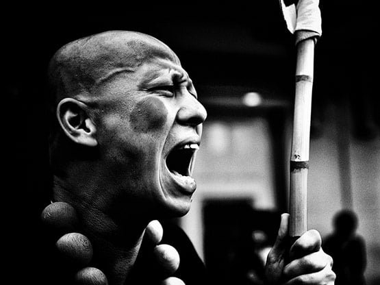
Raw unadulterated emotion. This photo caught my eye for that alone. The expression deepens the creases and thus the shadows on the face. Really helps convey the feeling of rage.
Ok, it's getting late and my muse is striking, so I need to paint now before I get too sleepy and/or my muse bails on me. I still need some good reference photos for metals but I'll continue that research tomorrow. Happy painting all!

Friday, April 06, 2012

From the Desk: Color Resources

Two quick resources around color theory for those looking to experiment more...

Color Schemer App - I picked up this app for my iPhone and have found it to be pretty useful. One of the things I really like is snapping a picture of some random thing and then using the app to pick out particular colors. It's a good exercise actually to find something with rich color to it (a rusted pole, a bush, a pair of old jeans) and try to guess what the hues present are. Then use something like this app to snap a picture and analyze the actual colors. Building color IQ is something I have really felt a benefit from.

Speaking of color IQ, here's a color test that is pretty interesting. It takes a little time, but it gives a good sense for one's sensitivity to color variations. Definitely worth the 10 or so minutes.

And how about you? Got any interesting online color resources out there? Post a comment! I'm going to create a sidebar section on this blog to catalog color resources that I come across and I'd love your input!

Wednesday, April 04, 2012

RtC: A Study in Black&White

Challenge is good for the soul. Well, that's what I'm telling myself for now. I've embarked upon my second entry for the painting competition, or at least a good experimentation piece.

These pictures are of an old Rackham model for Pilzenbhir, Defender of the Plains (2nd Incarnation). He's one of the Tir-Na-Bor Dwarves from their Confrontation line of models, back when they were metal models. These are beautiful models that overall I found to be really delightful. The game however was somewhat lacking, so I never really got that many of them. There's a whole gallery of them here for those that are curious.

This project is relatively straightforward: A black and white study with a single added hue. Sort of in the style of Kim Anderson's early photography work, or the movie Sin City, or any number of other such examples. I can't really say I'm a particular fan of any of those in particular, but it should give you an idea of the end results. The goal however is much more specific. By taking out hue as something to work with, it will force me to really study how light value works and interacts with different material types. This will obviously not be an easy project.

At this point you can see I've just done a couple washes over the entire thing of grey and then black. I bought a bunch of empty droppers and have been prepping a set of pre-mixed pure grey-scale shades using just the P3 white and black paints. I'm just going to focus on the black and white work first, and then add the single hue at the end. I honestly haven't picked a particular hue to use yet and instead plan to follow my muse once she strikes.

My main goal at this point is to get enough of his chest area painted so that I can get the head attached and start working from there. I also need to ponder a basing scheme for him, since getting to a base relatively quickly would be a very wise idea. For the moment though, I'm just basking in the lunacy of this idea and wondering how long it will take me to want to throw the model into the garbage disposal. Wish me luck!

Monday, April 02, 2012

Drake McBain

There comes a point at which working more on a particular model becomes an exercise in self torture. McBain here had definitely reached that point for me. I'm quite happy with what I've ended up with (even if the photos are sub-par). I spent a lot of time working on him, and re-working... and re-working some more. The end result is a model that I'm pretty happy with and plan to enter in the KublaCon painting competition. This post is going to end up as a mash-up of a gallery posting and an RtC post all together. So, in that spirit, I'm going to settle in with a beverage to write out the rest of this post and I suggest you find your favorite beverage if you plan to read the whole thing.

The final tweaks that I made to this model were pretty straightforward. I cleaned up the undersides of surfaces that I had previously missed. I added static grass and the razor wire (both from Army Painter). The razor wire got a number of wash treatments to make it look older. I also did some additional cleanup on the metals. I'm still not 100% happy with them, but more on that later.

As a competition piece, I think it's ok. I was comparing it to last year's entry (the WarHog) and have to say I'm satisfied enough. I feel like this model is slightly above the WarHog, but not necessarily award worthy. The one thing I am happy about is how the overall scheme comes together. It's sort of a slightly-narrowed triadic scheme of green/blue/red-orange. As I continue to refine my own painting style, doing higher-end paint jobs like this start to really bring out my personal preferences and characteristics. One such characteristic is that when I build up base coats, I tend to use thinner coats and a wider variety of hues. This creates much more variation in the color, and I personally like that complexity. On the downside, that technique can easily create challenges when trying to shade, and I need more refinement on making that process better.

Do I think this is going to earn me an award at Kubla? Honestly I doubt it. However I'm not really feeling like more time is going to take it to the next level. There's a point at which I have to acknowledge that further painting is likely to make things worse by obscuring detail, ruining good points, and just getting frustrating. So I'm calling it good and moving on to a second entry for the competition.

What went well:
* Basing - Really happy with this. Spending the time to make my own spent casings and paint cross-hatching on the sandbags to create that bit more of realism was worth the time.
* Feedback - Getting lots of feedback, and over multiple iterations, was very helpful. Particularly for helping me course correct as I went along.
* Triadic scheme - The color scheme works pretty well overall I think. I used a little blue in shading the green armor. I used some purple to shade the flesh. Overall I tried to get some blue into most everything, and I felt it helped tie the whole thing together.
* Face - Honestly, I don't think I've painted such a good face ever before. Totally happy with the results for my current skill level.

What could have been better:
* Metals - Just kinda frustrated with these. I can see why some people prefer NMM. It's just easier to force the lighting effects that way. Still though, I'm a true real-metal fan at heart, so I'll keep doing my thing and trying to get better.
* Arms - The flesh of his arms could definitely been a little smoother.
* Sealing - Ok seriously, he's a bit too glossy. But I'm not taking any chances to hit him with an additional coat of dullcoat.

And that wraps up McBain, my first Kubla entry, and my last outstanding unpainted merc! Whew! Time to refill my drink and start looking at my next project.