Showing posts with label minions. Show all posts

Friday, June 03, 2016

Sacral Vault

This was a beast of a project. So many challenges along the way.

What went well:
* Using the airbrush to do initial layers of stone work, then building up from there.
* Working through details one layer at a time.
* Painting in parts, but doing all the pinning/fitting work up front.
* Not letting myself get too buried in detail work and trying to make it all look great.
* Resin for water effects. Combination of luck and planning brought it together.

What could have been better:
* Spending more time on key parts.
* Paying closer attention on where to put candles at the beginning.
* Not letting it tip over and crash, necessitating multiple repairs.
* Green-stuffing the candles down rather than just gluing them.

Monday, February 22, 2016

Gobbler Tinker

Now this model is one of those rare conjunctions of highly frustrating and highly entertaining. The entertaining comes in the form of the huge amount of character that the model has. The frustrating part comes in the form of getting it put together. Once I finally got it assembled, I painted it separate from the base but had fortunately got a base prepped with holes already drilled for the pins. And even then while I was trying to get it on the base, I managed to bust it apart in two different places. However I managed to get it back together and on the base properly. I will say though that it was worth the effort. The myriad of sculpted details on this model make it really fun to paint. From the wagon full of random parts, to the characterful expression on the Tinker's face, it was all very fun to paint. I'll admit that there are some secluded parts of the model that didn't get painted properly but they are also pretty hard to see anyway. I highly recommend painting this model.

Thursday, February 04, 2016

Bone Grinders

So these were speed painted. Seriously, I cranked them out really fast. I used a trick from my buddy Bryan on this. I did basic base coating of the flesh, leathers and fur, and then drybrushed those parts, then washed the whole thing with SWW Sewer Water. Then I did details like metals and bones and such. The whole unit probably only took me 5 hours tops. I'm pretty happy with the result, the time spent, and perhaps most importantly getting these done after them sitting in a blister for at least 3 years.

Tuesday, April 16, 2013

Victor Pendrake

Finished Pendrake (finally) towards my April painting goal. I'm already halfway through the month and still a long ways from my goal. It's been a brutal month for work and I'm just getting crushed. It'll be a miracle if I pull this one off.

Just quick notes on Pendrake here. I pretty much speed painted this one and took a few shortcuts. The primer coat was also terribly grainy which screwed up some things as well. However I muscled through it and got it done. I spent way more time on the base for no particular reason than to add some flare and offset the other glaring mistakes. In any case, he's done!

Wednesday, February 27, 2013

Rask

Super fast pics of Rask since I've got a game later tonight, potentially using him too. Loved this model. Could have totally spent way more time on him, but I'm trying to close out my February projects. I probably should have done a prototype of a bogtrog before doing Rask so that I had the scheme locked, but I feel like this worked out quite well and should be fairly easy to replicate again.

Monday, February 11, 2013

Ironback Spitter 2

Yep, that's right, a second Ironback. Technically he was done at the same time as the second posse, but I hate to post back to back. This one will be super fast.

What went well:
* Lots of the same stuff as the posse was good with this model.
* Using a very different color scheme on this one worked well. I feel he still fits with the overall look of the army but has a distinctive pop to him. Also makes him easy to distinguish on the tabletop from the first one.

What could have been better:
* Definitely better smoothing of the overall look. I could have definitely done a couple of very thin washes to smooth out the rough spots, but it's still pretty good.

Friday, February 08, 2013

Gatorman Posse 2

More Croxorz! I wrapped these up just tonight by adding the grass tufts. The Envirotex had just enough time to cure, and fortunately in time for the Gold Rush Rampage tomorrow. Quick analysis...

What went well:
* Setting a deadline for myself of getting these ready for GRR was great. It forced me to push hard at painting and I think I've found my muse again.
* Having an existing formula to use as a basis helped speed the process as well.
* The drying blood on the spears worked out far better than I expected. See the picture below.

What could have been better:
* Uh, err... well lots probably, but honestly I'm stoked with how these turned out for spending only 5 evenings painting them.

This shot gives a somewhat better impression of the blood effect on the spears. It's nothing particularly hard to do, just a little secret sauce that I learned from Stahly's Tale of Painters. I adapted it and just make sure to create the spray of blood in a logical way across the blade so that it looked like a slicing or stabbing stroke.

Friday, August 31, 2012

Maelok the Dreadbound

My third (and final for now) Gator warlock is done! And with this completion it rounds out my Gator forces. I should caveat that by saying that I may eventually get more Gators, but this rounds out the first level of commitment I made to starting a Gator force. Anyway, more on that in an upcoming post. For now though, a quick review of painting this model.

Ok, straight up, I didn't spend as much time painting this model as I had originally intended. There's multiple reasons, but probably the most guilty of them is my desire to be "done" with my Gator force. This model is a really nice sculpt, but I did run into a couple challenges. Particularly in the realm of readability, I found the sculpt to be very busy with details. This always causes a bit of trouble for me. I felt like this model wasn't as frustrating, but it being the last Gator in my collection, well, I just wanted to be done. So it could have gotten more attention but the end result still makes me pretty happy.

What went well:
* The candles turned out quite nice I think. They added a lot of color and attention, and especially brought my Mardi Gras color scheme well into focus.
* The dead flesh and exposed muscle turned out fairly well for what I wanted. I was going for more of a dried out husk sort of look and I feel like I accomplished that.


What could have been better:
* As mentioned above, more time and more effort would have been nice. But c'est la vie.
* Basing turned into a fiasco with his feet being very wide apart and not fitting properly. If you turn the model upside down, you'll find several unfinished parts.
* Some details just didn't quite get done, like the eyes. I sort of spaced on them, and now that it's sealed, I'm not going back.

Monday, August 27, 2012

Gatorman Witch Doctor

And then there was one! Finishing this guy leaves me with just Maelok left out of my Gators collection. As noted in yesterday's Weekend Roundup, this model was plagued with disasters and frustration, so I'm keenly happy to be done with it. I'm actually going to skip the normal analysis because I was that frustrated with the model. It's not a terrible sculpt. Just happens to be one of those models that didn't gel for me.

Wednesday, August 22, 2012

Swamp Horror

So here's the result of my second self-imposed gator painting challenge: the pink octopus! I can't honestly say it's a complete success, but I can definitely say I'm happy with the results given the challenge I set forth for myself. It really was very fun to paint, and it does make for a very distinctive Swamp Horror.

I should note that this model posed some interesting challenges. The suckers for example had to be painted individually. The underside was uniquely difficult to get to, and then ended up being mostly not possible to see. And the eyes are very tiny to get to. Despite the challenges though, I enjoyed painting this model. Probably mostly due to the paint challenge.

What went well:
* The chitin on top worked out quite nicely I think. Good color variation and appearance of texture.
* The overall scheme worked out nice. Bright, but not overly harsh on the eyes.
* Being so well sunk down into the base really gives him a feeling of rising up out of the water.

What could have been better:
* Details like the eyes and teeth could have been a little better defined and highlighted.
* The membranes between tentacles really needed to appear more white/translucent, but I just couldn't quite get it right.
* The blending on the side bubbles (or whatever they are) could have definitely been smoother.

Thursday, July 05, 2012

Boneswarm

Another quick gallery post. The Boneswarm is a very fast model to paint. Mostly cause, well, it's just a big pile of bones with a few small details of earth in some of the gaps. Not much more to say on this one really.

Sunday, July 01, 2012

Calaban the Grave Walker

Calaban rounds out my first 15pts of gators, and I couldn't be happier! Honest I'm having a really enjoyable time painting gators. They are quick, but offer plenty of detail to focus on. Calaban was a little tricky at first because I wanted to make sure to incorporate all 4 of my "Mardi Gras" colors into his items if possible. As it turned out, it wasn't that hard to do after all.

I've already started on my next gators to get up to 25pts, and gotten a fair amount of work done as well. Speaking of which, time to get a little more done and then get some sleep. Happy painting!

Tuesday, May 31, 2011

War Hog

Apologies in advance, this post is going to be like 3 posts in 1, and longer than a normal gallery entry. I'll start with the normal gallery entry stuff and then move on to the Road-to-Competition stuff.

So here's my competition War Hog, in all his final glory! I have no idea how many hours I spent on this guy. Overall this model was pretty cool. Organic parts, mechanical parts, and just generally pretty interesting. He was pretty big and complex though, which made painting him pretty challenging. I should note that I didn't seal him since he is unlikely to be used on the table, and also sealing him would have affected the effects on the metals that I spent a lot of time on. So he's likely to just sit on the top shelf of my models cabinet where all the other best stuff sits. Perhaps sad, but honestly I'm not really very interested in playing Farrow at present, and regardless of whether I did play them or not, I had intended to paint this model.

What went well:
* Metals - I seriously feel like the metals worked out really well on this model. I spent a lot of time on them, both in terms of weathering and shading. I'm one of those people that like the look of metallic metal paints rather than NMM.
* Flesh - I spent a lot of time here too. It's not perfect, but I feel like the extra effort really paid off.
* Overall composition - Much of my time near the end was making little tweaks here and there to bring the overall composition together. I gathered a lot of feedback from people/places I trust on this. That leads me to...
* Getting feedback - Definitely very helpful. Not just friends getting in person viewings, but I also posted on the BrushThralls forum for feedback and got some really helpful critique. I'll definitely be doing that again for future competitions.

What could have been better:
* Not getting exhausted - Ugh! By the end, after having been working on it off and on for almost 2 months (just painting), I was ready to be done. I was pretty sick of looking at it in fact. I need a better way to tackle such large projects if I'm going to do them this seriously.
* Pigments - In all fairness, this was the first time I used dry pigments, so I'm still getting the hang of them. They were too thick in some places. I definitely like them though, and I'm looking forward to using them more in the future.
* Some details get lost - The model is huge and complex with a lot of details. I feel like some of the detailing work I did wound up lost in the overall complexity of the model.

Ok, so all that aside, time to talk about the competition itself. This year I entered the "masters" level which is still an "open judging" system, but did not place at all. According to the competition organizer, I was super close to getting a bronze. I was in good company actually, as there were other masters entries that didn't place, much to my surprise actually. There was a 40K Tyrant that was pretty impressive I though, but didn't get anything either. I can honestly say I'm not terribly disappointed. Why? Well...

After the awards ceremony I got a chance to sit down with Derek Schubert and he spent probably 20 minutes giving me an in-depth critique of my model. It was very education, and I am very grateful to him for his time. I've included notes about his feedback below, but before that I'll close with some things that I'm taking away to keep in mind for next year:
* Smaller model - Yeah, this one was too big. It's impressive, but smaller is better for the competition I think.
* Avoid metals - I think my love of metallics and trying to refine that style doesn't mesh well with the judges' perspectives. I'm probably better off avoiding them next year.
* Forced lighting perspective - This is something I'm still not comfortable with, but I think it's something I need to keep in mind.
* Telling a story - The model needs to tell a story much better. Overall composition is one thing, but if the model is able to convey a story then I'll have succeeded much better. It's not enough for the War Hog to be angry. There needs to be more of a sense of what's going on. I think my model selection for last year needs to take that into account.

The blending/shading on the muzzle needed to be tightened up considerably. Totally agree with this. I just sort of lost my steam in this area.
There should be reflections of light on the red of the gauntlet. Totally disagree with this one. I get where Derek's coming from, but this is a style thing that I just don't buy into. Forced light perspectives are a mixed bag. When you force the lighting perspective in a particular way, you must look at that model from that perspective to make sense of it. Just not my style, but it was interesting feedback.
The shading/transition of the hoof didn't work. Totally agree here. I blew this. It probably looks ok in the photo, but honestly the angling on it was wrong.
The plating "bumps" needed stronger contrast to stand out. Yeah, I mostly agree with this. They just didn't work out as good as I wanted. They needed more raise to their surface and just didn't have it to work with.
The blue hose stood out too much, and the busted pipe was somewhat unnecessary. This was something I hadn't even considered. The blue hose definitely stood out too much, and there wasn't any other blue on the model from that angle to balance with it. In comparison, the red hose worked well because there was plenty of red to balance with. The pipe, well, I'm torn on that. I like having it there, but it does make the whole thing a bit more busy. Point taken.
Mohawk needed more shading/highlighting to make it pop. Well, I'm torn on this. To some degree I wish I had done more on this. But on the flipside, I didn't want to be highlighting all the strands and making it look too gaudy. I've seen that too much already, and I got some very good advice from EricJ on the Wyrd forums about hair that I still very much subscribe to. I'll have to mull this over a lot more before I can decide whether I should have taken this advice.
Brighter highlights for the metals. Yeah, I mostly agree here. Overall there were plenty of opportunities to push the metal highlights farther. Derek picked out this section as an example where I could have put highlights on the lower half of the holes to emphasize reflections. Definitely a good point here. Overall there were other comments about metals not being smooth enough, and I sort of get that as well. Still more to learn with metallics.

Ok, I can't really handle posting anything more about this model. I'm done, and well past ready to be done. Time to move on to something faster and crank out some army stuff. I'll start thinking about the next competition in a couple months. In hindsight, I may not have even gotten a bronze, but I definitely feel like I painted like I had a pair!

Thursday, March 17, 2011

Feralgeist

Super quick post. Here's the finished Feralgeist that I painted the other day. Nothing amazing really. I decided to keep it in the pink theme. I sorely debated whether to try and make it lighter in the center and darker near the high points. I sort of wish I had, but it's done now. If I end up painting a second one for whatever reason, I'll do the reverse of this one.


Sunday, October 31, 2010

Thrullg

It's always nice to get back to fully painted for one of my factions, even if that faction is minions. I really would like to get down to just 1 or 2 unfinished factions, but that's going to take me a while, especially if I stay focused on Legion and keep expanding my model count. However, I can at least say that for minions I am done for a while. Adding Thrullg was sort of an impulse buy. I've fielded him a couple times now and not been particularly impressed yet, but he definitely has a learning curve to him.

Well, anyway, here he is. The picture is terrible unfortunately. There are some subtle details of color that got washed out when I tried to clean up the picture. I'd take another set of shots, but honestly I'm so busy with work and taking care of my son that picture quality is just going to have to slide.

My whole inspiration for this paint scheme was to go for something Giger-esque. It sort of worked, but I think more greys would have helped it. It is funny though how painting the spots, at the time, seemed pretty faked. But now that I look at them a few days later, I really dig them. Anyway, one more model down. Now on to finishing up the Sorceress.


Wednesday, May 28, 2008

Gudrun

Well, here was my primary entry for KublaCon. I didn't win (more about that later) but I'm still incredibly happy with how he turned out. I spent a ridiculous amount of time working on him (for my normal time investment).


I'm sort of still in a bit of a painting funk, mostly because work has been intruding on my personal life alot, along with other personal things getting in the way of painting. However, plans are in motion to get myself back on the painting track very soon.

Monday, September 17, 2007

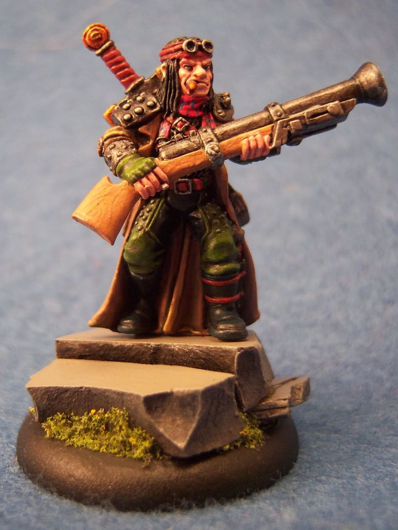
Alten Ashley

Finished up Alten Ashley this weekend. He was pretty fun to paint actually, despite a rather plain pose. I took this opportunity to try out a bunch of things. First, pics...


Basing: I wanted to try my hand at a slate base. I wasn't able to get any milliput in time, so I picked up some stuff called Super Sculpey. It requires baking, which limits its uses. However, it worked relatively well as a substitute. I used Ali McVey's slate bases tutorial on the brushthralls' site (which seems to be unavailable at the moment, so no link). Overall though, I like how this base turned out for a first attempt.

Wood grain: I tried my hand at painting wood grain on the rifle stock. Basically I started with rucksack tan, then painted grain lines with bloodstone, then did a couple thin glazes using a mix of rucksack tan, bootstrap leather and matte medium in roughly a 1:2:4 ratio. The key was making sure the glaze was thin enough to not hide the detail below, but thick enough to shift the color.

Two Brush: I used the two-brush technique much more extensively here. His coat, pants, and other misc places. The coat really turned out great I think. Still a couple rough transition spots, but after I finished it, I just kept staring at it thinking to myself how I've started to turn another corner with painting now.

Armor: I used a mix of armor wash and matte medium when washing the metals. It really dulled them down noticably, which I actually liked. I think less matte medium will be better in the future, but I do like the initial results I had. It also helped so that highlights added after the armor wash really stand out more.

Red Leather: This is something I wanted to try out just for kicks. I love the reddish leather look on some of the stuff that I've seen come out of the PP studio lately, and wanted to start figuring out how to build up that color. For this model, I used a mix of khador red base and bootstrap leather, and then glazed it with rust brown ink and matte medium. It's ok, but definately needs more refinement, especially in highlighting. The basic color is pretty close to what I'm looking for, but it needs more depth.

Photo: Ok, this is actually a problem area. The color on the above photos is really bad. I need to spend some time to enhance my photo rig some more. I'm thinking the background is a big issue at this point. That'll be my first adjustment.

Enough for now... All hell's broken loose at work, and I need to try to stay sane. Hopefully my painting time doesn't suffer too much.

Sunday, August 26, 2007

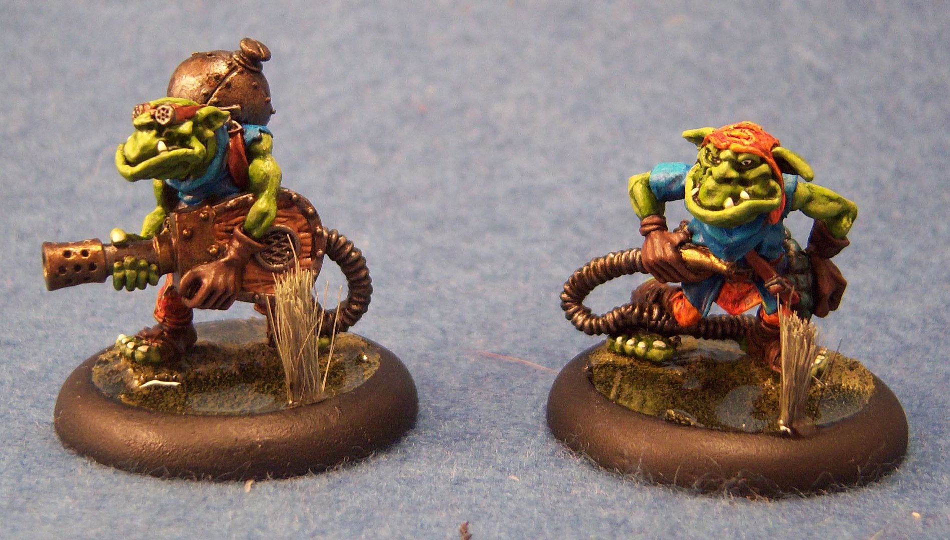
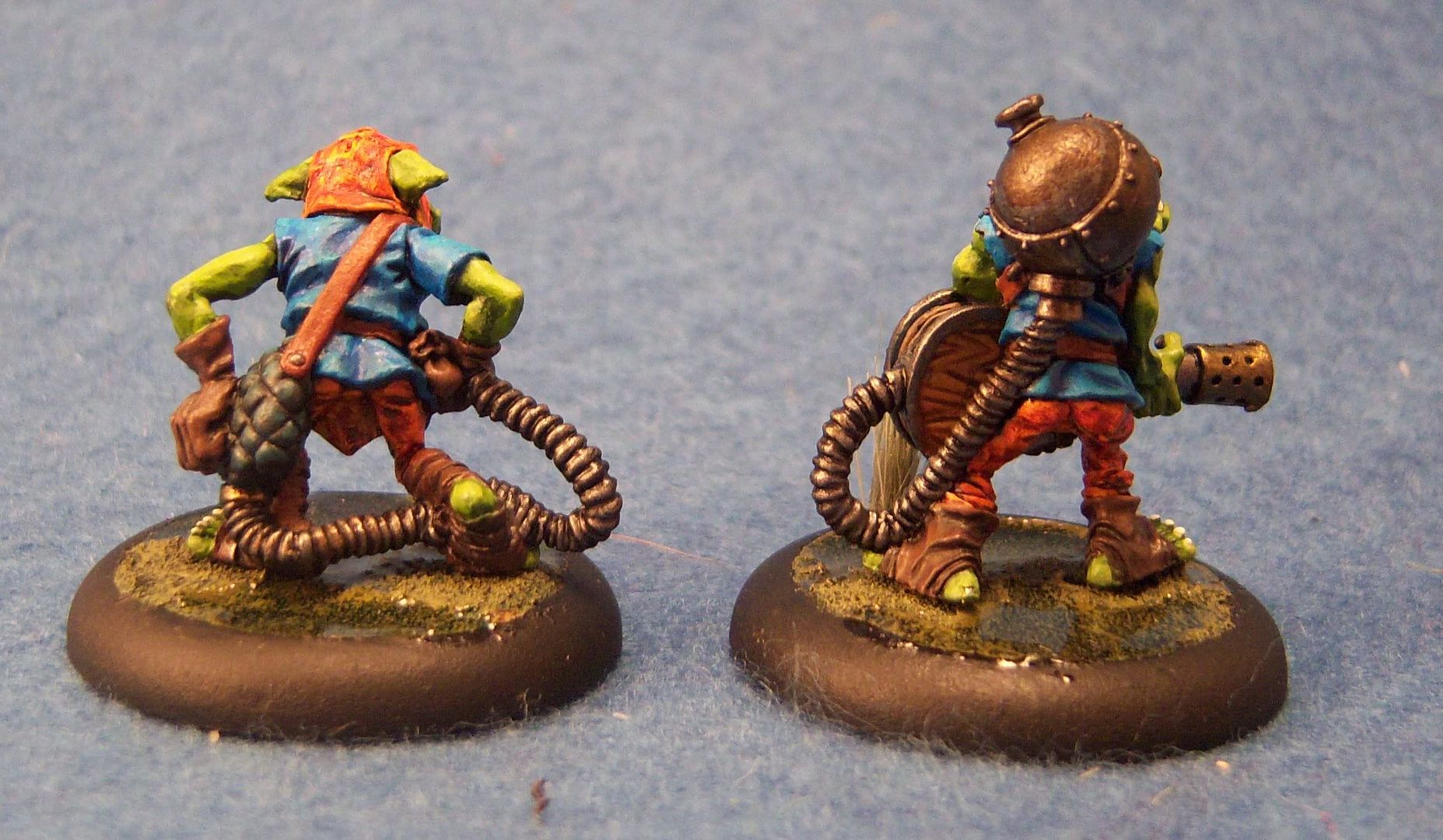
Swamp Gobbers

Whipped these little guys out real fast. Did all the painting in 1 day, which again is very fast for me. The bases I had made previously in preparation for these little guys (Swamp Gobbers deserve swamp bases of course). No really uncharted territory here except for the brighter orange leather that I did. For this I used P3 Heartfire and then a generous layer of the lovely GW Rust Brown ink. I'm nearly out of the stuff now, so I'm going to have to look into getting some more. This technique is fast, and has some striking results, but does make the models a bit brighter than I originally planned. Overall though, for getting finished in 1 day, I'm happy.

Thursday, June 28, 2007

Totem Hunter

This model was a blast to paint. Overall I'm relatively happy with it, although there is one particular mistake I made: I sealed it after attaching it to the base. The matt coat put an odd finish on the Envirotex, making it look hazy (these pictures are from before I sealed it). On the one hand, I look at this model and see a bunch of things I could have done better, or I see technique mistakes. On the other hand, I'm happy with having painted like I have a pair and just gone for it. The spots on his skin and the water effects are two specific examples. They could have been better, but having never really done those things before, I'm very satisfied with my first time results.