 |  |
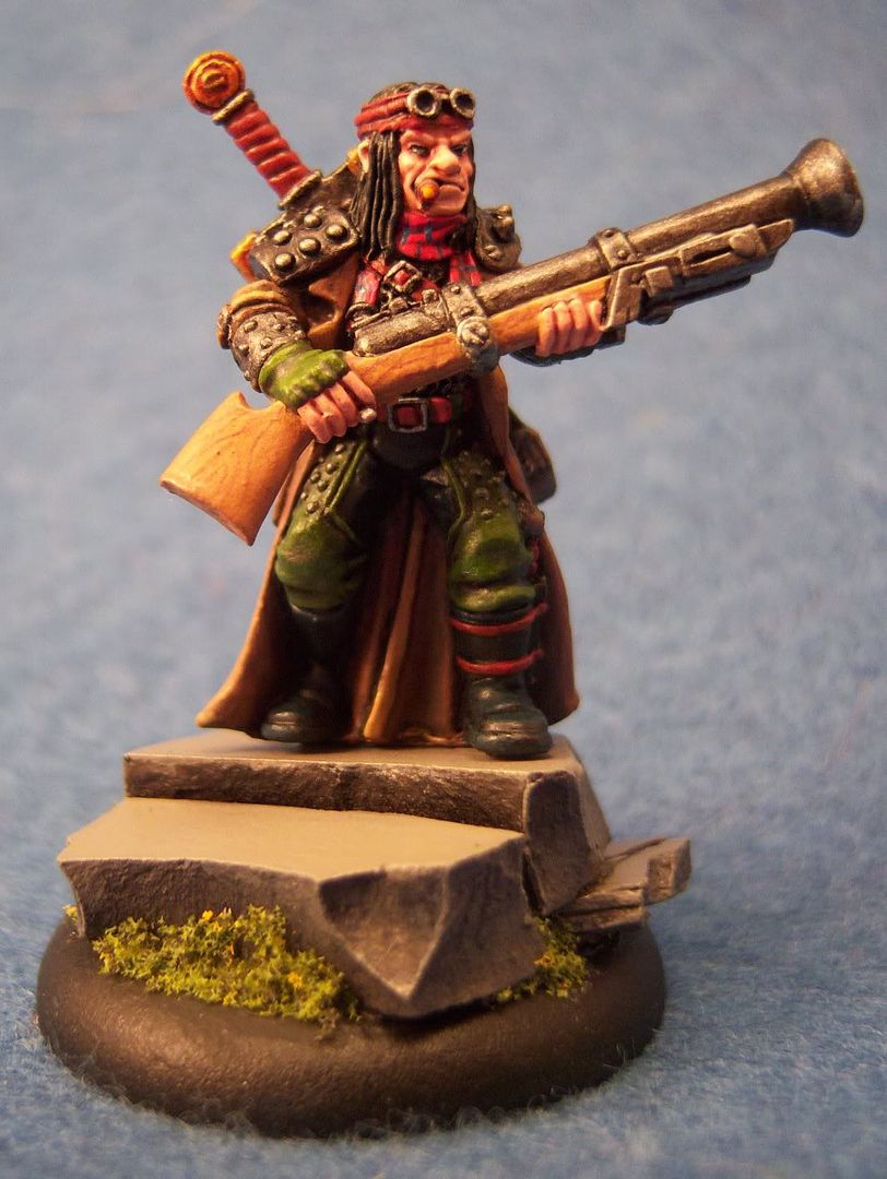
Basing: I wanted to try my hand at a slate base. I wasn't able to get any milliput in time, so I picked up some stuff called Super Sculpey. It requires baking, which limits its uses. However, it worked relatively well as a substitute. I used Ali McVey's slate bases tutorial on the brushthralls' site (which seems to be unavailable at the moment, so no link). Overall though, I like how this base turned out for a first attempt.
Wood grain: I tried my hand at painting wood grain on the rifle stock. Basically I started with rucksack tan, then painted grain lines with bloodstone, then did a couple thin glazes using a mix of rucksack tan, bootstrap leather and matte medium in roughly a 1:2:4 ratio. The key was making sure the glaze was thin enough to not hide the detail below, but thick enough to shift the color.
Two Brush: I used the two-brush technique much more extensively here. His coat, pants, and other misc places. The coat really turned out great I think. Still a couple rough transition spots, but after I finished it, I just kept staring at it thinking to myself how I've started to turn another corner with painting now.
Armor: I used a mix of armor wash and matte medium when washing the metals. It really dulled them down noticably, which I actually liked. I think less matte medium will be better in the future, but I do like the initial results I had. It also helped so that highlights added after the armor wash really stand out more.
Red Leather: This is something I wanted to try out just for kicks. I love the reddish leather look on some of the stuff that I've seen come out of the PP studio lately, and wanted to start figuring out how to build up that color. For this model, I used a mix of khador red base and bootstrap leather, and then glazed it with rust brown ink and matte medium. It's ok, but definately needs more refinement, especially in highlighting. The basic color is pretty close to what I'm looking for, but it needs more depth.
Photo: Ok, this is actually a problem area. The color on the above photos is really bad. I need to spend some time to enhance my photo rig some more. I'm thinking the background is a big issue at this point. That'll be my first adjustment.
Enough for now... All hell's broken loose at work, and I need to try to stay sane. Hopefully my painting time doesn't suffer too much.
No comments:
Post a Comment