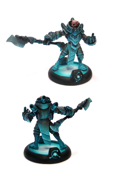
The other evening while painting I watched a documentary called
Helvetica. Now my point is not to do a review of the movie (which was a fine documentary), but rather to point out how it got me pondering. The Helvetica font has quickly become a very common choice, particularly for signs and logos. There's plenty of reasons why (which is what the documentary goes into) and they make sense. However what it got me pondering is how often we don't notice such stylistic commonalities. Take for example a door. So often there will be slight stylistic variations to the door's handle (size, color, etc), but there are many doors which have virtually the same door handle. It's not due to there being very few door handle manufacturers (as evidenced by the slight stylistic variations), but rather due to the usability design and ease of function of the door handles. That is to say, many door handles look virtually the same so that we, as humans, can easily assess how to use them without significant conscious thought. Helvetica got me thinking about this as well in terms of color choices, visual styles, and just overall appearance. How often are the visual qualities of things similar just for our cognitive convenience. And perhaps more importantly, how does that subconsciously influence us as artists?
I have no real answer to this. Rather I'm curious what others think. Some of the most striking miniatures I've seen have been models that set aside the "normal" and did something really different. Sure, some of them were by world class painters, but many weren't, and that's not really what matters. I've seen plenty of models painted with smooth blending, perfect zenithal highlighting, and rick color usage, and as impressive as they might be, they can sometimes feel all the same when taken in context of subjects where the artist really stepped out. Here's some examples of models that I found very striking.
|
|
 This Ramos by Eric Johns is probably the first paint job that really caught me off guard with how unique it was, and it still stands out in my memory as a favorite. What stands out to me so much is not the OSL specifically, but the implied story that the overall piece inspires. I can't help but look at it and wonder if he's hunting someone or something in the cool damp night. This is of course a beautiful paint job, but the vision is what really strikes me. In the vein of imitation is the highest form of flattery, this model has served as inspiration to many other painters. This Ramos by Eric Johns is probably the first paint job that really caught me off guard with how unique it was, and it still stands out in my memory as a favorite. What stands out to me so much is not the OSL specifically, but the implied story that the overall piece inspires. I can't help but look at it and wonder if he's hunting someone or something in the cool damp night. This is of course a beautiful paint job, but the vision is what really strikes me. In the vein of imitation is the highest form of flattery, this model has served as inspiration to many other painters. |
 This "magma troll" by my buddy Lance is another such example of having a vision and working to make it reality. Despite not being a "world class" painter, he's captured the essence of his vision here, and the implied background is clear. There's several magma trolls on his blog, including a brilliant Mulg, which all come together to make a beautiful looking army. This "magma troll" by my buddy Lance is another such example of having a vision and working to make it reality. Despite not being a "world class" painter, he's captured the essence of his vision here, and the implied background is clear. There's several magma trolls on his blog, including a brilliant Mulg, which all come together to make a beautiful looking army. |
 This epic Skarre model is not necessarily my favorite. I'm not even really sure that I like it at all. However it is striking. Not because of the buttery smooth blending or well executed NMM, but rather because of the well executed dual light source implication. If anything, I think it's too complicated for the viewer to immediately interpret what is supposed to be going on around the model to cause the lighting, but still the vision was quite intriguing. In that respect I am very much in awe of this model. It's not often I come across a model that I don't personally like, but sticks in my memory so strongly. This epic Skarre model is not necessarily my favorite. I'm not even really sure that I like it at all. However it is striking. Not because of the buttery smooth blending or well executed NMM, but rather because of the well executed dual light source implication. If anything, I think it's too complicated for the viewer to immediately interpret what is supposed to be going on around the model to cause the lighting, but still the vision was quite intriguing. In that respect I am very much in awe of this model. It's not often I come across a model that I don't personally like, but sticks in my memory so strongly. |
 This Rahn (which I'd posted a link to previously) was also quite striking to me. The mood of the overall model is great, but I think what struck me most was how the base was so incorporated into the complete look. Not in the normal building up of a base, but in a very different "the base is the light source" way. This Rahn (which I'd posted a link to previously) was also quite striking to me. The mood of the overall model is great, but I think what struck me most was how the base was so incorporated into the complete look. Not in the normal building up of a base, but in a very different "the base is the light source" way. |
So where was I... There are common things all around us, and particularly as painters, these commonalities can slide us right into a rut without realizing it. I'm not saying there's anything wrong with painting a Khador jack red, or painting troll flesh blue. The documentary Helvetica just got me thinking that many times I paint parts of models without necessarily making conscious decisions about how to paint those parts (like leather for example). Just because I have a "proven" technique for doing something doesn't mean I should use it
all the time.
Ok, that was much longer of a post than I expected. I imagine about 90% of readers abandoned reading this post long ago, so if you made it this far I thank you and ask that perhaps you post a comment with a model that you found particularly striking to share inspiration with others.


1 comment:
Being a graphic design, I know the Helvetica documentary well.
It's ironic that I was only thinking this morning (before I read your post) about Trolls with blue skin and how I'd paint them a different colour to get away from the norm.
I have to admit though, with the odd exception, I do tend to follow standard colour schemes with my model painting to date.
Great post – definitely got me thinking more about it.
Post a Comment