Tuesday, January 25, 2011

From the Desk: "Go To" Colors

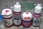
Everyone has them. There's those 4 or 5 paints that see more activity than anything else. They are your "go to" colors. The ones you fall back to for whatever reason. In the myriad of discussions I have with folks about painting, this topic came up the other day and it was suggested I post about it, so here it goes.

Theory:
Whether it's personal affinity for a color, or familiarity with how a specific paint performs, painters will find their own specific paints that they like. These colors may change over time, but a painter will tend to favor specific colors for stretches at a time. Let's look at a couple reasons and examples.

Utility - Some paints just present a lot of utility to them. They have flexibility to them that enables multiple tasks to be done, or simplifies specific tasks. The GW wash Badab Black is an excellent example of utility. It's really useful for black-lining around surfaces, or shading metals. P3 Menoth White Highlight on the other hand is really handy for lightening up a color for highlighting purposes. Paints chosen for utility tend to cause specific effects, whether that be through they way they flow or the color tone they introduce, as with the two above examples.

Performance - Some paints just perform better, specifically in coverage and consistency. GW metalics for example perform very well over pretty much every other brand of metals in this area. P3 Khador Red Base is another good example for it's good coverage despite being a red tone, which typically has challenges with coverage. Paints chosen for performance tend to stay as favorites until a better performing paint is found to replace it. These paints are also less likely to have a specific impact to the painting style directly.

Affinity - This has to do with what colors someone likes, and it obviously much more varied than the above reasons. Different people just like different colors. There's certainly some psychology to play into that, but I'll skip such discussion here. Needless to say, paints chosen for affinity do not themselves directly affect the painting style, but allow the painter to express their own artistic style.

Whatever the reasons, it's good to know when you favor particular colors and why you favor them. It's a good exercise from time to time to set aside a go-to paint and try out something new. Doing so can be frustrating, but will ultimately make one a better painter.

Practice:
Ok, now that the theory is aside, let's talk about my own go-to colors to give you some concrete perspective. I've included some pictures of my own models for reference.

P3 Sanguine Base
Sanguine Base has become a favorite color for me for a couple reasons. Firstly, the rich red color gives a feeling of warmth, but provides more than just a typical red color. Second, I like how well it covers and blends. It's a tone that works well for shading both blues and greens. Here on this Raek is an example of using the Sanguine Base to shade the light blue flesh given a sense of warm flesh on the undersides.

P3 Coal Black
Coal Black has long been a favorite for me. I once read a tip from of not using black to shade with because it appears less natural. I experimented with using Coal Black instead and fell in love with the results. It provides a deep cool blue tone to shadows which has become a staple effect for me. I've found that VMC Dark Sea Blue is also a good substitute for P3 Coal Black. The two aren't exactly the same, but close enough that the dropper bottle format from VMC provides an added level of convenience well worth the tonal shift. Here on Kraye's horse, I used Coal Black to shade to create a cooler contrast with the base.

P3 Bloodstone & RPP Blood Black
Ok, I'm cheating a bit on this one by lumping two together. Both of these are rich brown colors. Bloodstone in particular is a complex color. Blood Black has a rough equivalent to P3 Umbral Umber which I had used previously before I found the RPP color. Although they are ideal colors for working leathers (as exampled on this Death Marshall), I find that they are useful in a number of areas, including both subtle and deep shadings of greens.

P3 Cryx Bane Base
Cryx Bane Base is more of a utility color than an affinity for me. I use this color for everything from gray cloths to rocks to flat steel plates. It has a rich greenish gray color to it which I've found that works well with a number of schemes. Here on this Vassal I used it in the deeper shading of the robes to provide a little harmony with the yellow and red colors. I have to say that I'm really fond of how well this particular paint blends, particularly using the 2BB method.


Using them together...
It's not uncommon for me to use more than one of those colors on a single area. On this Ravagore's chitin for example, I used Coal Black, Sanguine Base, and Blood Red in washes and 2BB to bring out the surface characteristics of it more. The colors are not applied uniformly though so as to create plenty of character to the chitin.

So what does knowing this do for me? Well predominantly my go-to colors are dark shades. I tend to work my way down from lighter colors and shade down more than highlight up from dark colors. Knowing this helps me to plan my colors and process better. I will often start with a base coat that is somewhere around 75% brightness of my overall look and work from there, although sometimes I'll even work from a white primer base and only shade down, working special highlights in as needed. In any case, knowing what your go-to colors are and how this affects your style can help to better develop your use of color.

Monday, January 24, 2011

Raptors

Finishing up a unit is a nice feeling. I can honestly say that it's not very often that I finish a unit and really feel like I hit a home run on quality, and this one is no different. However getting these Raptors finished up was a major accomplishment for me. Five large based models is a fair portion of painting to get done, and I'm really looking forward to playing them more often now.

I'm going to skip the normal summary and just highlight that the photos and the speed painting were the downsides, but some of the speed painting on the black armor pieces was the upside. It's pretty late and I'm sorely in need of sleep.

Sunday, January 23, 2011

RtC [Road to Competition]: And So It Begins...

Once again, KublaCon is on my radar for the main painting competition to enter this year. This year I've decided to paint a War Hog for my entry so I figured I would chronicle the entire effort on this blog. Everything from initial planning through the final event. The series is going to span several months (since KublaCon is Memorial Day Weekend) so I'm going to tag these posts with the RoC label for easy reference.

Why did I choose the War Hog? It's certainly new and cool, but I chose it for other reasons than that. First of all, it has both "organic" and "machine" components to it which will challenge my abilities. This is also a good opportunity to display different techniques on the same model which can help win the judges' attention. Second, it's a good sort of model to draw attention to the PP line of models, which I enjoy trying to do. Third is that it's a larger model, and I wanted to focus on a larger model as my single entry rather than a smaller one. With my selection solidified, it's time to start the ball rolling. The next step is to go ahead and unbox the model and start looking over the parts.

Here are the various pieces for the War Hog, freshly unboxed. There are 14 total which could be a little intimidating. I went ahead and spent tonight prepping the pieces by trimming and washing them. I spent about 45 minutes on this step since making sure to catch as many ragged places to trim during this phase saves plenty of headache later. Since this is a serious competition piece, I decided to take the extra step of washing all the pieces with warm soapy water and scrubbing them with an old toothbrush. This helps get rid of any residue. Overall the pieces were in remarkably good condition and relatively little trimming was necessary. The biggest work was on the edges of the axe blades where a lot of filing was necessary.

My next step will be to begin assembly once all the pieces have dried. Here is pictured the assembly instructions from the back of the box. Due to the large number of pieces, I'll need to do it in sections so I'll need to spend a little time strategizing how I want to do that assembly. That's enough for tonight though, as I have other projects I want to get some work done on at the same time. For example I want to get Saeryn assembled so I can prime her tomorrow, and the Raptors are down to just final touch ups.

Wednesday, January 12, 2011

From the Desk: Being Sick Is Sometimes Good

Being sick sucks. But sometimes there are hidden benefits. The last two days I stayed home from work and managed to get some terrain making and painting in. To the right here is a picture of the simple hills I made, along with a Khador monolith. The monolith is really going to be a gift for a friend. I got the inspiration from this blog post. I'm not great at terrain making, and generally don't have the patience for it. However I wanted to get more terrain together for my own area. Part of my inspiration to do this was the Warmachine Battlefield Generator which creates a random terrain layout. I've become quite fond of this tool, but quickly discovered that I don't have all the terrain pieces needed to properly support following the random layouts it generates. Hence, I'm on a simple terrain making kick. I'm also sick of only having felt templates all the time.

I also got a serious amount of painting time in on my Raptors. Units are always a little soul crushing for me, but 5 large based infantry at once is a bit more so. I'm just going for tabletop standards on these guys since anything higher would probably drive me insane. Overall though, it's going pretty smoothly. Last night (after taking these photos) I finished up painting the armor edges which was a major hurdle. Now I can focus on details. The armor edging is always tedious and exhausting to do, so having that part already done really lifts my spirits.

In the realm of trying to meet my 1-1-1-1 unpainted goal, I did a quick tally of unpainted models and found I have the following counts:
* 4 Caster (2 Legion)
* 1 Jack
* 3 Units (2 Legion)
* 3 Solos (1 Legion)
Now there's some fudging in there. Two of those units are rolling in their UA's rather than counting the UA as a separate model, and one of those solos is actually the 3-pack of Spell Martyrs. But the principle is sound. I'm really quite focused on slimming this down. I've recently been very interested in the Farrow but I'm trying to keep focused on painting down my backlog before I start a small Farrow army.

Thursday, January 06, 2011

Battle Report: Double Impact

Last night I played an alternative battle format that my fellow gamers and I have been working on for a couple weeks now. The format is called "Double Impact". I'll post the detailed rules for the format in a few days once we've cleaned up the language, but the basic concept is sort of a tag-team format, where each army has 2 warcasters, with one warcaster off the table at any given time.

The Armies:
Me: Thagrosh, Vayl, Carnivean, Scythean, Typhon, Shredder, Forsaken, Striders w/ UA
Lance: Mohsar, Kromac, 2 Feral Warpwolves, Woldwyrd, 6 Bloodtrackers, Nuala, 5 Wolf Riders, Lord of the Feast, Feralgeist

The Throwdown:
Vayl and Mohsar were deployed first which really set the tone for the game. The battle quickly turned into an attrition game, pinging at each other and trying to wear things down. Vayl used Chiller on the Striders in order to reduce key targets' DEF to make it easier to lay some attacks out from the heavies. An early strike got a Carnivean spray hit on Mohsar, and Typhon was a rockstar at laying out sprays on Bloodtrackers and Wolf Riders.

The Endgame:
The triggering effect was Typhon getting into position to drop 3 sprays on Mohsar. On the last spray, Mohsar took the damage and croaked, putting Kromac on the board. At that point my turn was done, but Kromac was within the strike range of Vayl. He rolled up, jumped into melee with her, and then proceeded to go to town. However, due to a cruel twist of dice fate combined with Vayl having Tenacity on her to put her at DEF 16, Kromac missed with a lot of attacks. He landed enough to take Vayl out at which point Thagrosh landed on the table. This put an interesting twist since Kromac could then continue to land blows (and easier too since Thagrosh is only DEF 14). However Thagrosh is an effective ARM 18 and was able to absorb the remaining hits pretty easily. At this point it was a quick matter of the Scythean headbutting Kromac to the ground and the Thagrosh went to town like a master sushi chef.

Highlights:
* I still love my heavy beasts. Legion heavy beasts are just a ton of fun to play.
* I definitely need more practice with Vayl. She seems great, but has a number of features that I need to remember, and learn how to sequence her abilities. Honestly though I find her to be pretty interesting.
* Mohsar's feat has an old school Severius-style crushing feel to it. Not being able to reave fury is a huge pain, especially for a beast heavy list.

Reflections on the Format:
The format seems pretty fun. We're continuing to make tweaks to try and get it refined. There were a number of rules questions that came up while trying it, but most of them were easily resolved. I definitely like the tag team idea and this gives enough tweak to the format to introduce something new without throwing everything sideways like Frankenstein or Casterjackapalooza do.

Tuesday, January 04, 2011

Vayl, Disciple of Everblight

First finished model of the year! I told myself that I wanted to get to a point of having a 1-1-1-1 unpainted system for my Legion army, so this gets me closer. This puts me at 2-0-2-1, so not terribly far off from reaching that. Unfortunately this photo is rather grainy, and I'm not sure why. For this model though, I was issued a challenge by a friend to not use my "crutch" paints for some part of it. So I left out the colors I typically use for Legion flesh: Underbelly Blue, Trollblood Base, and Sanguine Base. It created an interesting color challenge for me to reproduce something close to those colors. It turned out to be easier than I thought. I used combinations of flesh tones and strong blues which worked well, and then added deep red tones to do the shading with.

What worked well:
* Despite the graininess of the photos, I feel like the blending of the cloak worked out quite well. I went with a more yellowish tone that previous Legion models and I like this shade better.
* The basing worked out well. Due to her wide robe I needed to put something wider, which meant adding some elevation. This base is simple but effective.

What could have been better:
* The blending on the flesh isn't so great unfortunately.
* The armor is ok, but I feel like it could have been done a little better. I really struggled with how to improve it but just couldn't fine a solution that I liked.
* I'm going to say that the feathers could have been better, however I really am pretty satisfied with how these turned out. I have yet to find a solution for small feather like this that I like. Only the Shepherd seems to have turned out to my complete satisfaction.

Sunday, January 02, 2011

From the Desk: Vayl, Photos, and Prepping for 2011

In order to produce more consistent photos (angle, lighting, distance, etc) I put together this little mounting system. The idea is that it will reliably hold my standard model mounts (empty spray cans) and the old broken tripod of my camera so that I get consistent results. This will be very helpful For putting together step-by-step photos without having to drag the models into my normal photo box (which is not meant for models still attached to paint cans). So how good is this little set up? Let's take a look at my very first attempt at such photos, using my current in-progress model: Vayl.

My before picture isn't really much of a before. I'd nearly finished her at the point I had this set up ready for testing. So the before and after is of her skin. At the time of writing this, I've finished painting her, but need to construct a base for her. The robe is a little annoying in that it flows out well over the edges of a small base. I typically try to create more interesting and raised bases for warlocks, but Vayl is definitely going to require something extra unfortunately. If it wasn't for the basing needs, I'd have her wrapped up tonight most likely. But the need for gray stuff to dry and whatnot will mean she needs to wait until tomorrow.

Here's the after picture. This is the point at which I've determined what additional steps I need to make sure I take when doing these sorts of photos. First, my removing the camera from the mount caused the mount angle to shift a little, which causes some differences in the camera angle. Second, cropping separately causes some inconsistencies between the pictures. Third, I didn't mark the alignment of the model, so it's not facing exactly the same as the first photo. These are relatively easy to fix as a matter of process though by just doing some simple markings as I do the first photo.

Saturday, January 01, 2011

2010 Wrap Up, and 2011 Resolutions

[Disclaimer: This post contains fluffy, introspective nonsense... Just like last year's did.]

Once again, I find myself at the beginning of a new year, and it's time to look back at the previous year.

Last year's goals:
1) Focus on a KublaCon painting entry that I am really proud of - Check! Last year was awesome for KublaCon for me. I'm still pretty psyched about how well I did. More than just that, I got a lot of useful feedback that helped me improve my painting.
2) Close out my unpainted Malifaux backlog - Uhh.... not check. I've still got several left, and I'm not making much progress on them.
3) Refine my own "style" of painting - Uhh... sort of check. I've been trying to do this, but in all honesty I haven't been doing a good job of it. It's hard for me to really elaborate more except to say that I'm more keenly aware of where my weaknesses are in my painting style.

Models painting last year:
This year turned out to be pretty similar to last year. All things considered I find that to be a feat unto itself given that I have a child now, along with a job that has become more demanding. The total comes to 69 models, 3 over last year. This year had a number of beasts as I was really working hard on my Legion army.
Legion: 27
Mercs: 18
Protectorate: 3
Circle: 2
Cygnar: 7
Khador: 1
Minions: 1
Malifaux: 5
Other: 5

Goals for next year:
1) Enter the KublaCon painting competition at the masterclass level. I promised myself if I got a gold in the open level, I'd move up to the masterclass level the next year. Last year's entries were good, but I need to step up my quality even further. Amazingly I am already thinking about what I'm going to enter.
2) Close out my unplayed factions. I'm really only playing Legion now, and I'm thinking about starting a minion "army" just for fun. But I really want to get done with the remaining models for the other 3 factions I don't play actively. It's only 12 models actually, so it shouldn't be that big of a deal.
3) Do a series of posts on "speed painting". This is a project I've started working on already (in terms of research and planning), but I want to make sure it takes shape. Look for this to start happening in the next couple weeks.

Well the evening hours are burning up, and there's models on my desk to paint. It's time to put the keyboard aside, pick up the brush, and paint like I have a pair. Happy new year everyone!

Thursday, December 30, 2010

Tuesday Nights at the LGS

I'm one of the fortunate players who has a fairly thriving WarmaHordes community in the area. Not just that, but within a 2 hour driving radius, there are at least 3 game stores that have table areas and hold tournaments. My favorite and closest LGS not only holds monthly tournaments, it has an active press ganger who organizes Tuesday Warmachine gaming. Normally I have trouble making it to Tuesday Warmachine night, but since this was a vacation week, I was able to swing in for a couple games.

Before I cover a quick battle reprot, I have to give our PG (Ray) a shout out. This guy is great for a number of reason, but here's a couple things I really appreciated this week:
* He was purposefully organizing games, putting himself at the bottom of the wait queue for a game.
* He takes the time to know who all the players are, and suggests match-ups for players so that they get a good gaming experience.
* He strikes just the right balance of being polite and delivering some friendly smack talk.
* He's quite a sharp player and makes a very worthy opponent.

Ok, now for a quick battle report. I got 2 games in, which I'll try to recount with extreme brevity...

Game 1:
Me: Absylonia, Scythean, Carnivean, Raek, Stinger, Shredder, Forsaken
Wing: pVlad, Beast 09, Destroyer, IFP, Manhunter
Outcome: Victory!
Summary: I hadn't played against pVlad in MK2 yet (amazingly) so this was a bit of a learning experience. During his first strike he laid out good damage on both my heavies, but since he didn't kill them, Absylonia feated and it put me in a strong position. My counter-strike cut Beast 09 down to 3 boxes left and slaughtered half the IFP. From there it was a grind match that ended up with pVlad alone against Absylonia, a Stinger and a Shredder. Under Blood of Kings he is a tough customer, but I managed to pull out the win with a Stinger poison charge in the back.

Game 2:
Me: Absylonia, Scythean, Carnivean, Seraph, Stinger, Shredder, Forsaken, Deathstalker, Sorceress
Ray: Grim, Blitzer, Impaler, 5 Scouts, 10 Burrowers, 2 Fell Callers, Chronicler, 6 Nyss Hunters
Outcome: Victory!
Summary: This was a serious knock down drag out fight. I managed to swing around to Grim's flank with most of my army and started pushing towards him while using the Sorceress to put a temporary hold in the middle of the board with her wind ravager ability. I got a the drop on the Blitzer and took it out, but the burrowers with bonuses from the Fell Caller were just overwhelming, taking down heavy beasts pretty quickly. Absylonia and Grim were toe-to-toe for 3 turns in a row before Grim finally went down. In the end Absylonia was only left with her Scythean while the trolls still had at least 15 guys on the board still. However the early slaying of both troll beasts put Grim in a rough position such that he couldn't generate enough fury. This was a tough battle but very fun and a great learning experience.

Wednesday, December 29, 2010

Madelyn Corbeau

Yes, yes, I know. She's all "American" style. The color scheme was half accident, half on-purpose. I wanted to try out the color scheme, and Ms Corbeau seemed like as good a subject as any. I'm not going to belabor this post too much. It's mainly nice to have one more unpainted merc done. Just 2 more to go!

What went well:
* The reds turned out pretty well I feel. Despite all the bad press about red as a color, I seem to have a knack for it. Either that or I've got some sort of color blindness.
* Overall composition of this model is not too shabby. I feel that the concentration of lighter colors (combined with the shape of the sculpt) draws the eye up to her face nicely.

What could have been better:
* The flesh is pretty weak for some reason. I've never had good luck with flesh. I need to just take more time on it I suspect.
* The whites appear somewhat dirty, but not on purpose.

Ok, time to see if I can squeeze out one more model before the new year.


Thursday, December 23, 2010

Ravagores

There are times when I paint a model just for the bliss of that model's sculpt. There are times when I paint a model because I desperately want to field it in my army and I strive to paint everything I field, even if the model is a complete eyesore. And then there are times when a great sculpt and great stats come together. The Ravagores are one such example for me. So much so that I bought 2 of them after proxying them only once. I can't exactly pin down what it is, but the "Carnivean chassis" for Legion beasts has always been fun to paint despite its size. Getting these guys done was more than just fun though. This solidly relieves my feeling of being such a whore for fielding two of them with eLylyth. In tribute to this accomplishment, I'm going to return to my old-style analysis entry...

What went well:
* Painting both at once - I had debated doing them individually. There were merits to both. I actually like having variations between my Legion beasts, but doing them together provides a certain economy of scale that's hard to argue with.
* Alternate chitin - When I first started going with the red chitin on the one Ravagore, I had my doubts. However the end result turned out quite striking I think. It gives each of them a distinct feel, makes them identifiable from each other, but they still seem to fit in theme.
* Slight pose alterations - The "red" Ravagore got a bit of a pose alteration so that he was a bit more straightened out and accentuating the breath attack. I didn't like the original angles of the pose, so making a shift was needed. I think the way these two worked out was nice yet subtle.

What could have been better:
* Flames - I'm not entirely happy with them. Ironically, they look better in the pictures than in person. There was something just not right about them. However I did them last, and by that point I was ready to be done. Putting more time into them was unlikely to yield significantly better results so I just called it completed so I could move on.
* Little mistakes - After sealing them, I found a couple more little places where skin base coat had gotten on the chitin. They aren't obvious, but spotting them ticks me off. I need a better process for the final inspection of models before I seal them.

Well, that's it for tonight. My painting desk is now finally rather clear from several months ago where I was feeling overwhelmed.

Friday, December 17, 2010

Absylonia, Terror of Everblight

My painting pace seems downright terrible these days. All things considered I feel like I'm making good progress considering my circumstances (work/baby), but I'm still having trouble getting things completed. However, I managed to get Absylonia here finished out tonight. My photo setup is still in desperate need of tuning, so the photos are pretty badly off from the real life viewing. However I'm happily trading time away from fixing my photos to just get painting done.

Nothing really special to report about this model. Pretty standard techniques for my Legion stuff. I tried to spend a little extra time on her, but honestly my skills (read as: patience) have slid off a bit and it's nothing really special to talk about in my opinion. I'm in the midst of the 2 Ravagores at the same time so it was hard to stay focused on this model while the two big beasties were staring at me from across the paint table. Speaking of which...

Monday, December 13, 2010

From the Desk: Displaying Models

There's plenty of discussion out there about how to transport models, but displaying them at home is a whole different ballgame. Perhaps I'm slightly insane, but I like to have all my painted models in a display case. Whether it's pride or an obsessive compulsive streak, I actually enjoy unpacking my models from the toolbox and placing them back on glass display shelves. For those of you looking for such options, I'm going to review two such cases that I've had first hand experience with.

First is the Detolf case from Ikea. I really liked this display case a lot. It's remarkably study for being 4 sheets of glass. A while ago I posted about adding shelves to that case as well, which worked great. The upsides of the Detolf:
* It's relatively cheap
* It looks nice
* It doesn't require lights in order to get good views of models (especially with glass on all sides)
The downsides:
* It's glass all around (making it rather unsafe for toddlers)
* It has distinct gaps on either side of the door that let in a fair amount of dust

The second case, which is the one I have now, is the Bjursta (also from Ikea). There are two reasons that I "upgraded" to this display case. The first is that I simply ran out of space in the Detolf. The second reason is that I have a new son, and I needed something a little safer. I actually blocked out the glass on the lower doors with cardboard for the time being. The upsides of the Bjursta:
* It holds way more models, probably 5 times as much shelf space as an unmodified Detolf
* It's easier to make toddler-safe
* It has a convenient drawer in the middle to hold cards, dice, books, tokens, etc
* The shelf heights are adjustable
The downsides:
* It needs lighting added
* It's definitely more expensive, especially when adding in the cost of lighting
* It has a larger floor footprint, approximately twice that of the Detolf
* Reduced viewing angles of models inside

There are plenty of other options out there. When you look for a case, there are a few key things to keep in mind:
* Model height: Determine what your largest model is, then make sure the case has plenty of height for that model.
* Maneuvering space: Again, in regard to shelf heights, make sure you have plenty of space to get your hands in and move models around safely without knocking things over.
* Capacity: Make sure whatever you get has plenty of space for everything you want to display, with room to expand as well.

And now a quick picture. This is the top half of my own Bjursta case. It has all of my Protectorate, Legion, Cryx, and Malifaux models, with room to spare still. I added the led display lights to it with a switch on top of the case to activate them all. So far I've been extremely happy with this case.

Sunday, December 05, 2010

Harriers

I can't believe I sealed these guys a week ago and just wasn't able to get pics posted until now. Work has been a serious nightmarish black hole of my time. However I have finally carved out enough time to get this post done. It's the last of the partially-painted stuff that's been on my desk for the last couple months. I'm sort of back to a zero reset with just primed stuff.

These models weren't especially entertaining to paint. They have lots of little tiny bits of chitin all over them, and it was hard to use my normal washing techniques to speed the process. Instead I had to spend a fair amount of meticulous time painting the little details. And even then, I sort of feel like it wasn't a great paint job for the amount of time it took. However, they are done, and it lets me move on to the Ravagores next.


Monday, November 29, 2010

From the Desk: GW Foundations Review

This week I'm doing a quick review of a relatively well-known product: GW Foundation paints. I'm sure many people out there have used them before, and I've mentioned them several times previously on this blog. However I figured it would be a good idea to give them a quick review here to make sure people knew what they were all about.

About a year ago, I was fortunate enough to win a complete set of these foundation paints. But even previous to that I had picked up a few colors after hearing a fellow painter talk about them. The Foundation paints are basically just formulated with a very very high pigment ratio. The intention is to provide excellent coverage in as few coats as possible. However, before I get too far into that, let's look at some actual test results:

For my first test I started with a blue/green-ish color painted over a piece of white plasticard. I should point out that I did not prime the plasticard at all. Each stripe was painted using a quick single stroke, with the intention of applying roughly the same amount of paint for each. My aim was to apply an amount of paint that would attempt to cover, but not diminish details too much. From left to right, the paints used are P3 Coal Black, Vallejo Dark Sea Blue, GW Foundation Orkhide Shade, and Reaper Master Series Green Shadow. As you can see, most of these covered quite well. Blue/green provides a good level of coverage in general, particularly in darker tones. On to test number two...

Red is traditionally a difficult color for a number of reasons, not the least of which is coverage. From left to right we have P3 Sanguine Highlight, Vallejo Burnt Cad, GW Foundation Mechrite Red, and Reaper Master Series Violet Red. Comparing these there is little contest. The only reason the Vallejo color does so well is that it's a darker shade (sorry, I didn't have a lighter shade on hand). The P3 color does an ok job, but a second coat would be necessary. The Reaper color does a pretty abysmal job.

So, were these tests fair? Yes and no. To make for a really fair test I'd need to get matching shades, and unfortunately I couldn't really afford (or want) to go out and buy matching shades of paints, particularly if I have no intention of using them again. However the test is pretty fair in that I didn't thin anything, and the target surface was uniform and the application amounts were fairly even.

Would further tests help? You bet. Sampling more colors and testing on black primed surfaces as well would provide other comparisons. I can vouch that the Foundations perform quite well over black primer where almost all other lines require a couple coats, particularly for lighter colors.

What are the limitations of the Foundations? Two big limitations are the relatively limited color range, and the speed with which the dry. I can't emphasize the latter point enough. They dry fast which means you can't do any meaningful blending and you need to pay attention to the build-up in your brush. It also means you need to pay attention to putting down a smooth coat the first time or you could end up with some added "texture" to your model's surface.

Are they worth buying? Yes and no. Depending on the color they range from little more than convenient to absolutely necessary. I've personally gone through more than one pot of the Mechrite Red, and the range of yellows/tans are extremely helpful. Other colors like the blues get nearly no usage. Honestly it boils down to this: If you have colors you commonly base coat with and have to do more than 2 coats, you might consider getting a Foundation color that matches relatively close to your base coat. Also I wouldn't necessarily recommend these for competition work since you need to be careful in applying the coats due to the thickness of the paint.

Monday, November 22, 2010

From the Desk: Speed Painting the Scrutator

I got a request to explain the painting process for Vindictus, and since I failed to get my latest "review" installment together, I'm replacing this week's normal review article with a quick overview of my speed painting technique for this latest model. First I want to share a little bit of my philosophies on speed painting.

1) Use techniques that bring out details quickly and easily. Washes and drybrushing are the most common. But some smaller controlled shading can go a long ways toward a finished product. And blacklining can really make things pop as well.
2) Make effective use of your time. Washes in particular are very quick to apply, but you have to account for drying time. Either work different areas of the model at the same time, or work multiple projects at the same time (including assembling the next thing to paint).
3) Think of speed painting as practice. I found that practicing speed painting techniques, but pushing myself to do just a little more quality than tabletop really helped develop my speed with more advanced techniques, particularly 2BB. And the reason for this was...
4) The end result still needs to have decent tabletop quality. This model was probably 1.5 hours of basecoating work, and 1.5 hours of detail work. It's definitely not my finest work, but I'm not at all ashamed to put it on the table.

Ok, enough of that. Here's what I actually did.
Step 1: Basecoat BLACK - When painting models with a lot of exposed metalics, I always prime black. The metals pop better when painted over a black base coat. If I prime white, I always end up basecoating black before applying metals.
Step 2: Silver metalics - First I heavy drybrush with GW Boltgun Metal then wash with GW Badab Black wash.
Step 3: Yellow metalics - Next I do a very heavy drybrush of GW Burnished Gold, then wash with VGC Sepia Ink, then a light drybrush of GW Shining Gold. (sometimes I also toss in some P3 Turquoise Ink into this step, but not for this particular model)
Step 4: Final metalics - Very light drybrush of GW Mithril Silver over all the metalics. Where necessary, I apply some specific point highlights using Vallejo Metalic Medium, and some specific point shadows with some thinned VGC Black.
[Note: At this point I'm done with all my drybrushing work.]
Step 5: Blacks - Basecoat P3 Coal Black, 2BB some VGC Black into the recesses, and then some thin highlights of P3 Trollblood Base.
Step 6: Reds - Basecoat GW Foundation Mechrite Red, then 2BB P3 Sanguine Base into the recesses, highlight with P3 Skorne Red, then a final highlight of P3 Khador Red Base.
Step 7: Finish basing and seal. That's all there was to it!

Sunday, November 21, 2010

Vice Scrutator Vindictus

Nothing fancy. Speed painted Vindictus over the last week. Probably a total of 3 hours or so to whip him out. Work has been trashing my free time lately so I wanted to get something done that would really give me a feeling of accomplishment. Not only did speed painting him get him done during a time that I would normally not get something done, but finishing Vindictus rounds out my remaining unpainted Protectorate models!

Saturday, November 20, 2010

Foodmachine Summary

This report is long overdue, but [insert flimsy excuse about work kicking my butt] so I'm just now getting this posted. Overall Foodmachine was a big success at our LGS. I'm not going to do a full overview of the whole tournament since our local PG wrote up a nice post about it as well. 250+ cans! 13 players representing 9 factions! Overall a rousing success! And I have to give props to our player base for how much stuff was painted.

For those of you not familiar with Foodmachine, well, I'd be shocked if you don't know what it is. For our LGS, they exchanged cans for tickets at tournament registration. Then during the course of a tournament you would rip the tickets in half whenever you used them. We used a subset of the full Foodmachine rules pack and just allowed 1 ticket to reroll any one dice roll of your own (not your opponents). This included starting dice rolls, damage locations, deviations, and pretty much any dice roll that could come up. However you could only reroll a single dice roll once, and you rerolled all the dice.

For my first list I brought an Absylonia tier 4 list, which included a Scythean, Typhon, a Harrier, a Stinger, a Shredder, 2 Forsaken, and a Shepherd. I had intended this to be my primary list, but I ended up only playing it once. I have to say, the Stinger's animus is proving to be more and more useful. It was instrumental in letting Typhon blast a bunch of guys and then scurry away to avoid being countercharged. And Absylonia is just a blast to play. I like her because she isn't really a "playbook" caster with a set battle plan. Plus, she's a closer. If she needs to swoop in and finish off an enemy caster, she can do it in most cases. I can see myself playing a lot more of her.

My second list was eLylyth, 2 Ravagores, a Shredder, a Stinger, 2 Forsaken, and a Deathstalker. This was my go-to list when I was facing a primarily melee-based army. It brings a lot of unquenchable strength to the table and I'm becomming more and more comfortable with the eLylyth/2xRavagore configuration. It poses a challenge because of the need to estimate the ranges without having a control area that supports that estimation better. However the combination of really long range and eyeless sight is pretty powerful.

My rounds didn't go so well overall. Round 1 was against my arch-nemesis Henry and his Khador eSorcha Winterguard Deathstar. I was totally beating him and then I blew it and got eLylyth in range of eSorcha's whoosh-assassination and he slayed me.
My second game was against Justin's pDeneghra list which was melee heavy. I rolled out eLylyth and would have won except that my dice totally failed me at the end. I needed to roll an 8 on 3 dice, and even with a reroll I failed.
Then I got the by... POUT!
Then I played Ray's Grissel list using my Absylonia list and we had a good old fashioned face punching time. It was a total blast. I eked out the win at dice down by having gained a control point in the Capture-the-Flag scenario and preventing any points for him.

All things considered I had a good time. My real bummer was that I still had almost 60 tickets left at the end (out of my 82) and just never had enough opportunity to spend them. But still, I had a good time and got to play 3 very fun games. I also won a randomly drawn prize of a gift card, so the tournament paid for my latest issue of NQ, which I can't complain at all about.

Monday, November 15, 2010

From the Desk: Flip Video Review

Originally I had intended to do a demo video of two-brush-blending, however it became obvious to me very quickly that I had no experience with doing any video work. So, this post is going to be part review, part how-to, and very much a demo of my lack of video skills.

Results:
Before I get into any of the review or how-to parts, I'll start right off with the results: This video I took of myself doing two-brush-blending on my test model. Note that there is no intentional audio for this video.


What I Used:
The video was taken with my new Flip Video MinoHD. I picked out this model specifically for home video as I have a new son. I did not pick out this model with miniatures filming in mind. I put the Flip on the mini-tripod that I use for my normal miniature photography, and used my normal painting desk lamp for the lighting. The video is posted through Youtube.

How-To:
Once again I must point out that I am no expert. There are plenty of things that I can improve upon. My goal was simply to do an initial test to see what level of quality I got and what sort of improvements would be next. Comments are of course welcome, but know that I'm already doing research to figure out how to improve my process. That being said...

All I did was put the Flip on the tripod, line up all my equipment, and shoot the video. I think this particular one was the 4th attempt, with minimal differences between them. The real differences were in trying to make sure I framed as much as possible to convey how the two-brush-blending mechanically works but still give enough detail of the paint itself. All things considered, it wasn't that successful. Anyway, once I shot the video, I simply plug the Flip into my computer (via the pop-out USB connector built into the Flip), transferred the video, and then uploaded it to my newly created Youtube account. I did absolutely zero video editing on this video before uploading it, which means that the original HD video is actually on there. I should note that it took forever to upload a 3 minute HD video.

Review:
The Flip itself is pretty slick. The built-in USB connector is handy, and the interface is brain-dead-simple to use. However, it has no settings to speak of so you pretty much just get HD all the time, and any editing must be done on a computer. Also there's no macro mode, so the focus in this video is terrible. For taking video of painting it didn't work out so great. However for the price point it's not terrible, and with some additional experience and tweaking there's still potential. For larger projects (like terrain making) it would probably be sweet. Also note that I didn't experiment with the audio at all, so I can't speak to the quality of that, although my experience of shooting other family video has been relatively good thus far.

Well, there you have it. Serious amateur hour from me this week, but it definitely gives you some perspective on the total newbie experience of posting video in the realm of miniature painting.

Monday, November 08, 2010

From the Desk: Brush Care 101

This week I'm going to cover brush care for natural hair brushes and review a product I am particularly fond of. During this post I'll refer to specific parts of a brush, so if you want a quick overview of the anatomy of a brush, check out this link. Also, rather than bore you with extra details, I've included some links out to other sources where some trivia exists.

Choosing a brush is a very personal choice, and I'm not going to tout my own personal choice in this article. However at the very high level is a choice between synthetic and natural hair brushes. The products listed below are meant for natural hair brushes. I make no claims as to their performance on synthetic brushes.

I personally use Winsor & Newton Series 7 round brushes, in sizes varying from 0 to 2. I have multiples of each, and as the quality of one degrades, I buy new ones and rotate the batch down. This allows me to continue to use the degraded ones for base coating and washing work, and preserve the higher quality ones for precision is needed. Series 7 brushes are made from kolinsky fur. There are a variety of other kolinsky or sable hair brushes out there that perform differently. Again, this is a personal preference and I won't get into a comparison here. The important point is that these brushes are using actual natural hair from animals.

Before...
Here you can see a couple of my working brushes. You'll notice that there is an obvious deposit of paint where the brush head meets the ferrule. This is a common problem, particularly as a result of using washes and not carefully cleaning a brush after every use. Regardless of how careful you are, paint will very likely build up in the ferrule over time. As paint builds up in the ferrule, this will cause the bristles to splay outward, ruining the brush's point. With the right care however, you can keep a brush clean and like new for quite some time.

Products:
The first product tip I have is dish soap, particularly a kind that is good for your hands. I use Palmolive for this myself. The soap quality has the ability to help break down water cohesion and allow the paint to better flow out of the brush. Soaps like Palmolive have moisturizing qualities as well which will help condition the natural hairs of the brush. Note that it takes very little such soap. I use old jam jars for my rinse jars (water I use to clean my brushes during a painting session) which are approximately 12 fluid ounces, and for that I only use 2-3 drops of soap. The effects are not perceptible on an individual use basis, but over time it does make a difference.

Next in the lineup is actual brush soap. This stuff comes in a little plastic screw-top container. The soap itself, when you first get it, is very hard and difficult to work with. However after a few uses it gets more and more wet and works into a sort of thick paste. This works very much like the dish soap, but in a more concentrated effort. When you use it, rub the brush around to work the soap throughout the head of the brush and clean the bristles. This will help to work the small amounts of paint out of the brush head. This product is intended to be used after every painting session. Note however that you should not use this in the middle of a painting session as the soap will dramatically affect any paint you are applying if you haven't washed it all out of the brush head.

Finally on the docket is a product I am particular fond of: W&N Brush Cleaner. This product is specifically designed for the care and restoration of natural hair brushes. I use this every 2-3 months, as the process is relatively inhibiting for getting painting work done. Again, this product will dramatically affect your paints if it is not completely washed out of the brush head before returning to painting. Also, for the brush-lickers out there, it tastes horrible and is detectable if even a tiny bit is still present in the brush.

Using the W&N Brush Cleaner...
This picture probably seems a little insane, so let me explain how to use this cleaner. First, the brush head needs to be completely submerged in the cleaner for several hours. Second, the brush should only be immersed into the cleaner up to the ferrule, but not all the way to the handle. I can speak from personal experience that the cleaner can actually dissolve the lacquer from the brush handle, which will weaken the join between the crimp and the handle and it will, literally, fall apart. Third, obviously the brush should not just be thrown into the container and rest on the brush head, as this will distort the bristles permanently. I have solved for this by drilling holes in my brush handles and using wire to hold them up so that the brush head is immersed in a smaller container of the cleaner (specifically an old paint pot). I make sure that the brush head is not resting against the side of the paint pot as well, for the same bristle distortion reasons mentioned above. I then leave this overnight and clean the brush head out under lukewarm water the next day.

The net result can sometimes be striking, depending on how much paint was built up in the ferrule. The cleaner actually works to "push" paint residue out of the ferrule somehow, and loosen it from the hairs of the brush. Not it is not a miracle working agent. Not everything will come out of the brush. However it does make a noticeable difference, and helps to condition the hairs of the brush for prolonged life. Also, it's safe to say that buying one bottle of this will last you a very very long time. I've had this bottle for at least 3 years now and can't imagine I will ever exhaust it. Definitely worth the price I paid for it.

Well, there you have it, my personal tips on brush care. I will freely admit that I could take better care of my brushes and get even more life out of them. A lot of it is just discipline to clean brushes after every session. In any case, thanks for reading, and please share any other tips floating around out there!

Saturday, November 06, 2010

Sorceress on Hellion

This model has been a long time coming. It has been sitting on my desk in various states for probably 5 months now. All things considered, it is a pretty daunting model which is part of what kept me from making much progress. Eventually I had to just muscle through it and know that I could always paint a second one if I was unhappy with the results of this one.

What went well:
* The color for the wings worked out pretty decent. I used flesh tones and then washes of purple over that, which gave it a bit more color range than other wings I've done.
* The Sorceress' cloak has a really nice range of colors. It was one of the last parts I did, and by then I was very much in the mood to experiment, so I tried out using sanguine washes over ochre and green bases. I'm pretty happy with the results.

What could have been better:
* The pose drove me bonkers. I think it's part of what kept me from working on it. First I don't like how it's "sitting". Second, the wings don't have a very dynamic look. Combined together, they don't make sense.
* Overall there was something wrong with all of my washes. I'm not sure if it was something about my primer, my environment, or just bad judgment on my part.

In any case, I'm not unhappy with the results, and honestly I'm glad to have it finished. On to work on more beasts.

Monday, November 01, 2010

From the Desk: Palettes

In what may turn into a weekly sort of review post for me, I'd like to share my thoughts on porcelain palettes. For all of you that have very strong opinions about whatever you happen to believe is the best thing, I have nothing against it. Everyone has their own preferences for palettes, even among the top painters. Jeremie Bonamant swears by a home-made wet palette, Laszlo Jakusovszky uses porcelain spot plates, and Mike McVey reportedly used leftover pieces of plasticard. I've personally used all 3 (and some others), and keep coming back to porcelain palettes. So, let me share a little more about my experience.

First a touch of science, although not too much science. Porcelain is essentially, clay that is fired to fix its shape, and in the process forms some amount of glass. There are many varieties of porcelain, but for the purposes of paint palettes, they are fired at high temperatures and the formation of glass is part of what makes them impermeable to liquids. This makes them idea for using with acrylic paints. Acrylic paints (GW, P3, Vallejo, etc) are basically plastic polymers in a liquid suspension. When the suspension dries, it leaves the polymers deposited on the surface and they form into a hard(er) material. The suspension allows the polymer to easily form to the surface it is being deposited on. This polymer can however lose adhesion to its surface when too much moisture is applied (depending on the particular acrylic paint formula).

What does that have to do with palettes you may ask? Well, the advantage of using porcelain palettes is that the glassy surface makes for less surface texture for the paint to adhere to. I used to use a plastic palette and was always frustrated with trying to clean it. Well duh, the plastic has a zillion irregularities (seriously, I counted them one day) for the paint to adhere to, making it really hard to clean. Furthermore, if I didn't clean it thoroughly, further usage could result in small flakes of previously dried paint in the well to come lose and then show up in my brush or on my model. Porcelain palettes make that much easier to deal with...

To clean my palettes, I simply submerge them in water overnight and then the next day I can easily wipe out all the paint with very little effort. Now strictly speaking it doesn't take overnight to loosen up the paint, but I've got about half a dozen various palettes that I use, so having 2-3 soaking and out of action is no big deal so I'm lazy about it. The porcelain comes clean every time and dries easily. This defining feature is exactly why I use them almost exclusively now.

So what's the downside to porcelain palettes? They cost more than the plastic/metal ones for sure. About 3 times roughly. So if you're on a tight budget you may pass them up. They are also not as readily available, so you may have to order online.
When comparing them to wet palettes, well, it's apples and oranges. Porcelain palettes won't keep your paint wet and workable for hours (or days) like wet palettes can. I certainly won't argue that point here. And depending on how much time you've spent refining your wet palette, you may have the option of not having to thin your paints directly. When I experimented with wet palettes I will admit that I liked that feature about them. I could go from pot to palette and then in seconds my paint was properly thinned to the consistency I needed for painting. However, the trade-off here is maintenance. Wet palettes require more care than traditional palettes and you have to make sure they have plenty of clean water in them, and have a steady supply of parchment paper on hand. Honestly it's just a trade off that each painted must choose for themselves.

When it comes to shapes of porcelain palettes, I have quite a variety. I have two of the traditional 7-well flower shape, one large 12-well one, two 12-well spot plates, and a few plain tiles from a hardware store.
  • 7-well Flowers - I tend to use this for making washes primarily. The well is large enough to mix up plenty of wash and experiment with the consistency as needed. I've owned these for the longest. The ones pictured above I have owned for probably 5 years now.
  • Large 12-well - I rarely use this one anymore. It's handy for jobs where I need to wet-blend a number of colors together, but that's very specialized. In general I find that it just takes up too much space on my desk being approximately 9" in diameter.
  • 12-well Spot Plates - These are getting more and more use. Laszlo turned me on to these last year at KublaCon during one of his classes. Spot plates are typically used in scientific labs. This particular one measure approximately 4"x6". The wells are fairly small which is actually good since I end up wasting less paint.
  • Ceramic Tiles - Not pictured here, I also have plain ceramic tiles used for things like kitchen backsplashes. The tiles come in a variety of sizes. I use plain white 6" square tiles. I'll use these when I want something more like a traditional artist's palette and actively mix paints together on the palette itself. I don't do this very often since the disadvantage of the tile is there's nothing to prevent the paint from just rolling right off the tile and onto my desk. Generally it behaves fine, but like the large palette, this is a more specialized use.

  • If you're still reading this already lengthy post, I'd like to just make one last remark in closing. Palettes are a tool just like paints and brushes, and should never be overlooked. Experimenting with your palette will help you learn more about how you paint. Even though I rarely use a wet palette anymore (cause it annoys me more than it helps me usually), I'm glad that I forced myself to try it out for a couple months. It helped me learn more about my own style and techniques. Hopefully some of the information here was useful for you. Until next time, paint like you have a pair!