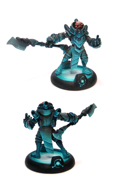
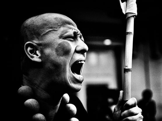
The other evening while painting I watched a documentary called Helvetica. Now my point is not to do a review of the movie (which was a fine documentary), but rather to point out how it got me pondering. The Helvetica font has quickly become a very common choice, particularly for signs and logos. There's plenty of reasons why (which is what the documentary goes into) and they make sense. However what it got me pondering is how often we don't notice such stylistic commonalities. Take for example a door. So often there will be slight stylistic variations to the door's handle (size, color, etc), but there are many doors which have virtually the same door handle. It's not due to there being very few door handle manufacturers (as evidenced by the slight stylistic variations), but rather due to the usability design and ease of function of the door handles. That is to say, many door handles look virtually the same so that we, as humans, can easily assess how to use them without significant conscious thought. Helvetica got me thinking about this as well in terms of color choices, visual styles, and just overall appearance. How often are the visual qualities of things similar just for our cognitive convenience. And perhaps more importantly, how does that subconsciously influence us as artists?
I have no real answer to this. Rather I'm curious what others think. Some of the most striking miniatures I've seen have been models that set aside the "normal" and did something really different. Sure, some of them were by world class painters, but many weren't, and that's not really what matters. I've seen plenty of models painted with smooth blending, perfect zenithal highlighting, and rick color usage, and as impressive as they might be, they can sometimes feel all the same when taken in context of subjects where the artist really stepped out. Here's some examples of models that I found very striking.
Ok, that was much longer of a post than I expected. I imagine about 90% of readers abandoned reading this post long ago, so if you made it this far I thank you and ask that perhaps you post a comment with a model that you found particularly striking to share inspiration with others.
This is my personal diary of painting experiments and Warmachine, Hordes and other miniature adventures (and perhaps a splash of real life thrown in occasionally too). This blog is as much for my own motivation as to share my experiences with others. My self imposed rule for my army is that I only field painted models. If you're a fellow painter, I encourage you to challenge yourself, learn new skills, try new things, and most of all, paint like you have a pair!
Friday, April 13, 2012
Thursday, April 12, 2012
RtC: More B&W Research
More progress, and I messed around a bit with my makeshift pictures process too. As you can see, the dwarf now has his head attached. I've also started working on a base for him as well, but no pictures yet since it's still in a lot of pieces.One of the really challenging things about painting this model in just B&W is getting the right look to various surfaces and implying texture without the use of color. More B&W photo research done this week. Here's a couple new items. | ||
This poster of the grill of a GTO is a very interesting reference. The chrome is really bright. I used the Color Inspector plugin for Firefox and looked through some of the values. It goes right up to max white. Even the "dark" parts are still at 60+% on the brightness scale. The one challenge of this as a reference is there's obvious reflection of subjects in the chrome. It's hard to see, but it throws off the reflectivity study a bit. Still though, there's good value in seeing how metal goes from very bright to medium grey in a very short distance. | ||
| ||
This Dire Troll Mauler was painted in black and white and is pretty interesting. I'm pretty sure this guy used an airbrush for large parts of it. Not that I'm against airbrushes (since I own one myself), but it definitely helps with the smoothness on the larger surfaces. I'm obviously in no position to use an airbrush on this much smaller dwarf. Still though, this model is a fascinating example. It got a 8.2 rating on CMON. Out of all the reference photos I've been looking for, this one is probably the most relevant in terms of learning something from. I could easily spend time picking this one apart but here's my top 2 observations. First, the difference between the rocks on his back and his flesh reads quite well as 2 different materials. Second, the highlighting on this model is all over the place and makes it hard (for me) to tell where the implied light source is supposed to be coming from. Both are good things to keep in mind when I work on my project. | ||
| That's it for this installment. I've got some other random posts on the way in the next few days as a bit of a break from just RtC updates on this project. |
Sunday, April 08, 2012
RtC: B&W Research
Friday, April 06, 2012
From the Desk: Color Resources
Two quick resources around color theory for those looking to experiment more...
Color Schemer App - I picked up this app for my iPhone and have found it to be pretty useful. One of the things I really like is snapping a picture of some random thing and then using the app to pick out particular colors. It's a good exercise actually to find something with rich color to it (a rusted pole, a bush, a pair of old jeans) and try to guess what the hues present are. Then use something like this app to snap a picture and analyze the actual colors. Building color IQ is something I have really felt a benefit from.
Speaking of color IQ, here's a color test that is pretty interesting. It takes a little time, but it gives a good sense for one's sensitivity to color variations. Definitely worth the 10 or so minutes.
And how about you? Got any interesting online color resources out there? Post a comment! I'm going to create a sidebar section on this blog to catalog color resources that I come across and I'd love your input!
Wednesday, April 04, 2012
RtC: A Study in Black&White
Challenge is good for the soul. Well, that's what I'm telling myself for now. I've embarked upon my second entry for the painting competition, or at least a good experimentation piece.
These pictures are of an old Rackham model for Pilzenbhir, Defender of the Plains (2nd Incarnation). He's one of the Tir-Na-Bor Dwarves from their Confrontation line of models, back when they were metal models. These are beautiful models that overall I found to be really delightful. The game however was somewhat lacking, so I never really got that many of them. There's a whole gallery of them here for those that are curious.
This project is relatively straightforward: A black and white study with a single added hue. Sort of in the style of Kim Anderson's early photography work, or the movie Sin City, or any number of other such examples. I can't really say I'm a particular fan of any of those in particular, but it should give you an idea of the end results. The goal however is much more specific. By taking out hue as something to work with, it will force me to really study how light value works and interacts with different material types. This will obviously not be an easy project.
At this point you can see I've just done a couple washes over the entire thing of grey and then black. I bought a bunch of empty droppers and have been prepping a set of pre-mixed pure grey-scale shades using just the P3 white and black paints. I'm just going to focus on the black and white work first, and then add the single hue at the end. I honestly haven't picked a particular hue to use yet and instead plan to follow my muse once she strikes.
My main goal at this point is to get enough of his chest area painted so that I can get the head attached and start working from there. I also need to ponder a basing scheme for him, since getting to a base relatively quickly would be a very wise idea. For the moment though, I'm just basking in the lunacy of this idea and wondering how long it will take me to want to throw the model into the garbage disposal. Wish me luck!
Monday, April 02, 2012
Drake McBain
Saturday, March 31, 2012
From the Desk: Color Choices Book Review
Book title: Color Choices
Author:Stephen Quiller
This book came recommended to me by another painter, and I have to say it was definitely worth the read. The intended audience of this book however is not really that close to the miniature painting hobby domain. Now before I continue with this review, I should make clear that I am not very educated on art history and will freely use terms that I may not fully understand. With that disclaimer in mind, I'm aiming to give a review of this (quite good) book from a miniature painter's perspective.
What I learned:
This book is jam packed with information about color, color schemes, and approaches to choosing a palette of colors for a subject. Perhaps the first big lesson was that there are other color wheels out there besides the classic one. The "Quiller Color Wheel" (laid out by Stephen Quiller obviously) has a slightly different arrangement of colors. Without getting into too many details about it, one of the things I found fascinating was the arrangement of colors such that if yellow is at 12:00 on the wheel, a grey scale bar can be put beside the wheel going from white at the top (aligned horizontally with yellow) to black (aligned with purple) and represent the relative brightness of the colors in horizontal alignment with the grey scale.
This book really gave me a stronger eye for the hue of a color. More on that later, but a preview is that I had 2 color wheels on my desk. I had never noticed it before, but the hue of the colors on each of them varied a bit. I have since retired the color wheel that I consider to be less accurate. This "gift" so to speak, from this book, is probably the most valuable lesson I learned.
It also goes over in detail the traditional color schemes: monochromatic, complementary, harmonious, split complimentary, and triadic. Although I knew about all of these before, Quiller goes over them in a bit more detail and talks about strategies in employing them. I found this additional perspective to be fairly interesting.
What I liked:
First, this book gave me motivation to use my own paints (P3 mainly) to experiment with putting together my own reference color wheel. The color value chart on the side of the color wheel is another part I really liked. I'll be doing more posts on that later.
Second, this book got me to experiment more with color. I've got a few swatches of color mixing that I used to get a better handle on how colors mix together.
Third, Quiller does a good job of reinforcing the need to feel one's way through the project. He's a big proponent of connecting with his subject and channeling that feeling of connection to make the production really come alive. I found it to be a good balance between discipline and freedom that he portrays. Subtle and unclear perhaps, but I appreciated it nonetheless.
What I didn't care for:
Straight up, this book is geared towards "2D" artists, and many of the examples are primarily done in an impressionist style with watercolors. This makes it a much more challenging exercise to translate it into miniature painting. The impressionist part is probably less challenge. Watercolors on the other hand behave very differently from acrylics.
Second, the color printing quality was somewhat lacking. Different color wheels presented in the book in different places have different hues. Now whether this was intentional or not I have no idea, but as a student to the book, it was frustrating to say the least.
What I would have liked to have:
Honestly I think this was a good book. It required a bit of heavy mental lifting on my part to really absorb it, but this book inspired me to experiment with my own paints in a way that no other book or class or piece of advice has ever done before. If anything I would have just preferred to have a stronger feeling that the color printing quality was consistent throughout the book.
Sunday, March 25, 2012
RtC: McMore McBain
No pictures tonight cause it's late and I'm tired. But I spent a little more time on McBain. Last night I also took him over for my buddies to look at and give me feedback. I also took along the Gorten I got from DeadDogg, and my WarHog from last year's Kubla competition. The whole idea was to have points of comparison to work with and really put a super critical eye on McBain. The feedback was super helpful. Here's the highlights:
- Turning the model upside-down revealed some small unpainted places which need cleaning up. There were also unshaded sections of the armor on the under sides.
- The metal on the sword needs more work. I'm debating throwing just a splash of hue into it somehow.
- Lots of stuff was good, like the face and the base.
- As a point of comparison, they had a hard time deciding between Gorten and McBain. There were good points on both models. This comparison was actually super helpful. Things like the face on Gorten is awesome, but almost too dramatic of shading.
- A visiting "uninitiated" person commented that she liked the WarHog better because it was larger and easier to see what was going on. However an interesting comment revealed that the WarHog also had places that weren't exactly intuitive what was going on. Admittedly, the WarHog had more experimentation going on, whereas McBain is focused on skills I've already practiced a lot.
- Adding battle damage would ruin the story going on. It's McBain! He's a badass! His armor isn't damaged because he kicks everyone's asses before they get a chance to hurt him.
- More work on the sword *sigh*
- More work on screws
- Cleanup around edges of glow areas (grill/sword)
- Left knee pad needs better highlighting/shading
Friday, March 23, 2012
Battle Report: eSeverius vs Strakov
Tuesday, March 20, 2012
RtC: McBain Steps Up to the Plate
So again it's time to document my Road to Competition, and for those of you that already saw the previous posts, you'll know that my first project is getting McBain from my tabletop standard to competition level. Note that for KublaCon with an open judging system, it's not so much "competition" against other people as it is just a judging. I really like this format as well because it encourages more people to enter. It also gives people bars to strive for by having two different levels of judging. I will again be entering the master level and hoping to at least capture a bronze. But, before I get ahead of myself, I need to focus on my entry...
Often times I pick a model and then try to paint it to a high level. But sometimes I discover that a model is a real joy to paint and just go with it. The Legion Shepherd was like that for me, and there have been others. When I started McBain, I didn't expect him to be. I saw him as my last unpainted merc, and an opportunity to close out another faction. But as I worked on him, I found myself spending more and more time on him. I was imagining a grand base for him. I was doing a subtle bit of OSL for the burning end of his cigar. I was very pleased with the results of painting his face. And that last point is what turned the corner for me. So now I find myself happily spending more and more hours tweaking and refining various parts. So each of my subsequent RtC posts on McBain will be about the additional tweaks I've made since last post to bring him to a higher quality level.
Skin - I did a bunch of work on the skin, particularly his arms. I did some more highlighting and shading, and then a couple of glazes of very thinned down GW Ogryn Flesh Wash. This glazing really helps to smooth the blending and especially create a bit more of a translucency to it. I chose the Ogryn Flesh shade because it has a hint of red and to bring out McBain's inner anger. I'm thinking at least 2 more glazes are in order.
Gun grip - I did some additional highlighting on the gun grip. Just some thinned P3 KRH to brighten it up a bit, but not too much to draw attention away. The goal is to keep the face as the brightest part of the entire model, but have other bright areas throughout the model to help draw the eye around a bit.
Lots of black-lining and shadow deepening - Particularly on the sword I did a lot of this, but also in armor creases. This really helped to bring the brighter sections out more without actually making them brighter. I'm always challenged in my own painting style to keep the brightest highlights from being over 75% of white. I fail routinely, and feel like this is one area where getting better at this would really bring me to the next level.
New To-Do List:
- Bolt on gun grip - Just missed it before
- Sword re-highlighting
- Armor screws
- More armor cleanups
- Buckles
- Grill on back (add blue glow?)
- Smokestack highlights
- Sword glow
Saturday, March 17, 2012
From the Desk: Saturday Joys
- Battle damage on armor
- Left arm cleanup (underneath, join, blending)
- Bolts
- Gun (handle highlights, metal cleanup)
- Sword (glow, smoother metals)
- Fix cigar OSL
- Static grass
- Razor wire
Wednesday, March 14, 2012
From the Desk: Random Post #556
Monday, March 12, 2012
From the Desk: Color and Light Book Review
Book title: Color and Light
Author: James Gurney
James Gurney (creator of Dinotopia) writes what is arguably one of the best books on color theory. No really, if you don't believe me, check out the reviews and ratings on Amazon! Honestly I really enjoyed this book. It's strikes a great balance between explanation and example. It covers a huge range of topics. And best of all, it's very accessible to non-classically trained painters such as myself (I have a whole 4 college art classes under my belt). As I sit here with the book on my desk while writing this brief review, I'm struck by the fact that there are over a dozen post-its sticking out from pages that I marked for reference. Definitely worth the investment to add to my meager library of art books.
What I learned:
The green problem - Common in nature, but can end up dominating a scene, so some artists have banished it from the palette. I'd never thought about it because miniatures don't tend to have this problem, but paintings of forests can cause havoc for an artist due to the amount of green. Nature's "green" is deceptive in the number of other tonal shades in it.
Proper definitions - It was nice to learn proper definitions for the 3 key qualities of a color. Specifically (and here's my paraphrased versions):
- Hue - The "color"
- Value - Measure of brightness on a B/W scale. Also called luminance.
- Chroma - Perceived strength of a color, as relative from neutrality. Sometimes called saturation. Think of the difference between Khador Red Highlight and Skorne Red as an example of reduced chroma.
Sunday, March 11, 2012
Gatorman Posse
Monday, March 05, 2012
From the Desk: Stuck
Sunday, February 26, 2012
From the Desk: ...
I do a lot of "From the Desk" posts on this blog. About 25% in fact. These posts are more for my own motivation than anything else. As of late though, I've been slacking on doing these. Fatherhood and work have both made it challenging to carve out additional time for doing desk posts. As I think I've mentioned previously, my new job comes with quite a bit more travel, and packing modeling/painting kits are not often feasible. Nevertheless, here comes another self-motivating post full of random bits of information.
First item of note here is I've gotten started on my Gatorman Posse finally. This photo is pretty poor, but I'm using a pretty similar formula as I used for the Bull Snapper previously. These guys represent the bulk of my first 15 points, and should be relatively fast to paint. However, using lots of washes has a couple of drawbacks. First is "dead" time while I wait for washes to dry (more on that later), and second is that there's some challenges with the washes being draw away from key spots. This usually seems to happen in nooks and crannies for some reason. It's mostly a gravity-drawn capillary action, but exacerbated when I use too much volume of wash in those places. Easily fixed, just annoying.
While I'm talking about Gators, I have to share one hugely positive note: The Wrastler is one of the best casting I've gotten in a long time. Practically zero mold lines and the joins fit together very well. I had to do nearly zero putty work. Yay!
Now back to that point about waiting for washes to dry. Here's what I'm doing with the time between. McBain has sat around, primed, for months now. Just waiting for his turn on the painting desk. I've been on a really good streak lately with clearing out stuff from my backlog. In an effort to wrap up yet another unfinished faction, McBain has emerged from the queue (for like the 5th time), and actually has paint on him finally. I'm using one of my speed painting tricks of washing and painting the underlying areas first. I figured I'd paint all his armor the green color and then add the metal on later. This delays having to make any decisions about what should and shouldn't be metal until the model is closer to having an overall sense of composition.
One last note: Thanks to Ghoul for posting a comment on my Paint Toxicity post. He shared some details about his past experience and his current view, and I am very grateful that he took the time to do so.
And that's it for today's post! I've got a bunch of other random stuff to share, but I'd rather keep desk posts short and sweet and do them more frequently, so I'll save that stuff for a Tuesday update. Until then, paint like you have a pair!
Wednesday, February 22, 2012
Gun Mage Captain Adept(s)
Monday, February 20, 2012
Bull Snapper
Friday, February 17, 2012
Sunday, February 12, 2012
Nicea, Tear of Vengeance
Sunday, February 05, 2012
From the Desk: Interruptions Suck
- Hobby knives and micro files
- Greenstuff and a generic sculpting tool
- Glue
- Drills and brass rods
- Basing sand (for the Nicea base)
Subscribe to:
Posts (Atom)