 Super quick battle report while I have a break to write it up.
Armies:
Me: eSeverius, Reckoner, Blessing of Vengeance, Choir (4), TFG (10+UA), Covenant, Vassal, Nicea, Vessel of Judgement
Henry: Strakov, Black Ivan, Torch, Sylys, Black Dragons (6+UA), Koldun Lord, Drakhun, Mortar, eEiryss
Terrain: Random!
Scenario: Random! (Bunkers, no reinforcements)
Overview:
The battle was pitched the whole way through. On one side of the table the Vessel, TFG, and Nicea faced off against the Black Dragons and Drakhun. In the middle, Torch and Ivan faced off against the Reckoner and Blessing. Although the scenario ended up being the deciding factor (due to a brave choir boy that gave his life to earn the first control point), it was a heavy battle of attrition.
Highlights:
* Severius buffing himself and charging into melee with Ivan to whack Eiryss
* Mortar with Sentry was lobbing many a deadly shot onto the TFG from the corner of a building
* Both casters were below 4 remaining boxes left by the end
* All 4 jacks were functional to the end
* The Covenant parking in a control zone to contest for a long time
* Strakov never got a good opportunity to use his feat
Endgame:
In the end, the assassination run on Severius just barely failed. On all average dice rolls it would have succeeded exactly on damage provided all the attacks hit, but it wasn't meant to be. At that point I was able to easily score a second control point and win the game.
Side notes:
I'm a huge fan of using the random battlefield generator and random SR2012 scenario generator together for casual games. Since I have an iPhone, they are both always available as well. Using both together makes for casual games that are always different. Random terrain is great because the choice to pick sides because valuable and it forces us to think more carefully about how to use the terrain. Random scenarios of course just bring more depth to the game than simple caster kill. All of this together I feel really makes the casual games dramatically more fun and further helps to keep the game fresh.
Super quick battle report while I have a break to write it up.
Armies:
Me: eSeverius, Reckoner, Blessing of Vengeance, Choir (4), TFG (10+UA), Covenant, Vassal, Nicea, Vessel of Judgement
Henry: Strakov, Black Ivan, Torch, Sylys, Black Dragons (6+UA), Koldun Lord, Drakhun, Mortar, eEiryss
Terrain: Random!
Scenario: Random! (Bunkers, no reinforcements)
Overview:
The battle was pitched the whole way through. On one side of the table the Vessel, TFG, and Nicea faced off against the Black Dragons and Drakhun. In the middle, Torch and Ivan faced off against the Reckoner and Blessing. Although the scenario ended up being the deciding factor (due to a brave choir boy that gave his life to earn the first control point), it was a heavy battle of attrition.
Highlights:
* Severius buffing himself and charging into melee with Ivan to whack Eiryss
* Mortar with Sentry was lobbing many a deadly shot onto the TFG from the corner of a building
* Both casters were below 4 remaining boxes left by the end
* All 4 jacks were functional to the end
* The Covenant parking in a control zone to contest for a long time
* Strakov never got a good opportunity to use his feat
Endgame:
In the end, the assassination run on Severius just barely failed. On all average dice rolls it would have succeeded exactly on damage provided all the attacks hit, but it wasn't meant to be. At that point I was able to easily score a second control point and win the game.
Side notes:
I'm a huge fan of using the random battlefield generator and random SR2012 scenario generator together for casual games. Since I have an iPhone, they are both always available as well. Using both together makes for casual games that are always different. Random terrain is great because the choice to pick sides because valuable and it forces us to think more carefully about how to use the terrain. Random scenarios of course just bring more depth to the game than simple caster kill. All of this together I feel really makes the casual games dramatically more fun and further helps to keep the game fresh.
Friday, March 23, 2012
Battle Report: eSeverius vs Strakov
Super quick battle report while I have a break to write it up.
Armies:
Me: eSeverius, Reckoner, Blessing of Vengeance, Choir (4), TFG (10+UA), Covenant, Vassal, Nicea, Vessel of Judgement
Henry: Strakov, Black Ivan, Torch, Sylys, Black Dragons (6+UA), Koldun Lord, Drakhun, Mortar, eEiryss
Terrain: Random!
Scenario: Random! (Bunkers, no reinforcements)
Overview:
The battle was pitched the whole way through. On one side of the table the Vessel, TFG, and Nicea faced off against the Black Dragons and Drakhun. In the middle, Torch and Ivan faced off against the Reckoner and Blessing. Although the scenario ended up being the deciding factor (due to a brave choir boy that gave his life to earn the first control point), it was a heavy battle of attrition.
Highlights:
* Severius buffing himself and charging into melee with Ivan to whack Eiryss
* Mortar with Sentry was lobbing many a deadly shot onto the TFG from the corner of a building
* Both casters were below 4 remaining boxes left by the end
* All 4 jacks were functional to the end
* The Covenant parking in a control zone to contest for a long time
* Strakov never got a good opportunity to use his feat
Endgame:
In the end, the assassination run on Severius just barely failed. On all average dice rolls it would have succeeded exactly on damage provided all the attacks hit, but it wasn't meant to be. At that point I was able to easily score a second control point and win the game.
Side notes:
I'm a huge fan of using the random battlefield generator and random SR2012 scenario generator together for casual games. Since I have an iPhone, they are both always available as well. Using both together makes for casual games that are always different. Random terrain is great because the choice to pick sides because valuable and it forces us to think more carefully about how to use the terrain. Random scenarios of course just bring more depth to the game than simple caster kill. All of this together I feel really makes the casual games dramatically more fun and further helps to keep the game fresh.
Tuesday, March 20, 2012
RtC: McBain Steps Up to the Plate
So again it's time to document my Road to Competition, and for those of you that already saw the previous posts, you'll know that my first project is getting McBain from my tabletop standard to competition level. Note that for KublaCon with an open judging system, it's not so much "competition" against other people as it is just a judging. I really like this format as well because it encourages more people to enter. It also gives people bars to strive for by having two different levels of judging. I will again be entering the master level and hoping to at least capture a bronze. But, before I get ahead of myself, I need to focus on my entry...
 Often times I pick a model and then try to paint it to a high level. But sometimes I discover that a model is a real joy to paint and just go with it. The Legion Shepherd was like that for me, and there have been others. When I started McBain, I didn't expect him to be. I saw him as my last unpainted merc, and an opportunity to close out another faction. But as I worked on him, I found myself spending more and more time on him. I was imagining a grand base for him. I was doing a subtle bit of OSL for the burning end of his cigar. I was very pleased with the results of painting his face. And that last point is what turned the corner for me. So now I find myself happily spending more and more hours tweaking and refining various parts. So each of my subsequent RtC posts on McBain will be about the additional tweaks I've made since last post to bring him to a higher quality level.
Skin - I did a bunch of work on the skin, particularly his arms. I did some more highlighting and shading, and then a couple of glazes of very thinned down GW Ogryn Flesh Wash. This glazing really helps to smooth the blending and especially create a bit more of a translucency to it. I chose the Ogryn Flesh shade because it has a hint of red and to bring out McBain's inner anger. I'm thinking at least 2 more glazes are in order.
Gun grip - I did some additional highlighting on the gun grip. Just some thinned P3 KRH to brighten it up a bit, but not too much to draw attention away. The goal is to keep the face as the brightest part of the entire model, but have other bright areas throughout the model to help draw the eye around a bit.
Lots of black-lining and shadow deepening - Particularly on the sword I did a lot of this, but also in armor creases. This really helped to bring the brighter sections out more without actually making them brighter. I'm always challenged in my own painting style to keep the brightest highlights from being over 75% of white. I fail routinely, and feel like this is one area where getting better at this would really bring me to the next level.
New To-Do List:
Often times I pick a model and then try to paint it to a high level. But sometimes I discover that a model is a real joy to paint and just go with it. The Legion Shepherd was like that for me, and there have been others. When I started McBain, I didn't expect him to be. I saw him as my last unpainted merc, and an opportunity to close out another faction. But as I worked on him, I found myself spending more and more time on him. I was imagining a grand base for him. I was doing a subtle bit of OSL for the burning end of his cigar. I was very pleased with the results of painting his face. And that last point is what turned the corner for me. So now I find myself happily spending more and more hours tweaking and refining various parts. So each of my subsequent RtC posts on McBain will be about the additional tweaks I've made since last post to bring him to a higher quality level.
Skin - I did a bunch of work on the skin, particularly his arms. I did some more highlighting and shading, and then a couple of glazes of very thinned down GW Ogryn Flesh Wash. This glazing really helps to smooth the blending and especially create a bit more of a translucency to it. I chose the Ogryn Flesh shade because it has a hint of red and to bring out McBain's inner anger. I'm thinking at least 2 more glazes are in order.
Gun grip - I did some additional highlighting on the gun grip. Just some thinned P3 KRH to brighten it up a bit, but not too much to draw attention away. The goal is to keep the face as the brightest part of the entire model, but have other bright areas throughout the model to help draw the eye around a bit.
Lots of black-lining and shadow deepening - Particularly on the sword I did a lot of this, but also in armor creases. This really helped to bring the brighter sections out more without actually making them brighter. I'm always challenged in my own painting style to keep the brightest highlights from being over 75% of white. I fail routinely, and feel like this is one area where getting better at this would really bring me to the next level.
New To-Do List:
 Often times I pick a model and then try to paint it to a high level. But sometimes I discover that a model is a real joy to paint and just go with it. The Legion Shepherd was like that for me, and there have been others. When I started McBain, I didn't expect him to be. I saw him as my last unpainted merc, and an opportunity to close out another faction. But as I worked on him, I found myself spending more and more time on him. I was imagining a grand base for him. I was doing a subtle bit of OSL for the burning end of his cigar. I was very pleased with the results of painting his face. And that last point is what turned the corner for me. So now I find myself happily spending more and more hours tweaking and refining various parts. So each of my subsequent RtC posts on McBain will be about the additional tweaks I've made since last post to bring him to a higher quality level.
Skin - I did a bunch of work on the skin, particularly his arms. I did some more highlighting and shading, and then a couple of glazes of very thinned down GW Ogryn Flesh Wash. This glazing really helps to smooth the blending and especially create a bit more of a translucency to it. I chose the Ogryn Flesh shade because it has a hint of red and to bring out McBain's inner anger. I'm thinking at least 2 more glazes are in order.
Gun grip - I did some additional highlighting on the gun grip. Just some thinned P3 KRH to brighten it up a bit, but not too much to draw attention away. The goal is to keep the face as the brightest part of the entire model, but have other bright areas throughout the model to help draw the eye around a bit.
Lots of black-lining and shadow deepening - Particularly on the sword I did a lot of this, but also in armor creases. This really helped to bring the brighter sections out more without actually making them brighter. I'm always challenged in my own painting style to keep the brightest highlights from being over 75% of white. I fail routinely, and feel like this is one area where getting better at this would really bring me to the next level.
New To-Do List:
Often times I pick a model and then try to paint it to a high level. But sometimes I discover that a model is a real joy to paint and just go with it. The Legion Shepherd was like that for me, and there have been others. When I started McBain, I didn't expect him to be. I saw him as my last unpainted merc, and an opportunity to close out another faction. But as I worked on him, I found myself spending more and more time on him. I was imagining a grand base for him. I was doing a subtle bit of OSL for the burning end of his cigar. I was very pleased with the results of painting his face. And that last point is what turned the corner for me. So now I find myself happily spending more and more hours tweaking and refining various parts. So each of my subsequent RtC posts on McBain will be about the additional tweaks I've made since last post to bring him to a higher quality level.
Skin - I did a bunch of work on the skin, particularly his arms. I did some more highlighting and shading, and then a couple of glazes of very thinned down GW Ogryn Flesh Wash. This glazing really helps to smooth the blending and especially create a bit more of a translucency to it. I chose the Ogryn Flesh shade because it has a hint of red and to bring out McBain's inner anger. I'm thinking at least 2 more glazes are in order.
Gun grip - I did some additional highlighting on the gun grip. Just some thinned P3 KRH to brighten it up a bit, but not too much to draw attention away. The goal is to keep the face as the brightest part of the entire model, but have other bright areas throughout the model to help draw the eye around a bit.
Lots of black-lining and shadow deepening - Particularly on the sword I did a lot of this, but also in armor creases. This really helped to bring the brighter sections out more without actually making them brighter. I'm always challenged in my own painting style to keep the brightest highlights from being over 75% of white. I fail routinely, and feel like this is one area where getting better at this would really bring me to the next level.
New To-Do List:- Bolt on gun grip - Just missed it before
- Sword re-highlighting
- Armor screws
- More armor cleanups
- Buckles
- Grill on back (add blue glow?)
- Smokestack highlights
- Sword glow
Saturday, March 17, 2012
From the Desk: Saturday Joys
 I love Saturdays where I get to paint. It's such a stress relief after a week of work. Today was pretty good for painting as well. More about the specific progress below. Here though is something very much "from the desk".
When I paint, I sometimes end up using my hand as a quick palette. I honestly tried the wet palette a few times. I somewhat liked it, but one of the big drawbacks was the desk space it takes up and thus it just hasn't found its way back into my normal arsenal. So when I need a quick "wet palette", I improvise. I lick the side of my hand and use that. Not exactly a recommended practice, but it works. Why do I do this so much? Well, it's fast, convenient, and most importantly, it's now a habit. The behavior reinforcement that keeps this habit alive is days like today where I got a good amount of painting time in and can look at my hand as a sign of accomplishment. Sort of like a battle scar from a day well earned.
Switching gears... for any of you out there that haven't already tried Citadel's new Liquid Green Stuff product: I definitely recommend trying it out. It's pretty nice for minor gap filling. I've found that applying some with a hobby knife and then using a slightly moist (trashy) brush to smooth things out. I've only used it maybe three times now, but every time I've been happy with the results.
I love Saturdays where I get to paint. It's such a stress relief after a week of work. Today was pretty good for painting as well. More about the specific progress below. Here though is something very much "from the desk".
When I paint, I sometimes end up using my hand as a quick palette. I honestly tried the wet palette a few times. I somewhat liked it, but one of the big drawbacks was the desk space it takes up and thus it just hasn't found its way back into my normal arsenal. So when I need a quick "wet palette", I improvise. I lick the side of my hand and use that. Not exactly a recommended practice, but it works. Why do I do this so much? Well, it's fast, convenient, and most importantly, it's now a habit. The behavior reinforcement that keeps this habit alive is days like today where I got a good amount of painting time in and can look at my hand as a sign of accomplishment. Sort of like a battle scar from a day well earned.
Switching gears... for any of you out there that haven't already tried Citadel's new Liquid Green Stuff product: I definitely recommend trying it out. It's pretty nice for minor gap filling. I've found that applying some with a hobby knife and then using a slightly moist (trashy) brush to smooth things out. I've only used it maybe three times now, but every time I've been happy with the results.
 Last up is the progress on McBain. Here you can see him sort of hovering over his mostly-completed base. I haven't fully attached him to the base so that I can finish some last details on the lower half and tidy things up. The razor wire hasn't been glued on either, and will need some painting to properly tarnish its appearance. So far though, McBain has been really entertaining to paint. So much so that I've decided to try taking him from my normal tabletop standard to competition quality. He's going to end up being one of my KublaCon entries this year I think. To that end, I'll start doing RtC posts about the rest of the work on him. For now though, I'm just capturing a quick to-do list of work that needs to be done based on what I've already noticed. Sorry for the boring list that only makes sense to me, but I figured some folks might like to see what sort of things I tackle to go from tabletop to competition.
The McBain To-Do List:
Last up is the progress on McBain. Here you can see him sort of hovering over his mostly-completed base. I haven't fully attached him to the base so that I can finish some last details on the lower half and tidy things up. The razor wire hasn't been glued on either, and will need some painting to properly tarnish its appearance. So far though, McBain has been really entertaining to paint. So much so that I've decided to try taking him from my normal tabletop standard to competition quality. He's going to end up being one of my KublaCon entries this year I think. To that end, I'll start doing RtC posts about the rest of the work on him. For now though, I'm just capturing a quick to-do list of work that needs to be done based on what I've already noticed. Sorry for the boring list that only makes sense to me, but I figured some folks might like to see what sort of things I tackle to go from tabletop to competition.
The McBain To-Do List:- Battle damage on armor
- Left arm cleanup (underneath, join, blending)
- Bolts
- Gun (handle highlights, metal cleanup)
- Sword (glow, smoother metals)
- Fix cigar OSL
- Static grass
- Razor wire
Wednesday, March 14, 2012
From the Desk: Random Post #556
 More random desk updates! Here's a photo of McBain. He's mostly done except for some touch ups. I also got highly motivated to create a proper base for him (pictured below). For some reason this model turned into one of those projects that I just really felt like going the extra mile on. I'm sort of tempted to take a bunch of time and take him to the next level and use him as an entry for the KublaCon painting competition. Once I get him on a base, I might just do that. We'll see how it goes though.
 This is the base I'm putting together for him. It'll eventually be sort of a little reinforced wall piece that he can stand on. Nothing particularly amazing, but enough extra oomph to be deserving of a man with a mustache and cigar.
Other random notes:
Meg Maples did a short write up about color theory on the PP insider recently. I love how color theory is becoming a much more common discussion in the painting community. It used to be more reserved for the serious paint-for-painting-sake folks, but now it's getting more attention.
Also, Ghoul posted on PP forums more about paint toxicity. There's good stuff in that post worth reading if you're still wondering more about the topic.
And I'm done for the night! Time to get a little more work done on this base and then get some sleep.
This is the base I'm putting together for him. It'll eventually be sort of a little reinforced wall piece that he can stand on. Nothing particularly amazing, but enough extra oomph to be deserving of a man with a mustache and cigar.
Other random notes:
Meg Maples did a short write up about color theory on the PP insider recently. I love how color theory is becoming a much more common discussion in the painting community. It used to be more reserved for the serious paint-for-painting-sake folks, but now it's getting more attention.
Also, Ghoul posted on PP forums more about paint toxicity. There's good stuff in that post worth reading if you're still wondering more about the topic.
And I'm done for the night! Time to get a little more work done on this base and then get some sleep.
Monday, March 12, 2012
From the Desk: Color and Light Book Review
Book title: Color and Light
Author: James Gurney
James Gurney (creator of Dinotopia) writes what is arguably one of the best books on color theory. No really, if you don't believe me, check out the reviews and ratings on Amazon! Honestly I really enjoyed this book. It's strikes a great balance between explanation and example. It covers a huge range of topics. And best of all, it's very accessible to non-classically trained painters such as myself (I have a whole 4 college art classes under my belt). As I sit here with the book on my desk while writing this brief review, I'm struck by the fact that there are over a dozen post-its sticking out from pages that I marked for reference. Definitely worth the investment to add to my meager library of art books.
What I learned:
The green problem - Common in nature, but can end up dominating a scene, so some artists have banished it from the palette. I'd never thought about it because miniatures don't tend to have this problem, but paintings of forests can cause havoc for an artist due to the amount of green. Nature's "green" is deceptive in the number of other tonal shades in it.
Proper definitions - It was nice to learn proper definitions for the 3 key qualities of a color. Specifically (and here's my paraphrased versions):
- Hue - The "color"
- Value - Measure of brightness on a B/W scale. Also called luminance.
- Chroma - Perceived strength of a color, as relative from neutrality. Sometimes called saturation. Think of the difference between Khador Red Highlight and Skorne Red as an example of reduced chroma.
Sunday, March 11, 2012
Gatorman Posse
 My Gators are now more than just a prototype model! The first unit is completed. I have to say it's a little odd to finish a unit before a Warlock, but actually this is huge progress. As a group these guys look pretty cool. These 5 guys actually make up over half of my initial 15pt force so I'm well on my way now.
Crunching my way through these wasn't too rough actually except for carving out the time to actually paint. This last week has been pretty rough with work travel. I really wish there was an easy way to bring a painting kit on a plane, but I'm not going to risk doing that. So for now I'm stuck with whatever time I can squeak out at home. Now that I've got this squad done, I'm really itching to finish up Calaban and the Wrastler so I can put them on the table to try out.
My Gators are now more than just a prototype model! The first unit is completed. I have to say it's a little odd to finish a unit before a Warlock, but actually this is huge progress. As a group these guys look pretty cool. These 5 guys actually make up over half of my initial 15pt force so I'm well on my way now.
Crunching my way through these wasn't too rough actually except for carving out the time to actually paint. This last week has been pretty rough with work travel. I really wish there was an easy way to bring a painting kit on a plane, but I'm not going to risk doing that. So for now I'm stuck with whatever time I can squeak out at home. Now that I've got this squad done, I'm really itching to finish up Calaban and the Wrastler so I can put them on the table to try out.
 So before I jot down random notes about paints I used for these, I just want to share my good/bad about these:
* As a group they look good, but individually they definitely appear speed painted.
* Using different colored ties on each staff worked out as a clear but subtle way to distinguish them.
* Creating a lot of contrast between elements (such as very dark shading around skulls) is not my normal style, but worked out pretty well.
* Adding just a touch of turquoise ink to the Liquitex was an improvement on the water effect.
So before I jot down random notes about paints I used for these, I just want to share my good/bad about these:
* As a group they look good, but individually they definitely appear speed painted.
* Using different colored ties on each staff worked out as a clear but subtle way to distinguish them.
* Creating a lot of contrast between elements (such as very dark shading around skulls) is not my normal style, but worked out pretty well.
* Adding just a touch of turquoise ink to the Liquitex was an improvement on the water effect.
 Aaaannnnd that's it! I'll leave you with random semi-intelligible notes about paints used.
Skin: Same as Bull Snapper, but a couple extra random coats on individual models to differentiate them a little.
Back plates: MWH wash -> Moldy Ochre wash -> streak with thinned Umbral Umber -> streak with thinned Bloodstone -> Jack Bone wash (repeatedly)
Aaaannnnd that's it! I'll leave you with random semi-intelligible notes about paints used.
Skin: Same as Bull Snapper, but a couple extra random coats on individual models to differentiate them a little.
Back plates: MWH wash -> Moldy Ochre wash -> streak with thinned Umbral Umber -> streak with thinned Bloodstone -> Jack Bone wash (repeatedly)
Monday, March 05, 2012
From the Desk: Stuck
 Once again I find myself posting about the lack of completion of projects. Oh there's plenty of progress, but nothing completed. I'm leaving tomorrow for another work trip which is going to further cut into any movement toward completion for a couple more days as well. But, in the mean time, here's a few updates. First is McBain, who is coming along nicely. I had originally intended to just speed paint him, but McBain demands more attention than that. So he's getting a fair amount of painting attention actually. The face turned out quite well which has me really energized to do a good job all over. I also need to get crackin on an appropriate base for him.
 Next is my Gator Posse. These guys are getting close. I needed a way to distinguish them so I used different colors on each of their spears. Speaking of those colors, I decided to incorporate a "Mardi Gras" motif into them by using purple, yellow and green for any sort of decorative colors. The odd-gator-out in this case got red. I like these colors together with the albino theme so far and I hope it'll work out well in the longer term.
 This somewhat unintelligible shot is of the blank bases for my Gators. I bought a bunch of blank round-lipped bases from Secret Weapon Miniatures, drilled holes in them, and stuck magnets in them. This way I can still magnetize them for easy transport, but don't have to do it after I've finished the model. I managed to add a magnet to the Bull Snapper after the fact by doing some very careful drilling and sticking a magnet in. I had originally not intended to, but it just really struck me as dangerous to try transporting around a bunch of loose angry gators.
 And finally, a random shot. I find myself emptying a lot of paint pots lately. Some of these are being replaced by design because they are old. Others are actually getting emptied. And still a few others were an experiment. 2 of these were part of that experiment. I got some empty dropper bottles and transferred some P3 black and white paint into them, as well as making some neutral gray from a 50/50 mix of P3 black and white. Doing this was tedious, but has already turned out to be quite valuable. I think I might do a few more of these for specifically useful colors.
Well, time to finish packing and perhaps get a little painting in before I go.
And finally, a random shot. I find myself emptying a lot of paint pots lately. Some of these are being replaced by design because they are old. Others are actually getting emptied. And still a few others were an experiment. 2 of these were part of that experiment. I got some empty dropper bottles and transferred some P3 black and white paint into them, as well as making some neutral gray from a 50/50 mix of P3 black and white. Doing this was tedious, but has already turned out to be quite valuable. I think I might do a few more of these for specifically useful colors.
Well, time to finish packing and perhaps get a little painting in before I go.
Sunday, February 26, 2012
From the Desk: ...
I do a lot of "From the Desk" posts on this blog. About 25% in fact. These posts are more for my own motivation than anything else. As of late though, I've been slacking on doing these. Fatherhood and work have both made it challenging to carve out additional time for doing desk posts. As I think I've mentioned previously, my new job comes with quite a bit more travel, and packing modeling/painting kits are not often feasible. Nevertheless, here comes another self-motivating post full of random bits of information.
 First item of note here is I've gotten started on my Gatorman Posse finally. This photo is pretty poor, but I'm using a pretty similar formula as I used for the Bull Snapper previously. These guys represent the bulk of my first 15 points, and should be relatively fast to paint. However, using lots of washes has a couple of drawbacks. First is "dead" time while I wait for washes to dry (more on that later), and second is that there's some challenges with the washes being draw away from key spots. This usually seems to happen in nooks and crannies for some reason. It's mostly a gravity-drawn capillary action, but exacerbated when I use too much volume of wash in those places. Easily fixed, just annoying.
While I'm talking about Gators, I have to share one hugely positive note: The Wrastler is one of the best casting I've gotten in a long time. Practically zero mold lines and the joins fit together very well. I had to do nearly zero putty work. Yay!
First item of note here is I've gotten started on my Gatorman Posse finally. This photo is pretty poor, but I'm using a pretty similar formula as I used for the Bull Snapper previously. These guys represent the bulk of my first 15 points, and should be relatively fast to paint. However, using lots of washes has a couple of drawbacks. First is "dead" time while I wait for washes to dry (more on that later), and second is that there's some challenges with the washes being draw away from key spots. This usually seems to happen in nooks and crannies for some reason. It's mostly a gravity-drawn capillary action, but exacerbated when I use too much volume of wash in those places. Easily fixed, just annoying.
While I'm talking about Gators, I have to share one hugely positive note: The Wrastler is one of the best casting I've gotten in a long time. Practically zero mold lines and the joins fit together very well. I had to do nearly zero putty work. Yay!
 Now back to that point about waiting for washes to dry. Here's what I'm doing with the time between. McBain has sat around, primed, for months now. Just waiting for his turn on the painting desk. I've been on a really good streak lately with clearing out stuff from my backlog. In an effort to wrap up yet another unfinished faction, McBain has emerged from the queue (for like the 5th time), and actually has paint on him finally. I'm using one of my speed painting tricks of washing and painting the underlying areas first. I figured I'd paint all his armor the green color and then add the metal on later. This delays having to make any decisions about what should and shouldn't be metal until the model is closer to having an overall sense of composition.
One last note: Thanks to Ghoul for posting a comment on my Paint Toxicity post. He shared some details about his past experience and his current view, and I am very grateful that he took the time to do so.
And that's it for today's post! I've got a bunch of other random stuff to share, but I'd rather keep desk posts short and sweet and do them more frequently, so I'll save that stuff for a Tuesday update. Until then, paint like you have a pair!
Now back to that point about waiting for washes to dry. Here's what I'm doing with the time between. McBain has sat around, primed, for months now. Just waiting for his turn on the painting desk. I've been on a really good streak lately with clearing out stuff from my backlog. In an effort to wrap up yet another unfinished faction, McBain has emerged from the queue (for like the 5th time), and actually has paint on him finally. I'm using one of my speed painting tricks of washing and painting the underlying areas first. I figured I'd paint all his armor the green color and then add the metal on later. This delays having to make any decisions about what should and shouldn't be metal until the model is closer to having an overall sense of composition.
One last note: Thanks to Ghoul for posting a comment on my Paint Toxicity post. He shared some details about his past experience and his current view, and I am very grateful that he took the time to do so.
And that's it for today's post! I've got a bunch of other random stuff to share, but I'd rather keep desk posts short and sweet and do them more frequently, so I'll save that stuff for a Tuesday update. Until then, paint like you have a pair!
Wednesday, February 22, 2012
Gun Mage Captain Adept(s)
 These Gun Mage Captain Adepts have been in my backlog for quote some time now and finally bubbled up. There were a number of causes for the delay, not the least of which was a missing hand for one of them. To be honest though, I got them as a part of my Ashlynn theme force which I haven't really been jazzed to play much lately. This does however get me one more step closer to having that list up to a playable level.
These models are actually pretty pleasant to paint. I opted for a pretty simple scheme, and went with a more muted tone overall. For speed painting (probably a total of 4 hours max for both together) I'm quite pleased with the results. I used a number of washes for the leathers which helped them to really pop. For the coats I opted for 2BB as the method to shade. Mixing up these techniques really works for me these days.
These Gun Mage Captain Adepts have been in my backlog for quote some time now and finally bubbled up. There were a number of causes for the delay, not the least of which was a missing hand for one of them. To be honest though, I got them as a part of my Ashlynn theme force which I haven't really been jazzed to play much lately. This does however get me one more step closer to having that list up to a playable level.
These models are actually pretty pleasant to paint. I opted for a pretty simple scheme, and went with a more muted tone overall. For speed painting (probably a total of 4 hours max for both together) I'm quite pleased with the results. I used a number of washes for the leathers which helped them to really pop. For the coats I opted for 2BB as the method to shade. Mixing up these techniques really works for me these days.
 Now let's talk color theory for a minute... This pair represented an interesting experiment. Most of the models are painted in a similar scheme, with the coats and heads being the differentiating features. I didn't specifically paint one before the other either, as I swapped them back and for order-wise. The net result is subtle, but fascinating. The crimson one really jumps out as being energetic, whereas the grey one seems to be more reserved. This has to do with where the highest color value focus is. For the grey one, the highest color values are the face and pants, which are more central. For the crimson one, the overall color value is shifted so that much more of the model has a higher color value. The other big difference is the grey (with a touch of green in it) provides a much more neutral feel whereas the crimson shade provides a much more dynamic feel.
Quite honestly I could go on much more about color theory as a result of painting these two models side by side, but I've got a big pile of gators to paint!
Now let's talk color theory for a minute... This pair represented an interesting experiment. Most of the models are painted in a similar scheme, with the coats and heads being the differentiating features. I didn't specifically paint one before the other either, as I swapped them back and for order-wise. The net result is subtle, but fascinating. The crimson one really jumps out as being energetic, whereas the grey one seems to be more reserved. This has to do with where the highest color value focus is. For the grey one, the highest color values are the face and pants, which are more central. For the crimson one, the overall color value is shifted so that much more of the model has a higher color value. The other big difference is the grey (with a touch of green in it) provides a much more neutral feel whereas the crimson shade provides a much more dynamic feel.
Quite honestly I could go on much more about color theory as a result of painting these two models side by side, but I've got a big pile of gators to paint!
Monday, February 20, 2012
Bull Snapper
 Well it's about time! Finally the first of my gators is done. This guy had been sitting on my desk for quite some time waiting to be based. Unlike the recent trend, I'm going to do a full write up for this one since it's the first of my gators.
Despite how it may look at first glance, this model is quite a departure for me on a number of fronts. First, I painted the front arc on it. I normally don't like doing this because "it ruins the aesthetic look", or at least that's what I'd told myself. So for these Gators I decided to put that to the test.
Second, this model doesn't have a magnet on the bottom for transport in the metal toolbox. I used a "blank" resin base, and it wasn't exactly an easy option to drill out a spot for the magnet. I could still conceivably do it, but for now I've decided to opt against it. Perhaps once I get further along I'll go back and put one in.
Third, this model is predominantly painted by washes. There was a little 2BB action in there, but very minimal. I've done this before for some of the Cryx I painted, but here I needed to keep the color relatively light to maintain the "albino" effect, so this was a real challenge for me.
Well it's about time! Finally the first of my gators is done. This guy had been sitting on my desk for quite some time waiting to be based. Unlike the recent trend, I'm going to do a full write up for this one since it's the first of my gators.
Despite how it may look at first glance, this model is quite a departure for me on a number of fronts. First, I painted the front arc on it. I normally don't like doing this because "it ruins the aesthetic look", or at least that's what I'd told myself. So for these Gators I decided to put that to the test.
Second, this model doesn't have a magnet on the bottom for transport in the metal toolbox. I used a "blank" resin base, and it wasn't exactly an easy option to drill out a spot for the magnet. I could still conceivably do it, but for now I've decided to opt against it. Perhaps once I get further along I'll go back and put one in.
Third, this model is predominantly painted by washes. There was a little 2BB action in there, but very minimal. I've done this before for some of the Cryx I painted, but here I needed to keep the color relatively light to maintain the "albino" effect, so this was a real challenge for me.
 What went well:
* Overall I think the albino look works relatively well. The intention is pretty obvious. I'll reserve more about that later though.
* Using this Bull Snapper as a prototype was a good choice. It doesn't have anything else on him really, so the albino look doesn't have contrasting elements. This forced me to keep the colors light. If I'd had other strong elements to the model I could have brought it darker without intending to.
What could have been better:
* Just not quite albino enough. There's a slippery slope here. Adding enough color to make the model readable easily pushes it past what true albino colors look like on a real Alligator.
What went well:
* Overall I think the albino look works relatively well. The intention is pretty obvious. I'll reserve more about that later though.
* Using this Bull Snapper as a prototype was a good choice. It doesn't have anything else on him really, so the albino look doesn't have contrasting elements. This forced me to keep the colors light. If I'd had other strong elements to the model I could have brought it darker without intending to.
What could have been better:
* Just not quite albino enough. There's a slippery slope here. Adding enough color to make the model readable easily pushes it past what true albino colors look like on a real Alligator.
 * The water effect needs just a tiny turquoise tint to it to make it look more swampy. Too late now though since the model is embedded in the resin!
* Some additional thought about the color scheme might have led me to have the back fins/plates be a different color of some kind. That would have introduced a bit of contrast to the model and would have worked with other models. I might still go that route and this model will just be the outlier.
Well, that about wraps up this first Gator. I'd like to point out that this is part of an informal "slow grow" project with my buddies Lance and Henry. Lance has whored his way to Legion, now covering all 4 Hordes factions. And Henry is starting Skorne much to my delight. We're targeting just 15pts to start with. I'll post up picks as we all make progress. And to that end, time to sign off for the evening and get painting!
* The water effect needs just a tiny turquoise tint to it to make it look more swampy. Too late now though since the model is embedded in the resin!
* Some additional thought about the color scheme might have led me to have the back fins/plates be a different color of some kind. That would have introduced a bit of contrast to the model and would have worked with other models. I might still go that route and this model will just be the outlier.
Well, that about wraps up this first Gator. I'd like to point out that this is part of an informal "slow grow" project with my buddies Lance and Henry. Lance has whored his way to Legion, now covering all 4 Hordes factions. And Henry is starting Skorne much to my delight. We're targeting just 15pts to start with. I'll post up picks as we all make progress. And to that end, time to sign off for the evening and get painting!
Friday, February 17, 2012
Thyra, Flame of Sorrow
 Quick pictures of Thyra before I fall asleep. Sorry about the terrible blog formatting. Nothing special to see here. Speed painted to get her off my desk and get closer to closing out another unpainted faction.


Sunday, February 12, 2012
Nicea, Tear of Vengeance
 Two models in a month and a half is pretty sad. That rant will hold for another day though. Tonight is just a quick post of this model's finished state and some comments about it.
First, this was a delightful model to paint. Great pose overall. When it came time to do a base, I decided that she really needed something special, so I took some leftover bits and threw this together. It ended up putting her at a slightly stronger angle than I originally intended, but I'm not going to complain too much. It really does have that look like she's starting to spring off and pounce on someone.
Two models in a month and a half is pretty sad. That rant will hold for another day though. Tonight is just a quick post of this model's finished state and some comments about it.
First, this was a delightful model to paint. Great pose overall. When it came time to do a base, I decided that she really needed something special, so I took some leftover bits and threw this together. It ended up putting her at a slightly stronger angle than I originally intended, but I'm not going to complain too much. It really does have that look like she's starting to spring off and pounce on someone.

 And that's it! The formatting for this entry is undoubtedly wonky given the dimensions of the pictures but I don't care. I'm tired and want to paint more, so blog formatting and content takes a back seat tonight.
Sunday, February 05, 2012
From the Desk: Interruptions Suck
 Tonight is going to be a little bit of a bunch of stuff. First up, my current painting project. I'm very keen to start thinning down my unpainted factions so I'm working down my Protectorate stuff currently. Here you can see Thyra in progress. I'm just doing metals at this point and about halfway done. I'm really speed painting her, so she probably won't turn out real great. You'll notice in this picture that I've got a few paints already lined up. Sometimes for my painting process I'll line up the next few paints I plan to use. This is helpful for me when speed painting through stuff because it keeps me focused and moving forward. In this case I'm aiming to wrap up the metal work and then do the base coating for the reds.
You can also see my two brush trays that I made. In case I hadn't described them before, I basically made a couple simple wooden trays with felt wrapped around them. The felt keeps them from sliding around and the trays keep them fairly secure and safe from accidental mashings of the bristles. I have two because I keep my brushes used for metalics separate from those used for non-metalic. Metalics tend to really destroy natural hair bristles much more quickly (due to the mica flakes damaging the hairs), so I've found I get way more mileage out of my good brushes this way.
Oh, and just past the paint brush trays you can see my iMac keyboard which has been an unfortunate casualty of paint splatters and spills repeatedly. Poor keyboard!
Tonight is going to be a little bit of a bunch of stuff. First up, my current painting project. I'm very keen to start thinning down my unpainted factions so I'm working down my Protectorate stuff currently. Here you can see Thyra in progress. I'm just doing metals at this point and about halfway done. I'm really speed painting her, so she probably won't turn out real great. You'll notice in this picture that I've got a few paints already lined up. Sometimes for my painting process I'll line up the next few paints I plan to use. This is helpful for me when speed painting through stuff because it keeps me focused and moving forward. In this case I'm aiming to wrap up the metal work and then do the base coating for the reds.
You can also see my two brush trays that I made. In case I hadn't described them before, I basically made a couple simple wooden trays with felt wrapped around them. The felt keeps them from sliding around and the trays keep them fairly secure and safe from accidental mashings of the bristles. I have two because I keep my brushes used for metalics separate from those used for non-metalic. Metalics tend to really destroy natural hair bristles much more quickly (due to the mica flakes damaging the hairs), so I've found I get way more mileage out of my good brushes this way.
Oh, and just past the paint brush trays you can see my iMac keyboard which has been an unfortunate casualty of paint splatters and spills repeatedly. Poor keyboard!
 Next is Nicea, who is nearly done. I'm working up a base for her right now actually. Something a little extra spiffy for this lady of pain. This is a very nice model to paint overall. Everything is accessible. It has a nice mixture of surface types to it (cloth, metal, leathers, skin). The pose is very dramatic and full of action. My only complaint (and this holds for a lot of PP models) is the eyes are just so darn small. This was something that I learned from Derek's sculpting class that I thought was really interesting. He purposefully sculpts the eyes a little larger than they should be to allow for better detail work since eyes are so expressive. Now admittedly my ability to paint eyes sucks pretty badly, and I need a lot more practice at it. Still though, I would like a little bit more space to work with.
 Ok, let's switch gears. I've thrown a 'life' tag on this post and here's where that personal life part comes in. My career took a bit of switch recently and I've found myself traveling a lot more for this new position. The job is great, but it is causing chaos for my hobby time. Tomorrow I leave for a 4 day trip, but fortunately it's driving distance. So since I don't have to deal with airport security for this trip, I decided to pack a modeling kit. My buddy Lance does this very often as well so I took some tips from him on a portable kit. In addition to a bunch of freshly unblistered model parts, I have the following tools and materials:
- Hobby knives and micro files
- Greenstuff and a generic sculpting tool
- Glue
- Drills and brass rods
- Basing sand (for the Nicea base)
 And finally we have my poor Bull Snapper. Painting is done and it's time to base him. I just haven't built up the steam to work on the base yet. There's probably some mental block that says once I finish this one I should really be cranking on the rest of the gators. Stupid subconscious!
Ok that's it. Time to finish packing, get in a little more painting on Thyra, and ideally get a proper night's sleep before the 3 hour drive tomorrow morning.
And finally we have my poor Bull Snapper. Painting is done and it's time to base him. I just haven't built up the steam to work on the base yet. There's probably some mental block that says once I finish this one I should really be cranking on the rest of the gators. Stupid subconscious!
Ok that's it. Time to finish packing, get in a little more painting on Thyra, and ideally get a proper night's sleep before the 3 hour drive tomorrow morning.
Monday, January 23, 2012
From the Desk: DominationThroneCheatery Mashup
Another total mash-up desk post here.
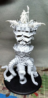 Meager progress on the Throne. As you can see, I've gotten everything put together except for the lower teeth and the tentacle claws. The sorceress is on a pin and just set on top rather than glued in yet since I plan to paint her separately. Getting all the tentacles attached to the main body was actually pretty easy. I used the drop-of-paint-to-mark-where-to-drill method, and it worked out very easy. Still though, there's a lot of gaps to putty later. Also the tentacles weren't all even at the bottom so I had to do some leveling with plasticard to get the whole thing attached to the base and level. The scale of this thing is just crazy though, standing over 8" tall.
Played in the Domination release event at my LGS. Rather than some huge battle report, here's a bunch of highlights:
Meager progress on the Throne. As you can see, I've gotten everything put together except for the lower teeth and the tentacle claws. The sorceress is on a pin and just set on top rather than glued in yet since I plan to paint her separately. Getting all the tentacles attached to the main body was actually pretty easy. I used the drop-of-paint-to-mark-where-to-drill method, and it worked out very easy. Still though, there's a lot of gaps to putty later. Also the tentacles weren't all even at the bottom so I had to do some leveling with plasticard to get the whole thing attached to the base and level. The scale of this thing is just crazy though, standing over 8" tall.
Played in the Domination release event at my LGS. Rather than some huge battle report, here's a bunch of highlights:
- 10 players! (4 Legion, 3 Circle, 1 Troll, 1 Khador, 1 Cygnar)
- Didn't take any pictures. Boo!!!
- I won the Legion faction coin!
- I played 6 games total, spanning 6 warlocks, and won every single battle by assassination.
- The dice gods were throwing their blessings on me left and right throughout all but the first game.
- Had a seriously fun time overall. The open format is definitely my favorite.
- Played the Throne in 2 of my 4 games and was very happy with it overall.
- One other player had a fully painted Throne for the event. I was totally impressed he had it done so fast.
- The tournament winner coin went to the Khador player. Crazy!
Thursday, January 19, 2012
From the Desk: Updates on Throne, Health and Misc
 Three different topics tonight! First up, progress on the Legion battle engine. I got a fair amount of assembly done in the last couple days. Just now I finished drilling holes for pinning the tentacles. I gotta say, when they say use a dust mask, they mean it! I'm glad I heeded the warning. I was using the dremel, in the garage, with a dusk mask, and I'm still feeling like it wasn't entirely safe. The amount of very fine dust particles spewed out was pretty crazy. After having taken what some might be a rather liberal stance on paint toxicity, I'm going to go on record saying that being extra cautious with the resin kits is highly advisable. Inhaling the dust particles is seriously bad news. That stuff won't leave your lungs. I highly recommend the wet method for any cutting, filing or drilling, regardless of what tools you use.
Ok, warning past, I am happy with the amount of progress. There's going to be a lot of gap filling to do though, and certainly some final mold line cleanup. The kit overall is pretty good, but the mold lines on the tentacles gets a little out of control. I'm not so surprised though given how wild those things are.
Second update, my push to get this battle engine assembled is because our LGS' Domination event is this Saturday and I wanted to field it. I don't have any solid plan for how to use it, but I want to bring the giant beastie to the table at least once. It won't be painted, and might be missing a few final detail pieces, but it's going to make an appearance. I just need to come up with a good way to transport it...
Third and final, thanks to those that gave me feedback on the health article. I'm still running down some additional information so there will probably be more updates in the future.
Three different topics tonight! First up, progress on the Legion battle engine. I got a fair amount of assembly done in the last couple days. Just now I finished drilling holes for pinning the tentacles. I gotta say, when they say use a dust mask, they mean it! I'm glad I heeded the warning. I was using the dremel, in the garage, with a dusk mask, and I'm still feeling like it wasn't entirely safe. The amount of very fine dust particles spewed out was pretty crazy. After having taken what some might be a rather liberal stance on paint toxicity, I'm going to go on record saying that being extra cautious with the resin kits is highly advisable. Inhaling the dust particles is seriously bad news. That stuff won't leave your lungs. I highly recommend the wet method for any cutting, filing or drilling, regardless of what tools you use.
Ok, warning past, I am happy with the amount of progress. There's going to be a lot of gap filling to do though, and certainly some final mold line cleanup. The kit overall is pretty good, but the mold lines on the tentacles gets a little out of control. I'm not so surprised though given how wild those things are.
Second update, my push to get this battle engine assembled is because our LGS' Domination event is this Saturday and I wanted to field it. I don't have any solid plan for how to use it, but I want to bring the giant beastie to the table at least once. It won't be painted, and might be missing a few final detail pieces, but it's going to make an appearance. I just need to come up with a good way to transport it...
Third and final, thanks to those that gave me feedback on the health article. I'm still running down some additional information so there will probably be more updates in the future.
Tuesday, January 17, 2012
Paint Toxicity
If you're a brush licker, you need to read this post. It could save your health!
There's a lot of discussions out there about whether paints are toxic or not. It's easy to read the side of a bottle of paint and see "non-toxic" and take that at face value. However that labeling may only be applicable to a specific type of exposure based on "expected usage" of the product. For those of us that lick our brushes though, that isn't necessarily part of the expected usage, so the question of toxicity is still on the table. I started off with a curiosity to learn a little more about paints and potential toxicity and, like Alice, found myself quickly falling down the rabbit hole. This post is a summary of what I learned that's relevant to those of us in the miniatures painting community. As a quick note, this post is rather lengthy so I've tried to organize it with headings to help you skip to sections you are most interested in.
Disclaimers:
First, I am not a toxicologist, government regulator, lawyer, chemist, manufacturer, or any other profession even remotely related to the art industry. I should not be considered an expert and the information presented here is to the best of my understanding. I've done the best I can to validate all the information presented, but I've provided numerous reference URLs for you learn more.
Second, I am not being compensated in any way by any manufacturer for this post. Everything presented here was as a result of my own rigorous investigation and although I dearly love my painting hobby, learning the facts was my chief motivation here.
Third, I am only covering traditional acrylic paints. That is pigment and acrylic polymer emulsion medium. I am not covering other acrylic additives or oil paints. I am also not covering other materials of the hobby such as putties, resins, plastics, metals or spray sealants (or anything else for that matter). If there's enough interest in other materials I will happily do future research and posts on those.
Grades of Acrylic Paints:
For the purposes of my investigation, I broke up acrylic paints into 3 groups:
 Acrylic paints are a relatively recent invention (about 60 years old). Acrylic paints are, very simplistically, plastic in water with pigments added. The plastic is an acrylic polymer emulsion and when applied to a surface, the water evaporates depositing the acrylic polymer. That polymer then hardens and is unable to be re-hydrated. It is these qualities that make them very well suited for the miniatures painting hobby.
The first acrylic paints were made using similar pigments as traditional artist oil-based paints. Many of these pigments were made using heavy metals (more on that below) because of their colorfastness. Today, most pigment are made from various organic or synthetic compounds. Some pigments are even made from normal dirt!
Quick Chemistry and Health Lesson:
Acrylic paints are a relatively recent invention (about 60 years old). Acrylic paints are, very simplistically, plastic in water with pigments added. The plastic is an acrylic polymer emulsion and when applied to a surface, the water evaporates depositing the acrylic polymer. That polymer then hardens and is unable to be re-hydrated. It is these qualities that make them very well suited for the miniatures painting hobby.
The first acrylic paints were made using similar pigments as traditional artist oil-based paints. Many of these pigments were made using heavy metals (more on that below) because of their colorfastness. Today, most pigment are made from various organic or synthetic compounds. Some pigments are even made from normal dirt!
Quick Chemistry and Health Lesson:
 Heavy metals (such as As, Cd, Co, Cr, Hg, Pb, Sb, Se) are toxic! If absorbed into the bloodstream (through skin, ingestion, or inhalation) they can cause very serious health problems. Cadmium (Cd) for example can cause liver and kidney failure and cause cancer. So if you're thinking that the small amounts of paint that we're working with can't be dangerous, think again!
A quick note on metallic paints: The "metal" part of metallic paints is actually tiny particles of mica. Mica itself is not particularly toxic, but there are a number of studies out there in the cosmetics field that will indicate dangers about mica. To the best of my research, this is only relevant for the particles being inhaled, and there is no specific toxicity dangers to the mica particles being ingested. In fact I discovered that some toothpastes actually include powdered mica as a whitening agent.
Regulating Bodies
There are three primary regulating bodies in regard to artist material safety.
Heavy metals (such as As, Cd, Co, Cr, Hg, Pb, Sb, Se) are toxic! If absorbed into the bloodstream (through skin, ingestion, or inhalation) they can cause very serious health problems. Cadmium (Cd) for example can cause liver and kidney failure and cause cancer. So if you're thinking that the small amounts of paint that we're working with can't be dangerous, think again!
A quick note on metallic paints: The "metal" part of metallic paints is actually tiny particles of mica. Mica itself is not particularly toxic, but there are a number of studies out there in the cosmetics field that will indicate dangers about mica. To the best of my research, this is only relevant for the particles being inhaled, and there is no specific toxicity dangers to the mica particles being ingested. In fact I discovered that some toothpastes actually include powdered mica as a whitening agent.
Regulating Bodies
There are three primary regulating bodies in regard to artist material safety.

 I'm going to start with this P3 Iosan Green. If you look at the label you'll see the text "Conforms to ASTM D4236". What this means is that the product is labeled according to the D-4236 standard for labeling artist materials. This part does not mean it is entirely non-toxic. It only means that the labeling will include any relevant warnings. If you keep reading you'll see "Nontoxic", "Do not ingest", and "In case of eye contact...". So how do you make sense of all that given it seems a little conflicting? Well the "Nontoxic" part is pretty straightforward, the "Do not ingest" is an indication of intended use, and the directive about contact with eyes is exactly what it is. At first review it may seem like this label is saying that licking your brushes is going to be "bad" in some unspecified way. But, before you panic, let's take a look at another example.

 This bottle of Golden Fluid Acrylics is a much more interesting study. Notice how it has the "ASTM D4236" seal on the back. However, in the fine print you'll also see "Warning: This product contains a chemical known to the State of California to cause cancer." That's right boys and girls, this paint is not safe to lick. This is why I said the D-4236 standard was not a seal of non-toxicity in itself. If you go to the Golden Paints website for more detail, you'll discover that this particular paint contains "crystalline silica" and "iron oxide" (and yes, it's also on the front label of the bottle). On the data sheet they have many other heavy metals listed as used in other paints. This bottle is a good example of why it's important to check the labels carefully. If you just looked for the "Conforms to ASTM D-4236" labeling, and didn't read the rest, you could be on your way to the hospital. Ok, enough scare tactics. Let's move on...

 Now here we have a RMS bottle with no ASTM labeling on it. You will however notice that it has the "CE" symbol, and the words "non-toxic". Although I am less versed in the details of the CE labeling, if you see these together you can feel fairly safe that the paint is non-toxic.
This is just a quick overview, but you should have learned the importance of reading the labels carefully. Also I have admittedly had a bit more of a US-centric focus in terms of standards, so for those readers in other geographic regions I do apologize. I only had access to paints available in US stores so hopefully your labelings will be similar. Odds are that one or both of the ASTM or CE labeling schemes will appear on your paints. There are other labels (swirling arrows and big "e" to name a couple) which I have not researched here. Also remember that the ACMI labeling functions as a roll-up for approved non-toxic product under the D-4236 standard, so if you see the ACMI AP label, it's safe. For now though, let's cut to the chase on some specific manufacturer's lines...
Guidance for Specific Manufacturer's Lines:
Once again, please take care in noting that this is only my guidance and I am not a qualified toxicologist, doctor, or any other professional of any kind to rely on. I'm only sharing the guidance I am giving myself about paints I commonly use. This is a list of paints immediately found on my desk that I use on a regular basis. If I've noted it as "safe", that means the entire line seems safe for normal painting activity, including brush licking.
Now here we have a RMS bottle with no ASTM labeling on it. You will however notice that it has the "CE" symbol, and the words "non-toxic". Although I am less versed in the details of the CE labeling, if you see these together you can feel fairly safe that the paint is non-toxic.
This is just a quick overview, but you should have learned the importance of reading the labels carefully. Also I have admittedly had a bit more of a US-centric focus in terms of standards, so for those readers in other geographic regions I do apologize. I only had access to paints available in US stores so hopefully your labelings will be similar. Odds are that one or both of the ASTM or CE labeling schemes will appear on your paints. There are other labels (swirling arrows and big "e" to name a couple) which I have not researched here. Also remember that the ACMI labeling functions as a roll-up for approved non-toxic product under the D-4236 standard, so if you see the ACMI AP label, it's safe. For now though, let's cut to the chase on some specific manufacturer's lines...
Guidance for Specific Manufacturer's Lines:
Once again, please take care in noting that this is only my guidance and I am not a qualified toxicologist, doctor, or any other professional of any kind to rely on. I'm only sharing the guidance I am giving myself about paints I commonly use. This is a list of paints immediately found on my desk that I use on a regular basis. If I've noted it as "safe", that means the entire line seems safe for normal painting activity, including brush licking.
- Hobby grade - These are paints use for the miniatures painting hobby and make up 99% of my paint supplies. As examples on my desk, I have P3, RMS, RPP, GW, VMC, VGC, VPA, VMA, and Secret Weapon (see abbreviations in sidebar).
- Craft grade - These are paints bought in craft stores that come in larger bottles. They are used for a wide variety of projects. I've excluded them from my investigation for a number of reasons. The main reasons are there are a huge array of manufacturers out there and I own almost none of them due to the particle size of the pigments. I will note that in general, I found craft grade paints tend to be even safer (less toxic) than hobby grade paints. On my desk I have Delta Ceramcoat, Folk Art, Craft Smart, DecoArt, and Apple Barrel.
- Artist grade - This refers to acrylic paints intended for traditional canvas artists. They are purchased in art stores, come in tubes, and tend to be far thicker than traditional miniatures paints. Although I own a few random tubes of artist grade paint (from Winsor & Newton, Golden Acrylic, and Liquitex) I almost never use them. In general, most artist grade paints are non toxic, however there are many notable exceptions and if you are going to use them, make sure to read the labels carefully. On my desk I have W&N Finity, W&N Artisian, Liquitex Professional, and Golden Liquid Acrylics.
Acrylic paints are a relatively recent invention (about 60 years old). Acrylic paints are, very simplistically, plastic in water with pigments added. The plastic is an acrylic polymer emulsion and when applied to a surface, the water evaporates depositing the acrylic polymer. That polymer then hardens and is unable to be re-hydrated. It is these qualities that make them very well suited for the miniatures painting hobby.
The first acrylic paints were made using similar pigments as traditional artist oil-based paints. Many of these pigments were made using heavy metals (more on that below) because of their colorfastness. Today, most pigment are made from various organic or synthetic compounds. Some pigments are even made from normal dirt!
Quick Chemistry and Health Lesson:
Heavy metals (such as As, Cd, Co, Cr, Hg, Pb, Sb, Se) are toxic! If absorbed into the bloodstream (through skin, ingestion, or inhalation) they can cause very serious health problems. Cadmium (Cd) for example can cause liver and kidney failure and cause cancer. So if you're thinking that the small amounts of paint that we're working with can't be dangerous, think again!
A quick note on metallic paints: The "metal" part of metallic paints is actually tiny particles of mica. Mica itself is not particularly toxic, but there are a number of studies out there in the cosmetics field that will indicate dangers about mica. To the best of my research, this is only relevant for the particles being inhaled, and there is no specific toxicity dangers to the mica particles being ingested. In fact I discovered that some toothpastes actually include powdered mica as a whitening agent.
Regulating Bodies
There are three primary regulating bodies in regard to artist material safety.
- The first, and in my opinion most important, is the American Society for Testing and Materials (ASTM). Unfortunately this body oversees a huge variety of things. The relevant standard to know about is D-4236. This is the standard for artist materials and you'll see this referenced on pretty much all of the paints. More on this later.
 The second is the Art & Creative Materials Institute (ACMI) which is a US-based non-profit organization that certifies a variety of artistic materials. Essentially, as far as I can tell, their standards are an implementation of ASTM D-4236, but with simplified labeling. The upside is that the ACMI labeling makes it much quicker to assess the safety of a product. The downside is that relatively few products seem to actually use this standard. Of my own collection of paints, less than a third of them had it, and specifically none of what I classify as hobby grade paints had it.
 The third is the European Commission which is responsible for the EC symbol you'll see on many paints. There's a lot of details around this on their website. It's essentially meant to be the same as the ASTM D-4236 standard. Obviously I didn't go into the detail to determine how similar those standards are.

 I'm going to start with this P3 Iosan Green. If you look at the label you'll see the text "Conforms to ASTM D4236". What this means is that the product is labeled according to the D-4236 standard for labeling artist materials. This part does not mean it is entirely non-toxic. It only means that the labeling will include any relevant warnings. If you keep reading you'll see "Nontoxic", "Do not ingest", and "In case of eye contact...". So how do you make sense of all that given it seems a little conflicting? Well the "Nontoxic" part is pretty straightforward, the "Do not ingest" is an indication of intended use, and the directive about contact with eyes is exactly what it is. At first review it may seem like this label is saying that licking your brushes is going to be "bad" in some unspecified way. But, before you panic, let's take a look at another example.

 This bottle of Golden Fluid Acrylics is a much more interesting study. Notice how it has the "ASTM D4236" seal on the back. However, in the fine print you'll also see "Warning: This product contains a chemical known to the State of California to cause cancer." That's right boys and girls, this paint is not safe to lick. This is why I said the D-4236 standard was not a seal of non-toxicity in itself. If you go to the Golden Paints website for more detail, you'll discover that this particular paint contains "crystalline silica" and "iron oxide" (and yes, it's also on the front label of the bottle). On the data sheet they have many other heavy metals listed as used in other paints. This bottle is a good example of why it's important to check the labels carefully. If you just looked for the "Conforms to ASTM D-4236" labeling, and didn't read the rest, you could be on your way to the hospital. Ok, enough scare tactics. Let's move on...

 Now here we have a RMS bottle with no ASTM labeling on it. You will however notice that it has the "CE" symbol, and the words "non-toxic". Although I am less versed in the details of the CE labeling, if you see these together you can feel fairly safe that the paint is non-toxic.
This is just a quick overview, but you should have learned the importance of reading the labels carefully. Also I have admittedly had a bit more of a US-centric focus in terms of standards, so for those readers in other geographic regions I do apologize. I only had access to paints available in US stores so hopefully your labelings will be similar. Odds are that one or both of the ASTM or CE labeling schemes will appear on your paints. There are other labels (swirling arrows and big "e" to name a couple) which I have not researched here. Also remember that the ACMI labeling functions as a roll-up for approved non-toxic product under the D-4236 standard, so if you see the ACMI AP label, it's safe. For now though, let's cut to the chase on some specific manufacturer's lines...
Guidance for Specific Manufacturer's Lines:
Once again, please take care in noting that this is only my guidance and I am not a qualified toxicologist, doctor, or any other professional of any kind to rely on. I'm only sharing the guidance I am giving myself about paints I commonly use. This is a list of paints immediately found on my desk that I use on a regular basis. If I've noted it as "safe", that means the entire line seems safe for normal painting activity, including brush licking.
Now here we have a RMS bottle with no ASTM labeling on it. You will however notice that it has the "CE" symbol, and the words "non-toxic". Although I am less versed in the details of the CE labeling, if you see these together you can feel fairly safe that the paint is non-toxic.
This is just a quick overview, but you should have learned the importance of reading the labels carefully. Also I have admittedly had a bit more of a US-centric focus in terms of standards, so for those readers in other geographic regions I do apologize. I only had access to paints available in US stores so hopefully your labelings will be similar. Odds are that one or both of the ASTM or CE labeling schemes will appear on your paints. There are other labels (swirling arrows and big "e" to name a couple) which I have not researched here. Also remember that the ACMI labeling functions as a roll-up for approved non-toxic product under the D-4236 standard, so if you see the ACMI AP label, it's safe. For now though, let's cut to the chase on some specific manufacturer's lines...
Guidance for Specific Manufacturer's Lines:
Once again, please take care in noting that this is only my guidance and I am not a qualified toxicologist, doctor, or any other professional of any kind to rely on. I'm only sharing the guidance I am giving myself about paints I commonly use. This is a list of paints immediately found on my desk that I use on a regular basis. If I've noted it as "safe", that means the entire line seems safe for normal painting activity, including brush licking.
- Reaper Miniatures: Safe! Reaper actually responded to me 2 days after I emailed them. They sent me an entire data sheet of product safety information about their entire line of paints. Unfortunately the sheet is not directly available on their website. If you are interested, you can email them. Please note that the data sheet only covered the Reaper Master Series paints though. The Reaper Pro Paints were replaced by the RMS line. I think in order to be on the safe side, the RPPs are going into my "archives".
- Games Workshop: Safe! Admittedly I'm relying on the labeling alone here. I attempted to contact GW by email but never heard back from them after 2 weeks.
- Privateer Press: Safe! Same boat as GW actually (no email response for 2 weeks), but with the caveat that I've seen forum posts by Matt DiPietro and Mike McVey stating the paints are non-toxic and these guys are consummate brush lickers when they use the 2BB technique. Heck, Mike helped formulate the P3 line of paints, so he ought to know what's in them.
- Secret Weapon Miniatures: Safe! Ok, this needs a significant caveat here. At present the Secret Weapon line is not labeled for safety. Also they have dry pigments and washes only. However Justin McCoy from Secret Weapon went above and beyond in helping me out on this research project. Turns out he is in the process of getting the ACMI certification for the entire line of pigments, washes and scenics. Many thanks to him for the numerous emails we traded!
- Acrylicos Vallejo: Do not ingest! Vallejo was the one manufacturer that I didn't attempt to contact via email. They have a very comprehensive website in terms of safety standards and ratings and a good FAQ on health questions. Now when I say "mostly safe", it's important to note that most of their paints are fine, but some are of questionable nature. The individual labeling on their dropper bottles is not always clear either. I never found a single bottle in my collection that says "non-toxic" on it. My unfounded suspicion is that there are trace amounts of something bad. I'd love to call it safe, but I think going forward I'm going to avoid any 2BB work with them.
- Red tape on bottles - Any paints that I plan to keep in normal circulation will get a stripe of red tape to remind me of any potential toxicity concerns.
- Cleaning out my rinse jars more often - This is something I didn't explicitly cover above. Although generally the paint ingredients are inactive, leaving a jar of water out that's gotten all kinds of stuff in it has the potential to turn bad. I had this happen to me once when I left a jar of very dirty rinse water sit for over a month. When I opened it, there was a puff of compressed air released and a noxious odor. As a result of this study and seeing more than a couple posts about rinse water going bad, I'm going to make an effort to dump out my rinse water between each painting session. Btw, the dish soap I put in my rinse to condition my brushes... I check and it's safe.
- Added caution about inhalation potential - By far the biggest danger presented is inhalation of materials. Although most hobby grade dry pigments and airbrush paints are fairly safe, getting materials into your lungs is a recipe for problems. On of my goals for this year is to use the airbrush and a couple of the VMA paints I have are not entirely clear on their safety. I think I'll make sure to use caution with those and not spray them up my nose.
- Brush licking is still game on - My wife asked me whether licking my brush was a habit or a conscious practice. Although 2BB work is definitely a conscious act, I had to admit that licking my brush after I rinse it is just a habit now. Fortunately it's a pretty safe one. I'm going to continue to lick my brush, 2BB, and even on occasion lick the back of my hand and use it as a wet palette.
- Wikipedia - Yeah, it's Wikipedia, but much of the information on it I was able to corroborate from other sources, and Wikipedia had lots of information all in one convenient place.
- ACMI Safety - Although I listed it above, this page in particular is of great use.
- eHow - Actually just this specific eHow page with a very concise summary of the ASTM D-4236 standard.
- Earth Pigments - I don't actually use their products at this time, but they have wonderful fact sheets on their site about product and material safety.
- Additives - Medium modifiers that change the properties of the paint in terms of drying time, viscosity, or cohesion.
- Binder - A medium used to bind the pigment to the surface. For acrylic paints, this is the Acrylic Polymer.
- Cohesion - A measure of a liquid's tendency to cling to itself. Often referred to as surface tension in terms of the application of paint. Flow improvers are used to reduce paint cohesion and allow it to flow from the brush easier.
- Colorfastness - The ability for a pigment to retain its original hue without fading over time.
- Dry pigments - Raw pigment material, separate from any sort of liquid medium.
- Emulsion - A mixture of two liquids that are normally not mixable.
- Glazes - Generally a formulation designed to extend working time of a paint and cause it to form a thin coating.
- Inks - Generally formulated with a higher concentration of pigment and a thinner medium. Ink formulations can vary greatly between manufacturers and particularly between paint grades.
- Medium - Refers to the vehicle of the pigment, typically a water-based liquid of some kind for acrylic paints.
- Metallics - Paints with a metallic medium (generally flakes of mica) suspended in it. Generally the higher the ratio of mica to pigment, the shinier the paint. Normal "steel" metallics are made using black pigment.
- Particle Size - Refers to the size of the pigment particles. Generally the smaller the particle, the smoother the look.
- Pigment - Refers to the color agent specifically.
- Retarders - An additive that extends the drying time of the paint to allow for more working time. Also referred to as an extender.
- Viscosity - A measure of a liquid's "thickness" or resistance to being moved.
- Washes - Generally a formulation intended to spread a thin coat of pigment over an area, but with enough flow to cause the wash to recede into crevasses.
Monday, January 16, 2012
From the Desk: Once Again Unto The Blight Dear Friends
 So right about now you're looking at this picture and thinking "Great, another random useless post. So glad I clicked a link to get here." Well, yes, it's another random useless post. I haven't gotten much done since finishing eVayl in terms of painting. I did some trimming, and some prep, and cleaned my desk, and worked on a blog project (which will be unveiled tomorrow sometime). But in terms of painting or assembling, I've gotten a big fat zero done. There's plenty of semi-valid reasons. In fact, let's play a game called Pick the Weakest Excuse...
 I was ultra-busy with work for the last week and barely got time to sleep, but took this sweet picture of the view from my hotel room.
- I have family visiting so anytime not consumed with work is taken up having fun with them.
- The weather here is unseasonably cold an I can't prime anything.

Sunday, January 08, 2012
Vayl, Consul of Everblight
 Now this model was a delight to paint. Great sculpt. If I had one complaint it was that the two Oraculi in her right hand look a little odd with the circle of whatever connecting them. I'm not really sure what else they could have done though, so I consider it a minor gripe. The cape took a tricky bit of pinning to do without letting the join show too oddly, but the rest was easy. I decided eVayl needed a slightly more epic base than most of my Warlocks have gotten so I did a little carved glowing rune action. It also served to tie the colors together better.
 This was also the first time that I used The Army Painter grass tufts. These particular ones were the highland tufts. I have to say that I really like them. Very easy to work with and they look quite nice.
Overall things went pretty well with this model. I spent an average amount of time on it rather than trying to really pour over it and get everything perfect. I really don't want to get too bogged down at this point and keep my momentum up. There were some details I could have spent more time on like painting some pattern on the cloak, shading the metals a little more deeply, and doing some better pushing of the shadows. The glowing bits could have certainly used a little more work as well, but that's become somewhat of a sore point for me that I'm not going to get into right now.
This was also the first time that I used The Army Painter grass tufts. These particular ones were the highland tufts. I have to say that I really like them. Very easy to work with and they look quite nice.
Overall things went pretty well with this model. I spent an average amount of time on it rather than trying to really pour over it and get everything perfect. I really don't want to get too bogged down at this point and keep my momentum up. There were some details I could have spent more time on like painting some pattern on the cloak, shading the metals a little more deeply, and doing some better pushing of the shadows. The glowing bits could have certainly used a little more work as well, but that's become somewhat of a sore point for me that I'm not going to get into right now.
 This base actually made me quite happy too. Overall I'm looking forward to having this model on the battlefield.
Wednesday, January 04, 2012
Taryn di la Rovissi
 I've lost count of how many times I've misspelled this model's name. Nevertheless, she's done. One less merc to paint. It was a pretty pleasant model to paint actually. Simple, easy to get to, and generally a nice sculpt. She's got a lot going on, so I tried to create a color scheme that picked out different functional elements of her outfit without it getting too busy with colors. The blue shades permeate almost the entire model in one way or another.
 I can't say I'm going to be playing her anytime soon, but I may get antsy to try out the Ashlynn theme force at some point and this is one more piece of that puzzle.
Monday, January 02, 2012
2011 Wrap Up, and 2012 Resolutions
[Disclaimer: This post contains fluffy, introspective nonsense... Just like last year's did.]
After 5 years of doing this, it seems pretty rote, but I'm doing it anyway. 2011 overall wasn't a good year for my hobbies.
Last year's goals:
1) Enter KublaCon masterclass painting competition - Success! Not a win, but a valuable experience for sure. I'll definitely enter at the masterclass level again this year. In all fairness, this was my main goal for this year.
2) Close out unpainted factions - Fail! Seriously, too little effort, too late. I'm so close on most of them. Maybe this year.
3) Do a series of speed painting posts - Fail! Well, kinda. I did a couple, but overall my painting time this year was horrible and I just didn't get a lot done.
Models painted last year:
This year was noticeably lighter with a total of 52 models completed, and that's if I generously include the Solar System project for my son. I'm going to count those planets since having a one year old in the house definitely impacted my painting time (joyously I might add). Overall not a gangbusters year. However I spent a ton of time on the War Hog for KublaCon and really found value in doing the Road to Competition series of posts as a part of that effort.
Legion: 32
Minions: 2
Mercs: 1
Khador: 1
Cygnar: 7
Planets: 9
Goals for next year:
1) Enter KublaCon masterclass painting again. This is a no-brainer, and I've got plenty of lead time for it. I've already got a couple models in mind as well. As a part of this I'm going to do another RtC series of posts.
2) Finish reading my books on color theory. I've got two of them sitting around that I started but never finished. This is a pretty straightforward goal. The real trick will be whether I learn and apply something significant from them. I'll commit to chronicling my learnings in more color theory posts.
3) Use my airbrush once. This probably sounds like a dumb goal. I mean seriously, just once? The idea here is simple: If I commit to using it once, odds are it'll get me over the initial hurdle of trying it out and figuring out the logistics and I'll actually start using it more. [I'm doing the same thing with the gym.] Again, I'll plan to record my attempts in a set of airbrush tagged posts.
Subscribe to:
Posts (Atom)