Saturday, August 25, 2012

Daily Inspiration: GenCon 2012

Today's inspiration comes via CMON and is the winning GenCon 2012 painting entry by Marike Reimer. This paint job is absolutely stunning. There are so many amazing freehand details to it. I think the one that most caught my eye was the subtle lace sleeve on her left arm. The dress is also absolutely stunning all around.

It's easy to be completely disenchanted with painting when seeing stuff like this. But in this case I think it's actually pretty inspiring. There's so many little details that are neat ideas. I might even try some of them on my current Skarre project.

Also something to keep in mind is Marike has been painting for quite some time. If you look at her gallery of models, you can get a good sense of how her painting progressed over the years. You'll see some really interesting PP stuff too.

Wednesday, August 22, 2012

Swamp Horror

So here's the result of my second self-imposed gator painting challenge: the pink octopus! I can't honestly say it's a complete success, but I can definitely say I'm happy with the results given the challenge I set forth for myself. It really was very fun to paint, and it does make for a very distinctive Swamp Horror.

I should note that this model posed some interesting challenges. The suckers for example had to be painted individually. The underside was uniquely difficult to get to, and then ended up being mostly not possible to see. And the eyes are very tiny to get to. Despite the challenges though, I enjoyed painting this model. Probably mostly due to the paint challenge.

What went well:
* The chitin on top worked out quite nicely I think. Good color variation and appearance of texture.
* The overall scheme worked out nice. Bright, but not overly harsh on the eyes.
* Being so well sunk down into the base really gives him a feeling of rising up out of the water.

What could have been better:
* Details like the eyes and teeth could have been a little better defined and highlighted.
* The membranes between tentacles really needed to appear more white/translucent, but I just couldn't quite get it right.
* The blending on the side bubbles (or whatever they are) could have definitely been smoother.

Sunday, August 19, 2012

From the Desk: Weekend Roundup #6

Somehow a whole week passed and I didn't post anything. Probably has something to do with a huge bout of the terrible twos.

First a brief battle report. Henry and I rolled out a 50pt game of pSeverius vs Asphyxious3. The game was a total blast. We both rolled out our respective colossals, as proxies obviously. Highlights include me destroying three-quarters of his army in a single turn, then followed by getting assassinated by Gaspy3 in a very No Quarter Challenge style. Brilliant game full of entertainment. Probably the best part was when Asphyxious used Bone Shaker to whack Nicea who then walks back and pops Severius, nearly killing him!

And... no photos of works in progress. A bunch of stuff moved forward this week actually. The Swamp Horror and the Witch Doctor both are wrapped up and I'm just waiting for the Envirotex to set. Skarre got a little more progress as well. Maelok is now on deck and I got some base coating work started on him. I also have a couple "off blog" projects that hit the desk and got prep work started. I'll include posts of those when they wrap up.

Hopefully the next roundup post is a bit more interesting!

Sunday, August 12, 2012

From the Desk: Weekend Roundup #5

Only one massive photo this week, and it's not great quality. My 2 year old has a massive fever. I'm just happy he's resting now and can write up this post.

Going from left to right...

Skarre - Still working on her a bit at a time. Not huge progress, but I did a little shading work on the metals, some work on the blues and flesh, and on her horns. I really love this model so I'm purposefully taking my time. She'll probably remain on my desk for at least 2 more weeks if not more.

Vessel of Judgement - Tedious, and not my favorite model. Will be glad to be done. It's just got so much filigree detail and the surfaces don't break up very well. The overall readability of the model is poor. I'm hoping at some point I'll turn the corner and be enjoying it, but I'm not holding my breath.

Gatorman Witch Doctor - Just started this guy today, so there's not much to say here. He jumped the line in my painting queue since he's more important to get painted than Maelok is in terms of army options.

Swamp Horror - Not particularly succeeding at my self-imposed painting challenge to match the pink octopus photo, but I am having a blast trying. It is starting to come together though, especially now that I've painted the suckers. There's lots of little details on him that picking out helps to really liven up the model.

Finally a quick battle report note. Played Barnabas (2x 5 Posse, Ironback, 2x Bull Snappers, Totem Hunter, Croak Hunter, Witch Doctor) vs Zerkova (Devastator, Decimator, 4 Widowmakers, 8 Black Dragons, Aiyana & Holt, Sylas, Drakhun) in an "Outflank, Outfight, Outlast" scenario. It looked like I was going to have an uphill battle due to the Devastator parking in the control zone and I had no way of even scratching that thing. However bottom of round 2 I managed to get a boosted Ironback Spitter shot on Zerkova after popping Barnabas' feat and nearly killing her. From there it turned into Barnabas the irresistible force just punching through the lines of IFP to finish her off with a spell assassination. I gotta say, the more I play Barnabas, the more I like him. Counter-charge, Spiny Growth, Iron Flesh, Swamp Pit, tough and unyielding make for a really hard target to dig out.
I believe overall my record with Gators is getting better. I might be forgetting a battle in here (or gotten one of the enemy casters wrong), but here's the stats as I recall:
  • Calaban: 2 wins (eHexeris, Mordikaar), 4 losses (eMorghoul, eMakeda, eHaley, Vlad).
  • Barnabas: 2 wins (Zerkova, Harkovich), 0 losses!

The only other thing to report is I'm starting a super secret project titled Project Sunset Cowboys. I'm keeping it a secret to unleash on my local buddies so I won't be posting much about it here until I unveil it to them.

Saturday, August 11, 2012

From the Desk: Pantone Color Guides Book Review

Book Title: Pantone Guide to Communicating with Color and Color: Messages & Meanings - A PANTONE Color Resource
Author: Leatrice Eiseman

The Pantone guides are sort of an industry standard, particularly for advertising. After reading both of these books I can see why. I originally bought these books because I was looking for a resource that would provide me with more insights into the associations between colors and evoked emotions, and I definitely got that in these books.


What I learned:

These books are the 5th in my series of book reviews. In the course of my readings I've read books aimed at mostly artists. In my past (as an armchair theoretical physicist) I've read plenty of books that dealt with the topic of light and color in that realm as well. However this is the first time I've read a book aimed at marketing and advertising. The fascinating thing is the book treats the topic of color more from the perspective of psychology than anything else. But not in a soft fluffy way. It's a very scientific psychological study of color. They've done thousands of interviews with focus groups. They weave in information from physics, biology and sociology. It really opened my eyes even further to the complex world of color.

The second Pantone guide does an incredible job of breaking down colors and showing related word associations most commonly evoked by each color. This part is invaluable in particular and was exactly what I was hoping for.

And one last interesting fact that I learned: 20% of visual information taken in by the eyes is directed to the pituitary gland. That's pretty fascinating.


What I liked:

It had exactly what I wanted in terms of word/emotion association for a wide selection of colors, as well as general impressions of color families.

The color printing quality is, of course, top notch. I honestly expected nothing less, but after experiencing books with sub-par or even poor color printing I've gotten much more picky about this.

The additional information about the perception of color was a welcome addition. There were plenty of little tidbits of information that I found particularly interesting.

There are loads of sample color swatches using a Dominant, Subordinate, and Accent model. And when I say loads, I really mean loads. Several hundred swatches. And they are all grouped together into themes. The swatches are not only good for finding examples, but from them you can extrapolate your own swatch pretty easily.


What I didn't care for:

In the end, I didn't really need to buy both books. That's probably my only complaint. I could have also done without the basic color wheel theory stuff they threw in, but I completely understand why it's there and since it was limited to just a couple pages I didn't mind.


What I would have liked to have:

The one thing I would have loved is simple condensed chart with small color swatches next to it of all the associations. Obviously that would be a lot of information to condense down though. I might end up making my own at some point if I find myself with a bunch of free time.


Overall though, these are great books and I see myself referring back to them many times in the future.

Friday, August 10, 2012

Daily Inspiration: Massive Voodoo Party

Today's inspiration comes from the Massive Voodoo guys. They recently had a big birthday party for Roman. As a part of the party, they had prepped a big canvas with a sketch of a monkey last supper and people there painted in parts of it. It really is an amazing idea for a party and looked like a huge amount of fun.

Happy birthday Roman!

Thursday, August 09, 2012

Bloody Barnabas

Finally! A second Gator warlock to play. My whole self-imposed restriction of not playing a Gator model until it's painted is both a blessing and a curse. I'm stoked to put Barnabas on the table now. Not that I hate Calaban. I'm just ready for something different.

This model was, like Wrong Eye, a delight to paint. I was anxious to give him an aggressive look so I opted to paint his coat red. Again I have to say that I really love the look of stitched-together clothes on these models. Gives them a real foothillbilly look.

This model didn't have all four of my theme colors on him (he's missing yellow). I just couldn't quite figure out how to get it in there. There's not quite as much stuff going on here as with other characters so I sort of ran out of options before I realized it.

What went well:
* Red coat worked out well. Makes him look angry!
* The squiggly runes on all his wraps really gives him an arcane look.
* The chitin on his tale came out nicely with good color variation. Really helps reinforce his age (as presented in the fluff).

What could have been better:
* Working yellow in through better planning.
* Better shading/highlighting/weathering on metals to make them pop more.

Well this rounds out the big batch of updates. There's more stuff in the queue but further finished models might be a few days out, particularly due to life events ramping up for a while.

Wednesday, August 08, 2012

Daily Inspiration: Pink Octopus!

Today's inspiration is my next painting challenge. After the fun I had with the Croak Hunter challenge, I was looking at my Swamp Horror and trying to decide on what to do with it. I searched for pictures of an "albino octopus" and everything I found was pretty uninspiring. Basically they looked like white, semi-translucent squid. Not only boring but incredibly hard to paint convincingly. So then I was inspired to search for purple and pink octopi and I came across this photo. Magnificent! I am very keep to try this paint scheme. CHALLENGE ACCEPTED!!!

Tuesday, August 07, 2012

Croak Hunter

So here's the culmination of my self-imposed painting challenge to match the scheme of a yellow tree frog. I'd say it turned out relatively well all things considered. I didn't really have a clue exactly how to pull it off so I just kinda went at it with techniques that I thought might work.
For the belly spots I tried out a technique of using washes but stippling them on. However rather than stippling them onto a dry surface, I used a slightly moistened brush to lightly wet the surface. That way when I stippled it, the dots naturally smoothed out their edges slightly.
I also used a broad stippling technique using my bigger drybrush. I simply load it as if I am going to drybrush but don't dry it too much. Then I stipple with it to put lots of tiny dots all at ones. This was applied to the yellow skin on his back, neck and arms.
I also used washes on his feet and hands to give them a red tint after doing all the normal highlighting and shading of yellow. That turned out to be an easy change that required very little work but accomplished a nice effect quickly.

What went well:
* Setting a target for myself rather than just blundering in without a scheme in mind was a different process. A nice change of pace just to shake things up.
* Just trying out a bunch of techniques and making the best of it was a fun way to push myself. I really feel like I learned something new, even if the results aren't as good as some other things I've done.
* The wet stippling technique was a success, at least in terms of proof of concept. Definitely more refining of my skill with it in the future.

What could have been better:
* The belly skin tone isn't a good match to the original picture I used as a reference, but I'm sorta happy with the darker fleshier tone I used.
* Overall the paint job feels "rougher" than my normal stuff, but maybe that's a good thing.

I have to say this project was fun and I'm definitely counting it as a success, particularly in the learning experience column. I think I'll definitely try this process again. Perhaps in the very near future...

Monday, August 06, 2012

Ironback Spitter

The Ironback Spitter presented me with the first real shift in my Gator force in terms of general look (aside from the obvious Boneswarm that is). I wanted the Ironback to match the other Gators, but still be distinctive. One of the things I liked about the studio scheme was the use of orange, however it was a little bit overpowering. So I tried to work in orange into my normal albino scheme. The end result worked out fairly well to me.

What worked well:
* Using orange as a theme tone throughout most of the model. Particularly the small patches being bright orange brings a lot of interest to the overall look.
* Keeping the skin relatively pale to accentuate the albino look underneath the shell.

What could have been better:
* Spent a lot of time fighting with my washes when doing the shell, particularly the swirly parts.
* Posed a little too far forward, making him look like he's about to fall over.

Sunday, August 05, 2012

From the Desk: Weekend Roundup #4

This week was pretty much a roller coaster on the life front. But despite some good times and getting kicked in the nuts, I still got some good painting time in. This post is gonna be quick though cause it's late and I need sleep.

The Croak Hunter challenge worked out as not too shabby. It could obviously have been better, but for speed painting he came out pretty well like I was hoping for. He's bright and fancy and incorporates some of the qualities of the yellow tree frog that I was trying to pull off. Not my best work by any stretch, but I'm going to count this challenge in the win column.
Yay airbrush! Saved me probably an hour of painting time, despite some technical challenges. My VMA Gold dropper has congealed and is pretty much useless. I managed to salvage the situation by breaking out my Golden Acrylics Iridescent Gold, thinning it down and using that. It gives everything a shinier look but I can definitely work with that. Besides, this model is meant to be a centerpiece so a little extra shine will be fine.
And this is some progress on the Swamp Horror. I just did the chitin and nothing else really, but I really like how it turned out. I'll be posting my inspiration for this paint scheme in a couple more days.
And finally, some more progress on Skarre. Working a competition level piece can be frustrating because a lot of work can yield a seemingly small amount of progress. But it's coming along.

Saturday, August 04, 2012

Daily Inspiration: 15 Hours Straight?

Today's inspiration is actually a couple weeks old and comes from Dim's Gallery. As he notes, he does take breaks but a 15 hour frenzy over 2 days is pretty staggering. And the results speak for themselves. I'm not really in a position to do such a thing myself (being the father of a toddler), nor do I think I'd have the attention span to do so. However I can still be inspired by it. Well done!

Friday, August 03, 2012

Snapjaw

Snap! Jaw! Here's Wrong Eye's buddy. The hardest hitting beast Gators have. Not quite as much fun as painting Wrong Eye, but I did enjoy this model a fair amount.

What went well:
* Painting some scales with different colors randomly gave him a lot more interesting look.
* Using a more orange-ish color for the, uh, fins(?) on his arms gave a nice offsetting color addition. * Eyes turned out better than average for my gators and gives him a good "hungry hunter" sort of look

What could have been better:
* Better shading/highlighting on the chains to make them pop would have helped a bit
* Stronger shading contrast on his belly to accentuate the zenithal light source would have given him a more dramatic look

And boom! The pair is ready for prime time.

Thursday, August 02, 2012

Wrong Eye

This was a very fun model to paint. I have to say that in general the gators are fast and relatively simple to paint. However the characters are really quite characterful. Wrong Eye was fun because of all the little details and I found myself spending a lot of time on him. The stitched coat in particular was a lot of fun to paint. Again I worked in my four theme colors (red, yellow, green and purple) into various parts of the model.

In an effort to get back to my old gallery post format, I'll do a quick breakdown of the good and bad...

What worked well:
* The model is just a joy to paint. Made it easy to spend extra time on it.
* Working in the four color scheme.
* Painting blacks using blue as a base. I really like how the hat and coat turned out given the speed at which I was painting him.

What could have been better:
* The bottle just didn't turn out as nice as I would have liked. Probably just too bright.
* Poor zenithal highlighting sort of creates some weirdness in where the bright parts of the model are. I really need to be paying more attention to such things.

And there he is. Tomorrow: Snapjaw!

Wednesday, August 01, 2012

Bull Snapper (2)

I finally got some models completely finished. They will all roll out to the blog over the next few days as I get a chance to snap pictures of everything and write up the posts. Today though is a bit busy so I'm just showcasing the second Bull Snapper that I've painted.

It's not often that I paint a second of something. The Bull Snapper is model is a really fast paint project though and this one afforded me an opportunity to experiment with how well I could match the previous one but still have just enough variation to tell them apart. There were two interesting comparisons for me:
1) This second one is lacking certain detailed features that I spent the time on with the first one.
2) This one not only went quicker, but the general washing/shading techniques came out smoother on this one with less effort. Definitely a result of the practice I've been getting.

So anyway, not much more to say on this guy. It'll be nice to have a second Bull Snapper to field on the table and I really feel like my Gator force is coming together nicely.

Monday, July 30, 2012

Daily Inspiration: Yellow Tree Frog

Today's inspiration comes courtesy of a Google Image Search, which I grow to love more and more every day. Today specifically I was looking at my Croak Hunter and trying to think of an interesting color scheme for him. For some reason I was struck by the idea of using yellow. So a quick search and I found this image in particular which I really like. Now I just need to see if I can execute this in paint...

CHALLENGE ACCEPTED!!!

Sunday, July 29, 2012

From the Desk: Weekend Roundup #3

Another week down, and a decent amount of progress. Not as many blog updates as I was hoping for unfortunately.

First is Barnabas and the Ironback Spitter. I just finished Barnabas this afternoon actually. He's not really done since I still need to pour Envirotex. Speaking of which, I've now got 5 models that need Envirotex poured, so that's my remaining task for the evening. I was putting off doing it since it's messy and there is a huge time savings in doing multiple models at once. Once the Envirotex is poured, the only remaining task is to put on the grass tufts on it. Unfortunately it takes a good solid two days for the Envirotex to dry to a level that I consider safe for tabletop activity. So several finished models should start popping off my Models On Deck list this week.

Next up just just a quick batch of extra bases I made for the remaining Gator models that are on deck right now. I figured it would save me some time to go ahead and make the bases for the remaining three models.

Another quick update, I built a better wet palette. The blister pack is great, but it doesn't seal well and so eventually the water evaporates. So I got this simple sandwich container. I like it because it's a relatively low profile so that I don't feel like I'm reaching down into something deep or that I'll accidentally bump it while working at my desk. It also seals quite well which should help keep things wet longer.

Finally just an amusing battle report picture. Henry and I wanted to try out the colossals. This is a shot of our Conquest proxy, courtesy of my son's toy chest. I have to say we were both pretty impressed with the Conquest and especially the Judicator.

And that's it!

Wednesday, July 25, 2012

From the Desk: Portable Assembly Case

Inspired by the value gained from having a portable assembly kit, I decided to upscale it a bit with a proper case that could hold everything I needed. Here's a quick overview of my refined version.

This is the case itself. I picked this up at Michael's for $8-ish. There were lots of options, but I picked this case because it was compact, had plenty of lengthy spaces for storing specific tools, and a larger section in the bottom that could hold models of decent sizes. Let's take a tour of the contents!
This section holds models in various states. I cut down my foam from before to fit. This foam lets me keep up to 6 projects safe and separated. As you can see, I've got an Ironback Spitter sitting in there, which is a large but relatively compact model. The case is great for things up to that size. However stuff the size and shape of say a Scythean or Dire Troll Mauler may not fit so well. There are of course limits to what can reasonably be carried in this case. Nevertheless, this gives me plenty of space to bring projects with me and is perfect for even large pieces that just need to be trimmed.
This section contains mostly tools. Clippers, knives, pin vise, micro files, tweezers, probe, and brass rod. This section of the case isn't very deep, so I keep the relatively compact tools in this section. There's plenty of space for more, but I found that this was more than adequate for what I normally do.
This is the top deck, which has a bit more space than the tools deck due to the shape of the lid. This one obviously contains green stuff, glue, liquid putty, a few random things, and then a mysterious bamboo roller (which I'll explain in a moment. This section also ends up carrying my dice and pencils when I take the assembly case to RPG sessions. At present I'm only bringing green stuff, but in the future I suspect I may also bring other types of putty with me, and fortunately there's plenty of additional space.
This is the unrolled bamboo roller. I've converted it into a brush case, but here I'm using it to store shapers, sculpting tools, additional micro files, and a brush (for the liquid putty). I just roll the whole thing up and stick a rubber band around it to keep it secure. I've found this to be a very convenient and safe way to transport this misc tools.
The whole case measures less than 7"(d)x10"(w)x6"(h) which makes it extremely compact. As I mentioned above, it's great for taking to RPG sessions or other situations where I know I'll be able to sit and get some work done. In those cases I usually throw some paper towels in as well to catch any waste material. In any case, I hope this is useful for other people. I've gotten a huge amount of value out of putting this case together already. Over the last few RPG sessions I've gotten 8 models assembled which is keeping my assembly pace ahead of my painting pace, and that's great for maintaining my momentum.

Sunday, July 22, 2012

From the Desk: Weekend Roundup #2

This has been a pretty busy week. Not just for the hobby, but for playing and for life in general. But let's skip the life stuff and start with the hobby stuff.

Wrong Eye, Snapjaw, and my second Bull Snapper are nearly done. They are all painted, sealed and on their bases. They just need the Envirotex poured and they are done. I got them this far so that I could play them today in fact. More on that below though.

The Skarre 2010 model is my current OCD project. By OCD I mean that it's the project I'm spending unlimited time on, only work on it when I'm inspired, and I'm attempting to paint it to near-competition quality. I'm only showing the back because that's where most of the work has been done. I've blocked in all the colors and just done her cloak. Her hair and face are painted, but they still need some detail work and clean up. I can't say enough good stuff about this sculpt. It's a really nice model to work on.

And finally from the hobby desk are my in-progress items: Barnabas and the Ironback Spitter. I just started them today so I haven't gotten very far yet of course. I'm hoping to have them done before the weekend. Both of these models are ones I've been looking forward to doing. I'm sticking with the albino theme for the Ironback, but I do want to try and fold in some of the orange color that the studio paint job has. I'll see what my muse comes up with.

Finally just some high level battle reports. Yesterday was a birthday battle mayhem day. Our local PG Ray's birthday was this last week and several of us showed up at the LGS to play. I got 3 games in total there. Then today I got an additional game in with my buddy Henry. Here's a quick summary of the games in the order I played them:
  • 15pt Killbox Mangled Metal - Calaban vs eHaley - Lost.
  • 15pt Destruction Mangled Metal - pThagrosh vs eHaley - Won.
  • 35pt Incursion - Calaban vs pMakeda - Lost (but it was an epic battle).
  • 35pt Killbox - Calaban vs pVlad - Lost (1pt short on an assassination run).
Overall my gator record with Calaban isn't looking so great. 2 wins, 4 losses, with those wins being against Skorne, and the 4 losses being 2 to Skorne, 1 Cygnar, 1 Khador. Still though, I'm enjoying playing Gators, even when I'm getting my tail handed to me.

And... time for sleep!

Tuesday, July 17, 2012

Daily Inspiration: Lost In The Haze

I hate being sick. Totally laid up today due to the stress that finally caught up with me. Painting a bit, but mostly sleeping. Today's inspiration is a very personal piece of nostaligia.

Sunday, July 15, 2012

From the Desk: Weekend Roundup #1

It's time I started numbering these type of posts rather than just making up silly titles...

I am LOVING the Wrong Eye model. I've found myself spending a lot of time picking out the details and working it over. I'm getting close to done at this point, but there's still plenty of little things left to clean up. Not to mention that the staff, bottle, buckles, pocket watch, and necklace all need to be properly finished. Still though, really enjoying this model.

A quick update on the cheap wet palette. I created one and tested it out almost 2 weeks ago, and then set it aside. Well today I opened it up and the paint I had in it was still usable. Amazing! And this was just a blister pack I used for it. Now I did however have some trouble cleaning it out again, but that's just newbie failure.

Ok, time for sleep. I feel a head cold coming on and I just took a pile of pills to shake it off.

Saturday, July 14, 2012

Daily Inspiration: Monet Exhibit at the Bellagio

Today's inspiration comes as a random unique opportunity that I got to attend. I was in Vegas yesterday for work reason and at the Bellagio's Gallery of Fine Art was a Monet exhibit.

Now honestly, I'm not a big Monet fan. I find most of the impressionists to produce work that I just can't really connect with. Caillebotte is one exception to that where I really do love his work. Monet and Renoir are in my "somewhat like" list, which is very short out the impressionists. So even though I'm not a huge fan, I had time to kill and this seemed like a nice opportunity. Boy was I glad I took it!

Most of the exhibit was just so-so for me. I'd say out of the 30 paintings, only 3 of them really were interesting to me. The one above though, Sunrise on the Seine really caught my eye. In comparison to most of Monet's other works, it's very subdued in color. However his use of color is astonishing and I really only could appreciate it by seeing it in person. There were subtle shades of red throughout the entire thing, but carefully placed so as to not be obvious. The whole composition moves and flows. The longer I looked at it, the more I enjoyed it. I even found myself changing viewing angles and seeing new things. At one point I was up very close inspecting the texture of the paint itself.

Am I now a fan of Monet, or even impressionism? No. Like I said, only 3 paintings really drew my interest. But I have a better appreciation for the brilliance of Monet. And for those paintings I did connect with, I caught a glimpse of what Monet was trying to convey. And in that, I feel more inspired to think about how I use color in my painting to tell a story.

Wednesday, July 11, 2012

From the Desk: Themed Gator Transport Tray

Here's my first finished Gator transport tray. It's one of the TableWar trays and I have to say I really dig the final result. The process to make it isn't hard at all, but it did take me about a week due to drying times. Here's what I did...
Step 1: Rings! Nothing fancy here. I just positioned the gators roughly where I wanted them, put rings in those spots, and super glued them in. I made sure to take out the models before gluing in the rings just in case some glue leaked or spread and ended up gluing my model to the tray. I also feel like doing a layout first before gluing them was pretty valuable.
Step 2: Plaster! I filled in all the areas outside of the rings with plaster of paris. No particular reason for using this over anything else. I just happened to have a ton of it on hand. When first mixed it pours nicely and then after a few minutes you can create nice smooth shapes in it which get a little smoother as it sets. I used a wooden craft stick to create a rough look of grooves worn by water. Speaking of setting, I let this sit for 2 full days before doing anything else. Mostly I just wanted to be sure it was fully dry.
Step 3: Paint! I used my airbrush to do most of this step actually. I used P3 Rucksack Tan for the main area, and P3 Ordic Olive (to match my Gators' bases) for the rings and edge. Then I did some drybrushing with P3 MWB. After that I did some washes using SWW Sewer Water and Baby Poop. Again, nothing particularly fancy here.
Step 4: Water! I poured Envirotex over all the sections of swampy area. I added just a touch of P3 Turquoise ink to the Envirotex to make it look a little more swampy. Again, nothing particularly fancy here. This step was just tedious due to the potentially messy nature of Envirotex. Long drying time here also. I let this sit for 2 full days as well, and made sure it was shielded from any dust or other particles that could ruin the look. Although given that it is swamp, it probably wouldn't be such a big deal.
Step 5: Grass! Last step was to glue on a whole bunch of Army Painter Swamp Tufts. I placed some of them strategically to hide places where the paint was more obviously rough, or where the Envirotex got a little overzealous.
And that's it! Super easy and I love the final look. And it makes an easy and safe way to transport this Gatorman Posse to their next feeding. Now I just need to make more of these for the rest of my Gators. Err, the Gators I should be painting right now!

Tuesday, July 10, 2012

Daily Inspiration: Rust Around The House

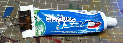
Today's inspiration comes from right from my own bathroom! You see, I use one of those black office clips on my toothpaste to keep it rolled up as I use up the toothpaste. I've been using the same one for several years now and over that time it's gotten a little wet and oxidized. The other day I noticed it very keenly though and it got me thinking about something Mr Justin said during one of his classes: "You use dry pigments to create texture." At the time I didn't really give it any thought. Of course it creates the look of texture. It makes it look like there's texture on the flat surface. What I didn't realize is that he meant it actually creates texture by piling on and adding surface texture in addition to color. Seeing this clip all rusted was sort of an "Oh duh" type of moment for me.

Any yes, for reference, here's how I roll up my toothpaste tube. Perhaps a little OCD, but hey, it simplifies my life by 0.000138%, and I'll take it.

Monday, July 09, 2012

Battle Report: Calaban vs Mordikaar (in 3D!)

Even if you don't care about battle reports, you should check out this post! Below are Lytro photos from a recent battle. In case you don't know what that is, it's a new type of camera where you can change the focal point after the fact. It's mad awesome technology, especially for photographic miniature battles. Check out the photos below and click on various spots to refocus the picture! Go ahead! I'll put the battle report at the bottom so you can play with the photos first.


Amazing huh? We took these pictures during the game and despite the poor lighting, the shots are super cool to play with. Anyway, on to a super fast battle report.

25pts, Assassination, Random Terrain.
Calaban, Wrastler, Boneswarm, Bull Snapper, Gatorman Posse (5), Totem Hunter, Thrulg.
Mordikaar, Titan Gladiator, Radiem (mounted), 4 Paingivers, 6 Arcuarii, Hakaar, Extoler

What looked like it might be a one-sided match against the gators (due to Mordikaar's Hallow spell among other things), turned out to be rather one-sided in the other direction. I nearly tabled Lance on this one. The big key was positioning Thrulg in the center of the board behind a rock, and then managing to strip Hallow off of the Arcuarii using Hex Blast so that the Gatormen could roll in and kick ass. Thrulg in particular really earned his points by being hard to dig out, causing damage to Mordikaar when he cast spells, and generally surviving a long time. Now in all fairness, I had pretty awesome dice rolling, and on average I think there would have been a bit more counterpunch taking place.

Ok, anyway, this battle report was really just an excuse to show off the awesome Lytro photos. I've still got a lot of painting on Gators that I want to get done, so enough blogging and back to painting. Enjoy!

Sunday, July 08, 2012

From the Desk: Airbrush Update

Another weekend down, and unfortunately it hasn't been as productive as I was hoping for. Before I get to the meat of my post (an update on my airbrush experience), just a couple quick notes. First, I rounded out my collection of Secret Weapon washes. I've found them to be an invaluable part of my painting arsenal. I sometimes use them straight for painting rather than washing, just because they are already pre-thinned to a level that is not that far off from what I would thin to anyway. Second is that despite not being close to fully painted on Gators yet, I bought a couple more models for my force. It was sort of a bit of retail therapy, given the chaos that has been going on in other parts of my life. Anyway, on to the important part.

I managed to break out the airbrush again over the weekend as a part of working on, what is for now, a secret project. That will get revealed in a couple more days. However, during this airbrushing exercise I was using my P3 paints instead of the VMA ones. Overall they worked fine, but it was challenging to get the right thinning. Everything was going fine at first. Then while secret project was drying, I swapped to start base coating the Throne of Everblight, and disaster. A chunk of paint got lodged and I had to disassemble the entire airbrush to clean it. And I mean the entire thing. That led me to think about airbrushing in general.

What I like about this airbrush is 1) it was cheap, and 2) it's good initial practice with double action. What I don't like, well, that's a long list, but the highlights are 1) it's not gravity fed, 2) it's a monstrous pain in the ass to clean, 3) it's not exactly the most finely tuned instrument.

With all this in mind, I've initiated a countdown. Once I have used this airbrush a total of 10 times (and I'm at 4 now), I'll indulge myself in buying a better one. I also need to find a better system for getting it set up and in a usable state than hauling everything downstairs, setting it up, and then hauling it back upstairs once I'm done.

Saturday, July 07, 2012

From the Desk: Wet Palettes Revisited

Quite some time ago, I tried out a wet palette to see if it helped with painting. I had originally intended to report back and, well, apparently failed to. After about a month of using it, I decided it wasn't really for me. I had some challenges with it, particularly in getting a new piece of paper prepped and in place. The paper needed a lot of soaking time, and often curled up at the edge. Eventually I abandoned it and went back to my old ways.

Recently however, there was a tutorial on Hand Cannon about building a cheap wet palette. In that article, Autumn mentions that the P3 palette paper works better than wax or parchment paper. It got me thinking that I should give the wet palette another try. The picture of the various types of paper on the palette was what really sold me. I found an additional artical on CMON where the author mentions using tracing paper. So with that knowledge in hand, I headed off to my local Michael's to find some tracing paper. However, what I found instead was much more interesting...

Sta-Wet Acrylic Paper, by Masterson Art Products Inc. It was $4 for a pack of 30 sheets of 8.5x7" wet palette paper designed for water-based acrylics. Fascinated, I snatched it up. I built a quick blister-pack wet palette, added water, cut down a piece of paper, and gave it 10 minutes to properly soak. No curling of the paper or anything, and it was ready to go. And I have to say, it definitely worked better than the parchment paper did before.

Although I'd like to say I'm going to use it for a couple weeks and report back, well, that didn't work out so well in the past. And given my current projects, I may not be using it a lot. However, I wanted to share this find with other painters out there that might be interested.

Friday, July 06, 2012

Daily Inspiration: WWPD

Today's inspiration comes from the What Would Patton Do blog. These guys are awesome. They really go the extra mile in terms of setting the stage for their battle. They do a lot of research on the history of the places they build and models they paint. They may not be winning any Crystal Brush awards for their painting, but I for one am routinely inspired by their fully (and authentically) painted armies. This post in particular reminded me how much I enjoy their blog, even if I don't play Flames of War. However I definitely recommend looking over their blog for some inspiration.

Thursday, July 05, 2012

Boneswarm

Another quick gallery post. The Boneswarm is a very fast model to paint. Mostly cause, well, it's just a big pile of bones with a few small details of earth in some of the gaps. Not much more to say on this one really.